HOME | DD
 PattyD — Moon Tutorial Final
Published: 2005-08-06 18:56:52 +0000 UTC; Views: 1832; Favourites: 25; Downloads: 174
Redirect to original
Description
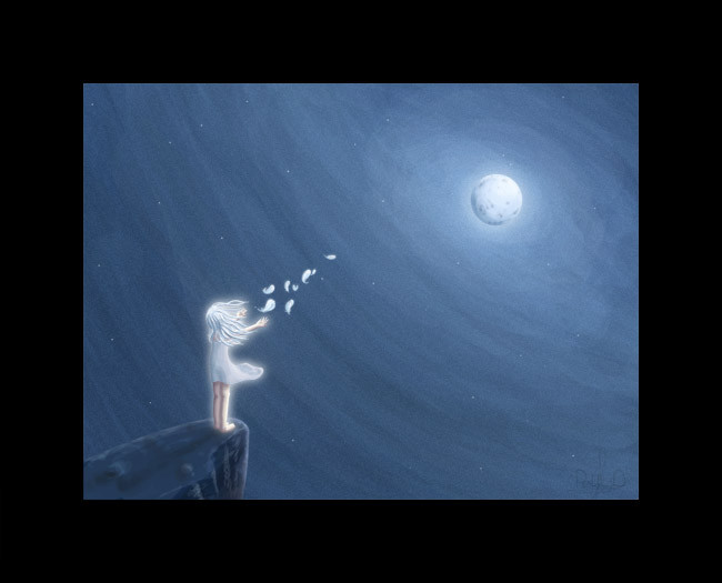
Okay, so I made this good looking background in the tutorial. No point wasting it right?
The setting is very standard, there are probably tons of similar pictures like this on DA, but still, I like the way it turned out. Nice, spacy, cute and well... pretty
 (Smile)") .
.
Related content


Comments: 8

Nice! How come all the people who starts doing digital-painting always paint that piece of rock ? I've just started digital-painting and i've painted like 20 piece of rocks like the one in your paint (same position too)! lol
👍: 0 ⏩: 0

hey! found your moon tutorial as i was browsing through stuff
The concept's really nicely used here~! `cept that prob...the thick border distracted me a lot.. haha

👍: 0 ⏩: 0

this one is really pretty and kind of mystical.. it has a floating feeling to it. but, the thick border looked a bit off for the image. (it just might be me 
but overall, I LOVE IT. <3
👍: 0 ⏩: 1

Thanks ")
👍: 0 ⏩: 0

nicely done... is it jsut my connection or is the lighting a bit boxy?
👍: 0 ⏩: 1
Thanks
The lighting 'could' be boxy on some monitors with a bigger contrast. I don't make perfect circles around the moon on purpose though, it just doesn't look right.
👍: 0 ⏩: 0
