HOME | DD
 Pe2te2r — Scarlet Moon Knowledge

Published: 2007-11-22 14:33:34 +0000 UTC; Views: 711; Favourites: 26; Downloads: 5
Redirect to original
Description
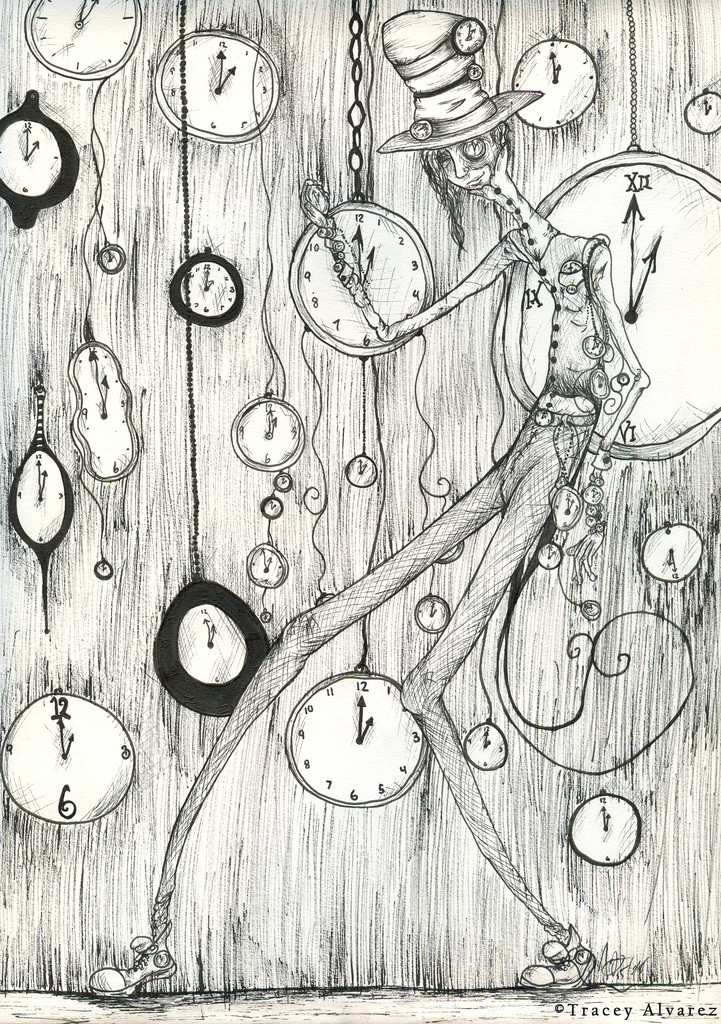
Wow this was a biggie ^_^Took me all day to make this and my head hurts soooo bad
T_T
oh well .... i realised people like my older work a lot more... wells its less effort and for me less creative thought .. but for the good of the people ill make somthing like Radness agian .....
welll here its is ... i couldnt think of what name i should choose so i combined the two ...
the first name was Under the tree of Knowledge
or
The scarlet Moon
oh well hope you enjoy
Related content


Comments: 97

...I really can't tell you how much i love this picture peter. It's amazing. I love the colors. Especially the sky...The dark blue/purple sky looks beautiful, constrastign with the black tree...
I wish i was the guy in that picture.
I really love this picture alot!!! ^^
👍: 0 ⏩: 1

hahah ayou dont know how much this means ... im glad you like it ^^...
i so want to draw sumthing liek this agian ... but gaah! its takes forever ...
but thank you ^^

👍: 0 ⏩: 1
your so welcome.
That really us one awesome drawing. ^^
")
👍: 0 ⏩: 1


pretty cool, i can see why it took so long, but nice work
 (Smile)")
👍: 0 ⏩: 1

hahah thank you so much >W<
👍: 0 ⏩: 0

I love your style! Excellent piece, good choice of colours too
👍: 0 ⏩: 1
haha thank you so very much
👍: 0 ⏩: 1

the shading again is awsoem but i dont think some of it sits as well as your other work... im not keen on the cyclops it just seems to steel focus i would concentrate on the tree and the character and work the foreground less
thats just my opinion i still really like it
👍: 0 ⏩: 1
yeah that was my lasyness taking over ... getting outa i deas... i started with the tree wich i realy like ... and then i got tired ... so i just sorta quickly did the rest ><
👍: 0 ⏩: 0

Hello! This piece has been featured in my journal ([link] )
👍: 0 ⏩: 0
original concept and exectution, the shading is great
👍: 0 ⏩: 1
wow thank you im glad you think so ^^
👍: 0 ⏩: 0

Ah, was this done only in pen? If so, very well done! The etching is calculated nicely.
Creepy, too! ^_^
👍: 0 ⏩: 1
haha yeah i did it with those lame bic pens ... >_<
lol
thank you alot by the way ^^... i dunno if i calculated the etching haha 
👍: 0 ⏩: 1
Ah, non-calculation: even better. I should have said "random" or "improvised" I guess.
This is very nice for a bic pen drawing ;D

👍: 0 ⏩: 1
haha no matter ^^... thank ya ... i actualy dont like this very much ... hahaha it doesnt require alot of creativity ... but gaah ok >_< it brings crowds ... what the heck ")
👍: 0 ⏩: 0


Like it a lot, red and purple always go well together!
👍: 0 ⏩: 1
haha thanx ^^ i think ill make more of these ^^
👍: 0 ⏩: 0

Like someone already wrote... very tim burton ! i like the purple shading the best and the detail on the tree
👍: 0 ⏩: 1
yes haahah i started with that ^^ aahh why do people like these drawings so much ... they take such a long time ... ahh welll v_v hahah thanx ^^
👍: 0 ⏩: 1
um... maybe cos they're really good ! don't underrate yourself
 (Wink)")
👍: 0 ⏩: 1

Really radical... I like your morphic lines very very much!
👍: 0 ⏩: 1
wow thanks reraly ^^ im so glad
👍: 0 ⏩: 0

I think this is a great piece.
Im loving the red and purple.
👍: 0 ⏩: 1

thank you im so happy that you like it ^^
👍: 0 ⏩: 0


thank you.... hehe im happy that you like it ^^
👍: 0 ⏩: 0

That's really interesting, it seems for me as the boy would be sad and wouldn't care about the scary stuff around him, or would like it to be alone...
👍: 0 ⏩: 1
wow havent thought off that ... intresting idea
thanx
👍: 0 ⏩: 1
and i told only how it look like...
👍: 0 ⏩: 0

Hmmm... the represented concept looks pretty nice and it Tim Burton's touch really fits. I'd really like to see it done by brushstrokes 
👍: 0 ⏩: 1
ooh that would be hard ...
im not very skilled with the paintbrush ... ahh hehe maby ill try one day ... ^^
👍: 0 ⏩: 0

So many elements in this one and they all manage to create such a playful and lively atmosphere. Great job!
👍: 0 ⏩: 1


| Next =>