HOME | DD
 Peachfuzz — Demanding Demeanor

#anthro #feline #leopard #markers #prismacolor #prismacolormarkers #traditional #anthrocharacter
Published: 2008-04-13 23:36:04 +0000 UTC; Views: 1089; Favourites: 15; Downloads: 0
Redirect to original
Description
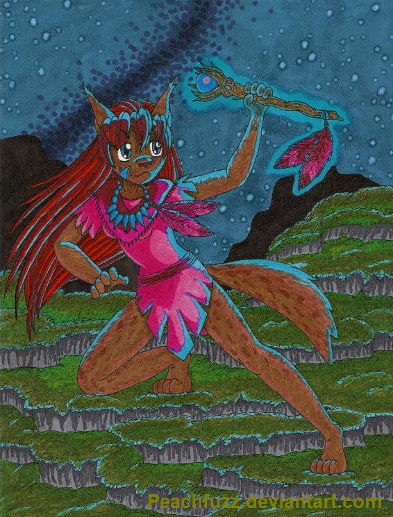
Please bear with me as I try to push through this art block. For the moment, if I don't omit the backgrounds, I won't be able to do any art at all.Anywho, it's my character, Dia. She definitely has the most attitude of any of my characters, and I really tried to show that. Dia is bossy, belligerent, vain, and demanding. Why would anyone be friends with her? Because there really is a nice, caring person under there. Chaka is very good at dealing with Dia's personality.
I messed up so bad in a couple of places.
 One is purely an issue with the lineart; Another is with the coloring. Feel free to point out mistakes if you see them, but don't be surprised if you get "Yeah, I know" as a response.
 Pitt Artist fine point pen, Sakura Pigma Micron 01, Prismacolor markers.
Obsidian and artwork © me, Peachfuzz .
Related content


Comments: 49

Bueeno, sí que tiene la actitud, (y hasta parece que esta buscando una víctima para regañar ")
Extraño tus fondos en este, pero yo creo que deberías aprovechar estos dibujos sin fondo para practicar un poco con las sombras, es decir fijar un punto de origen de la luz y intentar proyectar las posibles sombras, yo creo que con un buen trabajo de sombras hasta puedes engañar al ojo haciendonos olvidar que estamos mirando algo plano ^^
Nada mas que agregar a lo que ya pusiste, solo que me encanta su cabeza y la pose
👍: 0 ⏩: 1

Muchas gracias. 
")
👍: 0 ⏩: 0

ow wow, this character is sososo awesome, and her expression is rad
👍: 0 ⏩: 1
Thanks so much for the nice comment and fav. ^__^ Dia is always so fun to draw.
👍: 0 ⏩: 1
no prob, and i'll bet she is n_n
👍: 0 ⏩: 0

I love the pose here though and the expression certainly does fit well. And of course all the lil beads and additions in her outfit only add to things. Really, nice work! :3
👍: 0 ⏩: 0

Very nice and impressive, I like how this looks. She has a great pose and expression, a lot of character there. Impressive work with the details and the colors as always.
👍: 0 ⏩: 0

*could have sworn I already commented on this* xD
This looks so awesome though. I love the details, especially her hair looks excellent. The pose and expression really convey her attitude as well.
It makes up for some anatomical oopses.
Random tangent: I've been seriously wanting to try markers lately, I looked at the single ones at the art store here and they were $6.50 each (which might be even more than last time I looked xD), so that's out of the question. Plus, I don't really have extra money that I can justify on them at the moment.... hahah, okay this may have been the most pointless paragraph ever since I guess this isn't happening for a while. Alright, the point of that paragraph was now that you should be thankful that you don't live here where you'd have to pay $6.50 per marker and $2.50 per coloured pencil X_X
👍: 0 ⏩: 1
Aw, thanks.
$6.50 per marker? 
👍: 0 ⏩: 1
Another quick question about markers, if you don't mind. What do you think would be the smallest pack I should try to start? I'm going to need something that has different shades of each colour, but I don't really need everything since I'll be combining them with my pencils too. I was trying to figure out what size of a set I should get but it was just hurting my brain xD Any thoughts?
👍: 0 ⏩: 1
I'm not sure. I went straight from my first 12-pack (way too limited) to a set of 48, which I was very pleased with. The 48-count set is well-equipped with shades of all colors except purple. You will find Prismacolor markers severely lacking when it comes to purple, no matter the size of the set. I mix my own purples because of this. If they haven't changed the colors since I got my 48 set back in 2004, then all of the ingredients to make nice purples are present in it. If you're combining them with pencils, you might be able to get away with a 24-count set, but I haven't bought one myself and I don't know what's in it.
No matter what you get, I definitely suggest picking up a twelver of grays. Cool Gray is the most normal, useful type of gray. The grays are absolutely priceless for mixing and toning, and are fabulous when working with black and white because there are very pale ones and very dark ones. Only nine of the twelve markers in a grays twelver are actually grays. Three are blacks. Maybe it's just me, but I hardly use any black markers so I have lots of extras piled up because my gray twelvers keep restocking my blacks. XD I use the extra blacks for things like writing on posters and marking plastic, since they're better and more powerful than Sharpies.
Don't buy the metallic Prisma markers. They suck. You're better off with specialized brands of metallic markers or even metallic Sharpies.
👍: 0 ⏩: 1
Cool, very helpful! I took a look and I'm pretty sure I could get away with the 24 pack, at least to start. I'll definitely pick up a 12 of greys while I'm at it too. I'll most likely go with dickblick, carpediem doesn't ship internationally and I couldn't find any better prices than blick on the net. Now, I just need to find a free $80 or so and I'm all set.
👍: 0 ⏩: 1
Personally, I won't buy from CarpeDiem because their site has numerous typos and their return policy sucks. With them, you have to pay your own money to return bad items, and if they judge it okay, they'll replace it or whatever. Blick, with all but the most expensive items, lets you keep the one you got and sends you the new one, free, no questions asked... On rush order! They're amazing. You won't find better service than Blick even if you find better prices.
How exciting! Have fun, whenever you do get your markers. I started with just 12 of them, but it was enough to hook me.
👍: 0 ⏩: 0

Hahah, I actually really like this picture. It seems different from your other pictures somehow, can't put my finger on it. But it's neat ")
👍: 0 ⏩: 1
Aw, thank you.
👍: 0 ⏩: 0

I find this drawing pretty! It shows Dia's character and personality perfectly well 
The only thing I found that looks a bit strange is her right arm. But that's just it. Sorry for I can't write a more decent comment, but you know...english...eh.
👍: 0 ⏩: 1
I was wondering if anyone was going to notice how badly I screwed up her right arm. 
Thanks so much, Psamophis.
👍: 0 ⏩: 0


Is it the time of the month? I feel like everyone is artblocked at the moment. XD ( Me too sort of
But I think this is a good approach on fighting this! I really like her posture and the facial expression. She really looks bossy, nd charming at the same time
Really cool! And I won't say anything about mistakes^^ ( I haven't even found some which would be worth telling, so why bother at all? ) Nice art again!
👍: 0 ⏩: 1
Hug for you, Tabby!
👍: 0 ⏩: 1

It is so hard to believe you color this in markers and not on a computer. It is so perfectly blended I do not see any errors anywhere. So amazing.
Obsidian is my second favorite character of yours.
👍: 0 ⏩: 1
Thanks, Eclipsis.
👍: 0 ⏩: 1
I feel amazed at yours, even for the cartoons you claim you do.
👍: 0 ⏩: 0

YOu can push through the art slump, really you can XD!
This is pretty good, although I do miss that lovely background that so defines your pictures...but I can so understand it being hard at the current time! You really did catch the attitude with her pose, she looks pretty in your face sorta gal! Anatomy is a bit off with the hand on the cane, it just looks a bit ackward. BUt you are really improving the natural folds in cloth, like you did on the skirt...really nice job! Do try to bring that aspect into all parts of the outfit! Anyways, good job love, keep at it!
👍: 0 ⏩: 1
Oooooh, good to know that I did something right with this!
👍: 0 ⏩: 0

This cat gets what she wants! I love it. You really captured the expression and feeling of Dia and her attitude in life. She's such a cat! Of course she is bossy, demanding, arrogant, pushy and sweet all at the same time -- that's a cat for you. Especially a female. I vote her "Cat most likely to be matriarch of her family group."
Toms would find her *irresistible* for that.
I think I see the line art error, but I'll tell you in a note so as not to spoil it for anyone else. It's not that bad either, it's something that could be just a quirk of cartooning and a stylized expression thing.
👍: 0 ⏩: 1
Oh, thanks so much for saying that! 
 (Smile)")
👍: 0 ⏩: 1
Your expressions work is paying off. Your characters are all lively and show their personalities strong and clear!
👍: 0 ⏩: 0

The torso, like asmany of the others have commented, is not as well as it would've been before the art block (then again, art blocks tend to suck the anatomical abilities out of anyone, I should know, I've had that as well).
However, the colors are very nice and the folds are excellently done. Her fur is lovely. Dia has great attitude and it's nice to see some stuff from you, even without backgrounds.
👍: 0 ⏩: 1
Thanks for the kind and honest input, it means a lot.
👍: 0 ⏩: 1
You're welcome as always.
👍: 0 ⏩: 0

I think her pose and expression show that personality well. And, as always, those little janglies and doodads on her walking stick are fab-u-lous. The wrinkles in the arms of her shirt are still looking a little awkward, though not horrible, but the wrinkles in her skirt are looking really good! The one error I really see is that her tail probably wouldn't be at that angle because of where her center of gravity is. It seems to me like it should be more horizontal but at an upward angle and to the left side of the paper, to balance out the position of the rest of her body. That's not really what I'd call a major detail, though, so I wouldn't stress it too much. File it under "for next time".
Sorry to hear about the artblock. That can be pretty hard to work through somtimes. 

👍: 0 ⏩: 1
Thank you for your awesome comment, really.
Good point about the tail, as well. I think I got carried away using it to take up the blank space at the top-right of the paper so the drawing wouldn't look so off-center in my drawing book.
Again, thanks so much for the detailed, helpful comment. 
👍: 0 ⏩: 1
Not better wrinkles per say, but different ones. The way you did them here makes her sleeves look kind of poofy. (Unless you wanted them to be poofy?) I really don't know how to tell you to fix it except to keep playing around with it and trying lots of different ways of doing it. As with so many things in life, the more yu do it, the better you'll get. It also helps to look at a shirt or something while you're working on it, especially if you're wearing it. Wrinkles are hard for everybody.
You're very welcome, as always, Peach.
👍: 0 ⏩: 1
Hmmm... I do want the sleeves to appear a bit poofy, but nothing like you'd see on a ballroom gown or a clown suit. I guess I need to try and find a real-life example of the sleeve I'm trying to draw and work from that! I don't own a shirt with sleeves like this.
Thanks so much for taking the extra time to answer my question.
👍: 0 ⏩: 1
Look on the internet.
Aw, you're welcome. Gotta finish what I started, right?  (Wink)")
👍: 0 ⏩: 0

I really love the folds in the shirt and your new eyeballs, they're more expressive and "touchable". But, sistah, look at her torso! Feel where the your elbow is compared to the bottom of your ribs then look at the difference between her elbow and ribs. I know you have artblock, but... look at it!
👍: 0 ⏩: 1
I was personally thinking that I drew her arms too short (her upper arms are only as long as her skull is tall) but apparently it's the torso that came out looking weird.
👍: 0 ⏩: 0


on first sight, the black is really emphasized on my monitor. the white background may accent the dark colors. and I think at the night scene, the character easily become vague.
it's a lot of fun to think about the personallities about the characters. she have really strong characteristic and it come out on her expression well.
👍: 0 ⏩: 1
Thanks so much.
👍: 0 ⏩: 0

There are anatomical problems, most notably with the length of her midriff and her centre of gravity... but I do rather like it overall. The expression comes across as it should, and the colour is as always sumptuously done. Good stuff!
'Felix'
👍: 0 ⏩: 1
The pose is... Out there. XD
Thanks for the input, both kind and critical.
👍: 0 ⏩: 0

kekee some dark colors she has but I like them, along with hher pose and how well it shows her attitude!
👍: 0 ⏩: 1
Thanks, Cit.
👍: 0 ⏩: 0

ooo I love the pose <3! so awesome =3 very awesome work Peach! even if you're struggling through with that art block @_@;
👍: 0 ⏩: 1