HOME | DD
 Peachfuzz — Jazz, Peachfuzz style
Published: 2007-02-17 22:02:32 +0000 UTC; Views: 1104; Favourites: 20; Downloads: 17
Redirect to original
Description
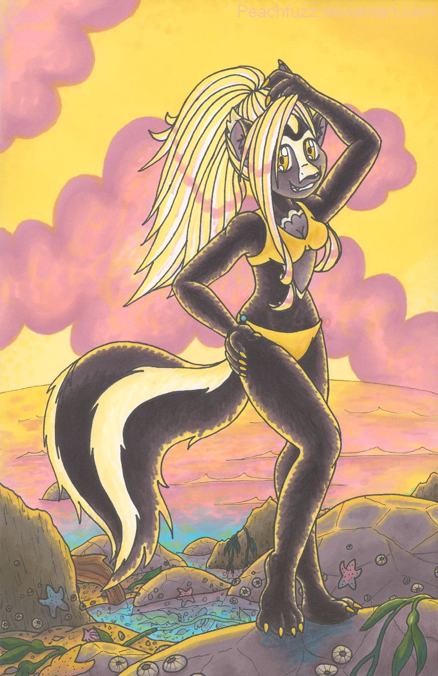
This is for my trade with , of her beautiful skunk character Jazz. Beachcombing in a teenie weenie yellow bikini, no less! She's also the first new animal in my 10 Anthro Challenge!Black fur and white hair are really hard for me, and both happen to be characteristic of Jazz. So that was a challenge. I also suck hugely at water and lighting, which happen to be large elements in this piece. So basically, I tackled some material that's very difficult for me in this piece. Hope it didn't come out too badly.
Didn't mean to give Jazz the pointy claws of doom.
 But I did want to show them.
Sakura Pigma Micron, Prismacolor marker.
Jazz (c) *sushikitten . Artwork (c) me, *Peachfuzz .
Related content


Comments: 49

Kudos on tackling so many of your weak points in one piece and still doing a nice job! 
👍: 0 ⏩: 0

You know, in my opinion you really got that skunk face down. 
")
")
Lovely background, too!


👍: 0 ⏩: 0

i love the details in the rocks and tide, it looks wonderfull. great work again, hun, keep it up
👍: 0 ⏩: 0

Lovely job Peachfuzz! Her pose is so playful and cute! Two big challenges in the one pic, too. You probably picked the hardest sort of lighting coupled with the hardest fur colour- super-bright backlighting on black. It looks pretty vivid to me, especially on the rocks and the tail, so I think you did a really commendable job.  (Smile)")
It may have detracted from the overall look, and I don't ink my work so I probably have no idea what I'm on about, however I think the ink outline around the back-ligt bits makes them less bright, maybe. But... you most likely needed that to separate Jazz from the cloudy sky.
The rocks and the little pools and aquatic life are all exquisite. They really do look lovely and watery and salty and sea-ish. O_o Wow. Articulate. The curve of the seastar in the front-left, draped over the rock, really helps with the 3D effect.
I love how the water fades from pink to blue, and how the Earth's curvature is indicated.
👍: 0 ⏩: 1

I still heavily depend on inking to separate my subjects from their backgrounds.
I do have colored pens, though. It would take more planning ahead on my part, but do you think colored ink would have been more effective around the highlighted parts? And if so, what color would you recommend for it in this case? Maybe a dark yellow...
Thanks so much for the helpful and encouraging input. 
👍: 0 ⏩: 1
Coloured ink? Awesome. Yeah, dark yellow, or even a verrry pale yellow/ orange, lighter than the background. I'd use white, but that's due to my lack of proper lighting know-how and over-reliance on white, because I doubt it'd be white really. I'd love to see you use coloured ink. How many colours do you have at present?
👍: 0 ⏩: 1
I have 20 colors of colored ink. It's a set of Staedtler Triplus Fineliners, which I very much recommend for an awesome colored pen set at a good price! They're great for writing, too, and are one of the few brands of pens that stands up to my marker ink without budging. Which is odd, since they smear with water...
I couldn't use white, though, even if I had a white pen, because it would make the underlying pencil lead from the sketch permanent and look awful! Yellow is hard enough with that, and white would be unworkable. All you'd see is the graphite. And even if I did manage to ink in white without adhering graphite underneathe... How on earth would I see it?
👍: 0 ⏩: 1
Hmmm... fair enough, I see your point. Well it still looked lovely with the black outline in the first place! What are you working on at the moment?
👍: 0 ⏩: 1
I'm coloring my squirrel now. She's over half way colored, but college is making it really hard to sit down and work on art. =/
👍: 0 ⏩: 0

NIcely done, tis a smexy skunk!! I like that light pink you used for the sky, ocean and highlights on the hair...what color is it, anyways?
👍: 0 ⏩: 1
The pinks I used are Pink Rose, Ballet Pink, and Deco Pink. Deco Pink is responsible for the shines in the hair, but all three went into the clouds and water.
...And were chopped up badly by the scanner, now that I look closely...
👍: 0 ⏩: 1
I only have two pinks, and none of them are those...I might just have to look into getting those, cause they look pretty, even if you don't like the way the scanner messed em up!
👍: 0 ⏩: 1
Other pinks I use a lot are Pink, Rhodamine, and Magenta. They're the three I used here [link] on the stripes and hair. (Deco Pink is the hair shine and most of the sky pink) I also use like Blush Pink, it's similar to Ballet Pink.
Deco Pink is my fav pink of all time. I recommend it! It's really light and subtle but also strong in a way. Blends awesomely with yellow and other colors to give a pink tinge. If you have to pick just one new pink, make it Deco Pink.
What pinks do you have, anyway?
👍: 0 ⏩: 1
I actually have Blush Pink, then Salmon Pink, Mulberry and Pink. I've been using the Blush Pink alot recently, its one of my newest colors, and I've been thinking I need to get more pinks
👍: 0 ⏩: 1
Ballet Pink is similar to Blush Pink, only a prettier shade. A little less fleshy.
Pink is one I like a lot, but it's not subtle. Too bright for some things. Deco Pink and Pink Rose are awesome for subtle things, like clouds.
👍: 0 ⏩: 0

This is absolutely amazing! 

👍: 0 ⏩: 1


Heh, this looks great, really wonderful work. The posing and the expression are just cute. Wonderful workon the details and the colors, the warm colors look great, don't think I've seen you work with yellow.
👍: 0 ⏩: 1
Thanks.
👍: 0 ⏩: 0

ooooo wow! <3 This is great! I love it! <3 I think the water looks great! =3 it's really neat x3
👍: 0 ⏩: 1
Hahaha, yay, thanks! 
👍: 0 ⏩: 1

Wow that is so awsome, I like a lot, I dont think I could ever in my wildest dreams do that good Way to go.
👍: 0 ⏩: 1
Thanks so much! 
👍: 0 ⏩: 1
your welcome... and just remember "practice makes perfect" so keep up the good work
👍: 0 ⏩: 0

That's awesome! She sure has a cute little sexy pose, doesn't she? Beautiful work, I love the detail that you put into the whole thing. The sea critters in the background are really well done!
👍: 0 ⏩: 1
Aw, thanks! 
👍: 0 ⏩: 0

her black fur and nice body is good contrast with the sunset background. I'm amazed you draw so many tiny sea creatures.
👍: 0 ⏩: 1
Thank you! I purposely picked light colors for the backdrop so that she would pop off the page.
👍: 0 ⏩: 0


The lighting isn't terrible; the only thing I would suggest is that you have the warm sunny high lights the under-lights would be better in blue, like they were reflected from the water. I do like the character and the colors and the background are great.
👍: 0 ⏩: 1
Thanks so much!
This is the first time I've ever heard the term "under-lights", though, some I'm not sure what they are or where they would go. Can you be more specific?
👍: 0 ⏩: 1
I had made this tutorial for you a few days ago: [link] The under lights are the light that reflects in the shadows of an object. You already have some in this picture but they're golden like the highlights.
👍: 0 ⏩: 1
Huh.
Sorry to come off so ignorant here, but this is a completely new concept to me, one I'm obviously not grasping yet. If it wouldn't be too much trouble, can you red-line this for me to show where underlights belong? Just indicate where it would have been appropriate to add blue underlights? I keep staring at the dog in the tutorial and I'm just not understanding how to place the underlights. Light direction is behind and slightly above, diffused by clouds so it's not as directional as unimpeded sun. I didn't take water reflection into account, though...
Thank you so much for always going to such lengths to help out this poor confused little artist.
👍: 0 ⏩: 1

👍: 0 ⏩: 1


OK, I love this. In fact, I LOVE THIS!
Not only is the drawing itself awesome, I absolutely ADORE the attention you put into the little details like the shells in the background, the interiors of the tidepools, the golden glow of the susnset on Jazz's fur...backgrounds are a HUGE challenge for me so I can really appreciate the effort that went into this ^^
I love your portrayal of Jazz, she's sweet and wholesome but cute and flirtatious all at the same time...that bikini rocks ^^
Thank you so very much hun, this is absolutely wonderful!

👍: 0 ⏩: 1
Hahaha awesome, glad to hear that you like it! 
👍: 0 ⏩: 0

*Snickerfit* Hey I say yay for the pointeh claws, not only because I like them, but because you don't usaully show them, so you did something else there you usually don't. And I think the bg came out quite nicleh, and very pretty, I love beacheh like backgrounds.
👍: 0 ⏩: 1
Yay, thanks!
👍: 0 ⏩: 0

Fluffy fluffy clouds! I like the details in the tide pool, I can almost smell that stinky ocean smell! Like the hair too, looks nice where it's pulled back.
👍: 0 ⏩: 1
Thanks.
👍: 0 ⏩: 0