HOME | DD
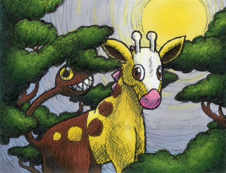
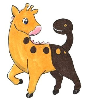
 Peachfuzz — Never Alone
#hatching #traditional #traditionalart
Published: 2010-03-13 03:35:18 +0000 UTC; Views: 463; Favourites: 29; Downloads: 0
Redirect to original
Description
There are so many things about this piece that I feel turned out awful. But I'm glad to be able to squeeze out some art between course work and art block. Feels good to color.
 Fun fact: Girafarig is one of my favorite Pokemon. Why did it take me so many years to finally draw it?
Drawn with a Prismacolor fine-line pen and colored with Prismacolor markers. =3
Girafarig © the Pokemon company.
Related content


Comments: 27

Oh, I've just seen an episode with Girafarig today (yeah, I'm waaay behind the official airing dates) and I've thought about drawing it immediately. Of course it's gonna be a.. different approach then yours, but I have to tell you that your one is just lovely. I like the mood you've created - this atmosphere of peace and well, some kind of hope, this mood of - yeah - never being alone. Very Pokemon-like
 (Smile)")
👍: 0 ⏩: 1

Aw, thank you! 
Girafarig would look great in your style.
👍: 0 ⏩: 0

Wow, I like the color choices, it really stands out! I really like the trees too ^.^
👍: 0 ⏩: 0


It looks so cute! 
For a moment, because of the title, I wanted to be a Girafarig.

👍: 0 ⏩: 1
I'm so glad you like it, Cheru! 
Really? I thought the head was the worst thing here! It looked a little less bad in the sketch but became more warped when I inked.
👍: 0 ⏩: 1
You're welcome =3 
I think the bulkiness and the way you have it curved looks more realistic. :3

👍: 0 ⏩: 1

Thank you! 
👍: 0 ⏩: 0

: D more card-worthy art 

But seriously, I love this scribbly cross-hatchy style you've got going on :3. All the colors work together very well. They are vibrant enough to pop, but they still look like they belong in the same image! Personally, I'm not a fan of girafarig, but just the way you drew it is so appealing I don't care XD. Don't stop!

👍: 0 ⏩: 1
Aw, thank you, Windie! This is such a wonderful comment.
I actually did mess up and flood fill one tree bough with the darkest green. 
👍: 0 ⏩: 0

I finally got the never alone part. 
This looks like it should belong on a card. Love that cross-hatching effect. I should give it a try sometime.
👍: 0 ⏩: 1
Thanks so much.
👍: 0 ⏩: 0

Pretty good, looks digitally done. The coloring is so smooth. =3
👍: 0 ⏩: 1
Thanks. :3 I used a very thin paper which makes it easier to get large areas of smooth color with little ink.
👍: 0 ⏩: 1
Really now? I did not know that. I never use thin paper because of bleed throughs. c.c'
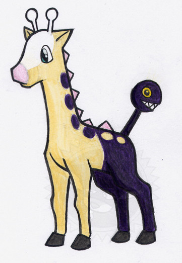
Gonna have a short pause till I submit my two psycho Girafarig pics on FAI to Pokedorks. You can sneak over and look if you want a sneak peak. =3
👍: 0 ⏩: 1
Thin paper is actually pretty amazing for markers. It has far superior ink economy to thick papers (less absorption), and depending on the surface, it can be very easy to control the bleed. See, here's the back of the piece .  - :D")
👍: 0 ⏩: 1
WHOA WHOA WHOA, is that those tiny sketch pads with lots and lots of pages? Otherwise I have no idea what kind of paper that is. It sure looks like what I think it is. D:
👍: 0 ⏩: 1
Yep. :3 Specifically, it's a Strathmore 300 Series Sketch pad . I have the little bitty one, but I wouldn't mind a bigger one since this paper is so lovely.
👍: 0 ⏩: 1
My gosh! I knew it right away! I have not bought 5 of those for nothing! *none of which are completely filled*
I have one exclusively for polished graphite drawings (the last one finished in it was Nobody Aerisis), another for ink (mostly ballpoint, finished quality just like the graphite one), umm.. another that was supposed to be for spiritual meditation (but I only did two graphite pictures), and the other one being used is truly a "sketch" pad with unpolished crud and doodles (one page is fully filled with me designing my new signature). X3 The fifth one is just an extra.
👍: 0 ⏩: 1
I haven't used the paper for much else but markers. Try yours out on them!
I also really like that it's so thin, I can just set it on top of a sketch and ink without a lightbox or anything.
👍: 0 ⏩: 1
Hmm... I see that about tracing. Hmm. Yes, I do have this same paper in a much larger sketch pad, so I guess I could try it if I wanted to with pointillism. I know when I tried doing coloring like you, my Bristol paper bleeded badly, now that I switched to pointillism, its much better.
Though I think in the end I prefer something a bit more sturdy then sketch paper. I can be a little rough with my stuff. D:
👍: 0 ⏩: 1
I use different papers depending on what I'm doing. I wouldn't use this thin stuff for everything. ^__^ But it's very nice for some things.
👍: 0 ⏩: 0