HOME | DD
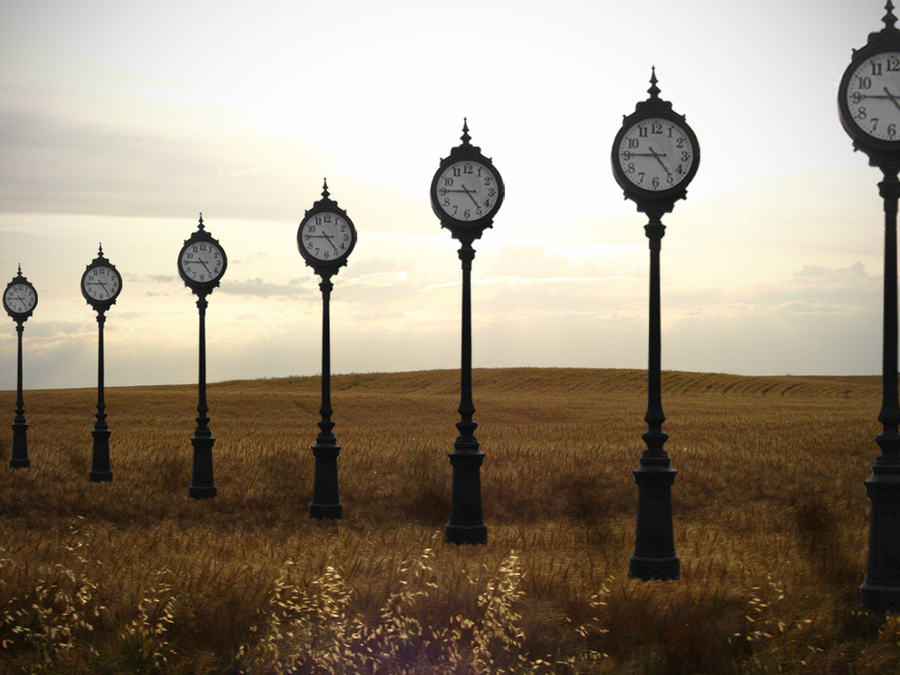
 Perzikhoofd — Beside You in Time
Published: 2010-12-26 11:04:51 +0000 UTC; Views: 1393; Favourites: 52; Downloads: 52
Redirect to original
Description
This was really one of the hardest manipulations I've done, simply because perspective is so damn difficult to fake. So I hope it turned out quite okay. If anyone has any tips on how to fake these kind of perspectives in Photoshop, or any other constructive qritique, you're more than welcome (Smile)")
I came to this idea while listening to [link]
Again a time theme. I think that one is here to stay.
Anyways, enjoy!
Stock used:
Street clock: [link]
Landscape: [link]
Related content


Comments: 21

I think it looks pretty good!
I think maybe a bit more color would be good... and the middle clock looks a bit off to me perspective-wise, but all in all a great piece!
👍: 0 ⏩: 1

Very interesting idea but the result, sorry to say so, isn't very harmonious.... the second pole (from right) is out of line, and if you did that intentionally it;s ok, but then it gets even more difficult to fix the perspective. Secondly (and most important) the little "knots" just below the round part are not aligned at all. Thirdly, the first from left is bigger than it should be, and looks too close to its neighbor. I still find the idea excellent and the rest of the technical details is greatly executed. Hope I helped a little, anyway that was my intention
👍: 0 ⏩: 1

It's okay, I'm aware of this ")
But thanks for your comment

👍: 0 ⏩: 1


This reminds me of the work of my favorite album cover artists ever ,Hipgnosis (genius design team)...it looks like a lost Pink Floyd cover,excellent !
👍: 0 ⏩: 1
Wow, thank you
Pink Floyd is amazing
👍: 0 ⏩: 1
You are welcome,really like what you are doing !...and you should totally check out the work of Storm Thorgerson ( amazing artist who is part of Hipgnosis design), he has a website...I think you would find the work really inspiring based on what you are doing...he provides endless inspiration for me, some really beautiful, genius stuff there
👍: 0 ⏩: 1

Not to be critical, but if I was going to change anything, I would look again at the shadows on the 3 furthest away, and also, where the base meets the grass maybe "smudge" some grass over the clean lines, or erase some grass through to give them a sense of being "in" the scene =] The top half of the image is very good and I like the idea =]
👍: 0 ⏩: 1
Critical is good!
And I thank you for your critique ^^
Where the street clocks meet the grass is indeed a bit.. not quite.. It looks sticked on
Thanks again
👍: 0 ⏩: 0


Concerning the issue of perspective, it's helpful draw the lines of the perspective on a transparent layer.
👍: 0 ⏩: 1
Thank you ^^ And that's a good one! Thanks
👍: 0 ⏩: 0