HOME | DD

pete-aeiko — A02 - A03

Published: 2007-06-25 12:04:31 +0000 UTC; Views: 30876; Favourites: 705; Downloads: 1040
Redirect to original
Description 
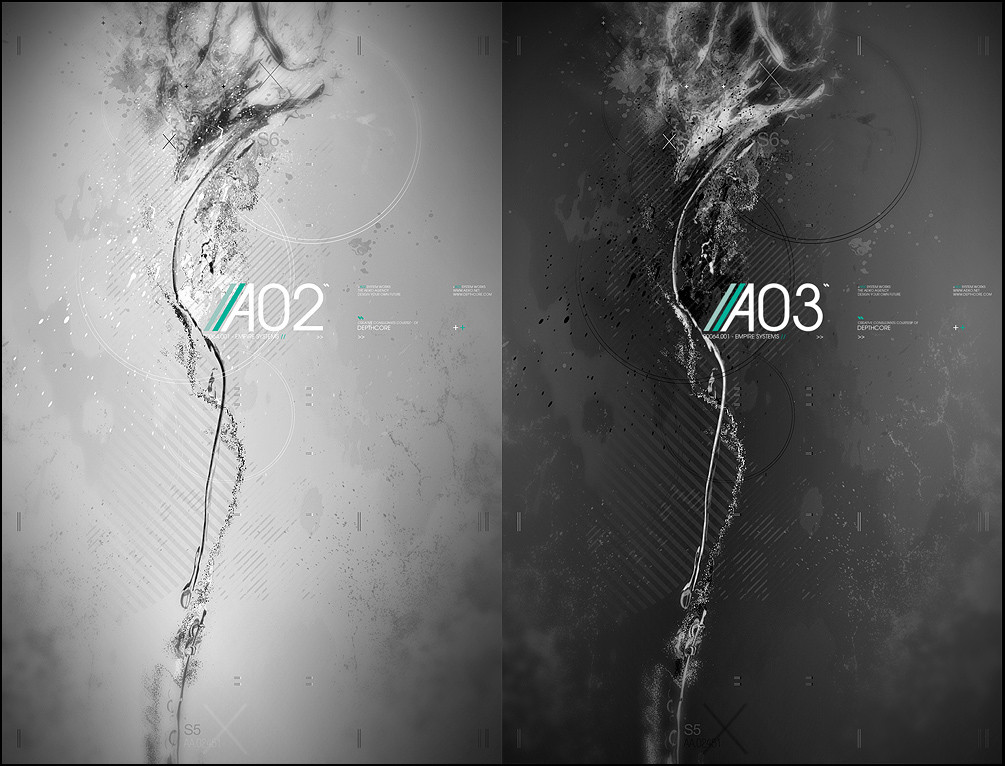
Experimenting with some abstract work, looking into mapping systems of a fuedal empire for depthcore's latest release.
Related content
Comments: 131

JOJOSOUNTHONE [2009-05-23 00:56:50 +0000 UTC]

I absolutely love all your work.
I love how you use your text.
its A.M.A.Z.I.N.G!

👍: 0 ⏩: 0

nobeachedwhales [2008-09-17 21:12:59 +0000 UTC]

Looks GREAT!

👍: 0 ⏩: 0

Freewhiler [2008-08-06 22:53:55 +0000 UTC]

Nicely done

👍: 0 ⏩: 0

mctrent [2008-08-01 10:14:57 +0000 UTC]

Awesome.

👍: 0 ⏩: 0

CTRLgs [2008-05-21 02:42:41 +0000 UTC]

This is just perfect.

👍: 0 ⏩: 0

yves2013 [2008-02-03 22:43:21 +0000 UTC]

hey amazing work! whay is the name of that font, it looks really good!

👍: 0 ⏩: 0

Miko-polski [2007-11-22 16:29:10 +0000 UTC]

very very cool!

👍: 0 ⏩: 0

Gmarconato [2007-11-07 21:17:13 +0000 UTC]

Nice work!

👍: 0 ⏩: 0

x-n3ll [2007-10-26 11:17:50 +0000 UTC]

Awesome work. ^__^

👍: 0 ⏩: 0

andrewfphoto [2007-10-16 12:57:15 +0000 UTC]

This is the best piece of art I have yet come across on DA - I was becoming tired of the repetitive and plagiaristic nature of this place, then I stumbled upon your work.

Miracles of aesthetics.

Andrew

👍: 0 ⏩: 1

pete-aeiko In reply to andrewfphoto [2007-10-16 14:19:46 +0000 UTC]

oh wow thanks, that means a lot

👍: 0 ⏩: 0

killjoydesign [2007-10-05 16:16:13 +0000 UTC]

wicked typography work man.

👍: 0 ⏩: 1

pete-aeiko In reply to killjoydesign [2007-10-05 19:31:13 +0000 UTC]

cheers

👍: 0 ⏩: 0

jesus1020 [2007-09-29 19:39:05 +0000 UTC]

i just loved it...

👍: 0 ⏩: 0

PersAbsynthFaerie [2007-09-20 23:45:52 +0000 UTC]

just wow

👍: 0 ⏩: 0

BloodyCheerleader [2007-09-20 17:28:43 +0000 UTC]

lovelyyy

👍: 0 ⏩: 0

amhaley [2007-09-18 20:56:12 +0000 UTC]

all of your stuff is amazing

how long have you been using photoshop

👍: 0 ⏩: 0

bikinikiwi [2007-09-18 16:15:03 +0000 UTC]

love all ur deviants!! ;J more the lasts ones but i like all!!

👍: 0 ⏩: 0

arhcamt [2007-09-12 03:50:05 +0000 UTC]

awesome!

👍: 0 ⏩: 0

samuelreis [2007-09-02 23:21:52 +0000 UTC]

perfec composition!!!!!!!!!!!!!!!!!!!!!!!!!!!!
nice!!!!!!!!! =]

👍: 0 ⏩: 0

terminal867 [2007-08-30 11:08:49 +0000 UTC]

love, love this style pete the abstract looks almost like silver water fluid!

👍: 0 ⏩: 0

Rasse [2007-08-21 18:24:41 +0000 UTC]

really love this piece!
fav

👍: 0 ⏩: 0

Rasse [2007-08-21 18:24:20 +0000 UTC]

really love this piece!
fav

👍: 0 ⏩: 0

electronfusion [2007-08-10 02:31:37 +0000 UTC]

such great juxtaposition of organic & geometric. nice!

👍: 0 ⏩: 0

Feni-x [2007-08-09 09:38:30 +0000 UTC]

nice

👍: 0 ⏩: 0

Calabur [2007-08-03 19:28:55 +0000 UTC]

Love this, particularly the typography.

👍: 0 ⏩: 0

rtn [2007-07-31 21:02:41 +0000 UTC]

👍: 0 ⏩: 0

ngupi [2007-07-31 02:00:31 +0000 UTC]

wow amazing, perfect grayscale, awesome composition.

👍: 0 ⏩: 0

Toop [2007-07-26 02:05:19 +0000 UTC]

That is some damn sweet experimentation.

👍: 0 ⏩: 0

n-o-v-e-n [2007-07-19 12:46:55 +0000 UTC]

great

👍: 0 ⏩: 0

ignitepjp [2007-07-11 03:19:37 +0000 UTC]

amazing work, i love the style and the concept itself is just plain sexy

👍: 0 ⏩: 0

revenantprime [2007-07-01 11:31:31 +0000 UTC]

As always, excellent work. Your 2d/typo skills continue to boggle my mind.

👍: 0 ⏩: 0

Sick-Osiris [2007-06-30 18:35:12 +0000 UTC]

pure bliss

👍: 0 ⏩: 0

Genesis-Orbit [2007-06-30 03:50:51 +0000 UTC]

Fn sick typography man, this rules.

👍: 0 ⏩: 0

EazeR [2007-06-28 17:34:18 +0000 UTC]

nice work!

👍: 0 ⏩: 0

vincentvc [2007-06-28 14:19:58 +0000 UTC]

Is the 2nd not just the inverted version of 1st?
Nice anywayz.

👍: 0 ⏩: 0

F3rg [2007-06-27 07:31:46 +0000 UTC]

very nice

👍: 0 ⏩: 0

AvSkyggene [2007-06-27 01:49:12 +0000 UTC]

Dark one has much better contrast because of the white text.

👍: 0 ⏩: 0

djagentorange [2007-06-27 00:24:27 +0000 UTC]

What font is that in the typo? Definitely feeling the gestalt in this piece.

👍: 0 ⏩: 1

pete-aeiko In reply to djagentorange [2007-06-27 00:57:41 +0000 UTC]

avante garde

👍: 0 ⏩: 1

djagentorange In reply to pete-aeiko [2007-06-28 04:41:59 +0000 UTC]

Really? Did you make the stem on the A vertical? I haven't seen a version of Avant Garde like that.

👍: 0 ⏩: 1

pete-aeiko In reply to djagentorange [2007-06-28 10:55:12 +0000 UTC]

yeah it was custom, but im pleased to say I have the actual special version now

👍: 0 ⏩: 1

djagentorange In reply to pete-aeiko [2007-06-28 18:45:33 +0000 UTC]

special version, hey? would you care to enlighten a fellow deviant as to where this version may be procured? Or at least the name? I've been looking for a while....

👍: 0 ⏩: 1

mistercreevy In reply to djagentorange [2007-06-29 22:34:12 +0000 UTC]

Pete is talking about the Avant Garde Gothic Alternate

👍: 0 ⏩: 0

a-r [2007-06-27 00:20:16 +0000 UTC]

Looking Good!
I like the dark one A03

👍: 0 ⏩: 0

suprsonic [2007-06-26 23:39:53 +0000 UTC]

brilliant use of text and the color scheme looks awesome

👍: 0 ⏩: 0

ilabstudios [2007-06-26 18:05:49 +0000 UTC]

lol more like Adobe Photoshop + ALOT of experimenting + ALOT of time!

Looks good bro!

I can't imagine what your Photoshop folders are like lol, I bet you have a whole archive of custom shapes, brushes, displacement maps and textures

Keep up the good work..! and don't over work yourself hehe

👍: 0 ⏩: 0

Fractured-Visual [2007-06-26 14:26:15 +0000 UTC]

That very good mate, like it how it turns something different! Good work :]

👍: 0 ⏩: 0

Exhale-NL [2007-06-26 11:54:20 +0000 UTC]

yeah what can I say...? It's fresh, it has a sweet flow running through the image. I think it's gold!

👍: 0 ⏩: 0

RIKOOSTENBROEK [2007-06-26 11:08:07 +0000 UTC]

You should do more stuff like this again pete, back to your roots!
I remember some collabs with kharil back in the days, this one reminds me a bit of those!
lovelyyy

👍: 0 ⏩: 0


| Next =>