HOME | DD
 pete-aeiko — Aeroform
Published: 2004-07-30 08:58:02 +0000 UTC; Views: 6876; Favourites: 119; Downloads: 3101
Redirect to original
Description
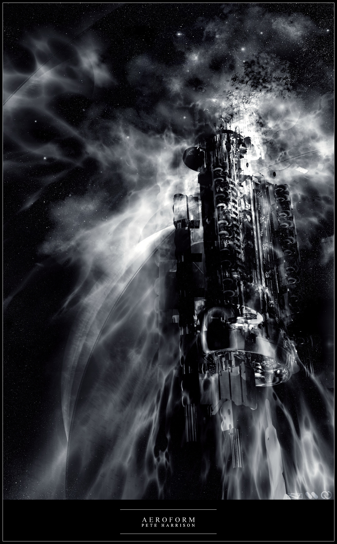
This piece was actually made in bryce, i havent used bryce in ages, since im a 3dsm and after effects whore now..Kept it black and white this one - I like the contrast and form, and you dont see too many b/w abstracts.
Decided render and lighting was enough, hence no 2d.
Also featured in the latest depthcore pack - infinity (www.depthcore.com)
Related content


Comments: 125
 (Smile)")

now this is some sweet work..
the render is incredible, like some old, tall haunted mansion or castle but it's floating out in space like a space-station or something.
the atmosphere is incredibly well done as well as the brushing is fantastic. one of your best pieces lately i think. 
great job on this ")
mP

👍: 0 ⏩: 0

this is beyind any word could ever describe! 
similarly, i have no words that possess the power to explain how amazing i think this is! im am rendered speachless!
👍: 0 ⏩: 0


2 bad its a bit grainy on some parts, but the lighting rocks man!
keep it up as always
👍: 0 ⏩: 0


Looks awesome! +fav .. You should definately make this a wallpaper cause I want it lol.
👍: 0 ⏩: 0

who hasn't made a piece called aeroform?
anyway, I like the render.
👍: 0 ⏩: 0


black color
and the blur(brushing) arround the render .. the render is excellent!
👍: 0 ⏩: 0

what brushing and what colour?
👍: 0 ⏩: 0


Nice. Good brushing. I like the render too, maybe you should do more in bryce...
👍: 0 ⏩: 0

omg, this is awesome man, really great job, your light is so beatifoul, and the brushing and the render, really great !! and the stars is just so great too !! but one thing that bugs me is at the top of the render it looks like you did some kind of an texture or something, i dont know... well, i dont like that ... else you did an great job man, this is an awesome pic !!!
👍: 0 ⏩: 0

Err... rocking bryce work Pete. Nothing more to say. Kinda epic looking...
👍: 0 ⏩: 0


Awesome man, I like the black and white scheme of the piece.
👍: 0 ⏩: 0

Cool. Looks like a space station, like an indutrialized castle in deep space.
👍: 0 ⏩: 0

Ha, very nicely done... bryce you say; wouldn't have guessed it. great job~
👍: 0 ⏩: 0

wow good job dude
i loved it
and the collors black and white rocks
👍: 0 ⏩: 0

")

It looks ok,although the stars was made by something else,the brushing you have been doing for awhile now is quite easy to do,just found out
And i agree most abstract pieces are colorfull,it still looks better with colors though imo. the render is good but overall kinda boring,just my 2 cents.
 (Wink)")
👍: 0 ⏩: 0

Awesome work of art. I love the massive-ness and sheer scale of it all. Great job
👍: 0 ⏩: 0

Can't really see much and the aliasing kinda ruins everything. But nice concept and still, needs more. More details you know what I mean!
👍: 0 ⏩: 0

NOT BAD!!
in otherwords. . . its pretty sweet kickass awesome!
👍: 0 ⏩: 0

well, the render is solid and good-looking. nice atmosphere in the image too, but there are some parts and shapes that doesn't look good. it's those who kinda looks like half-moons, It doesn't fit. maybe some more details would have been nice too, something that really uses this renders potensial, cause I don't think it's done here.
however, great job on the starfield and there are many great details here. great job and a tight render 8)
👍: 0 ⏩: 0

it looks like the depthcore splash a while ago which they had.
Last year people started to make this kinda art but not too many people did.
This reminds me of alot of images i saw exactly same style.
But your image is pretty decent.
I love the unique touch with black and white.
It's got alot of personality.
And it makes me think.
👍: 0 ⏩: 0


I love the contrast - very true though; not many abstracts are black and white. I like the idea.
Wonderful deviation!
👍: 0 ⏩: 0

WoW looks awesome I like your motion in the depthcore pack .. its great
👍: 0 ⏩: 0

great decision not to go with the 2d. People overdo that most of the time
great stuff!
👍: 0 ⏩: 0


Hey dude! it's been awhile
YOu've done really nice work on this one- like someone mentioned the amount of detail is amazing. Great work
-JJ
👍: 0 ⏩: 0


the b&w is cool, the atmosphere has a nice feel to it but i think the 3d is too sharp. nice approach without using 2d elements.
👍: 0 ⏩: 0

oo.. very nice as always
the b&w makes it unique.. nicely done
👍: 0 ⏩: 0


wow man. I'd say this is one of your best yet.
Its abstract, but yet has a very defined structure
some of the brushing at the top right looks a little strange, but all in all its very good.
I'd like to see a color version, but with only a very, very slight change in hue.
👍: 0 ⏩: 1
I didnt use brushing in this piece..all done in bryce including lighting, all i did in photoshop was adjust contrast, thanks for the comment
👍: 0 ⏩: 1
oh. heh heh.
well then.
then I give you tons more props than I did before. Good work.
👍: 0 ⏩: 0

| Next =>