HOME | DD
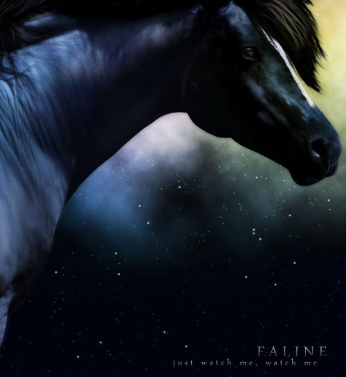
 petulant — Oh, empty my heart
Published: 2009-01-24 22:11:07 +0000 UTC; Views: 509; Favourites: 11; Downloads: 0
Redirect to original
Description
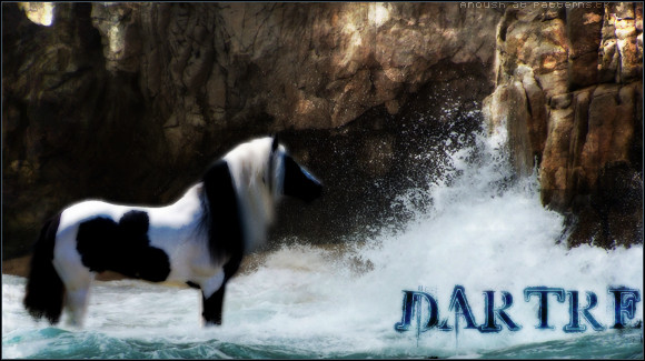
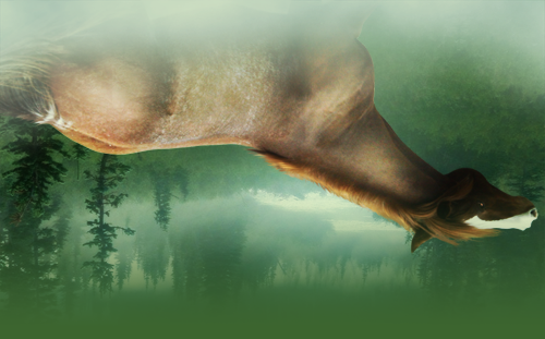
:3Image for a site~
The text placement bothers me, but whatever. I'm done XD
Repainted the mane/tail, cloned out some little white bits and a lot of whiskers, added the splashes (BRUSHES LOLS), blended the rocks in, painted the drippies on her hooves, added a reflection, smudged the body... uhhh
Also: adjustment layers out the BUTT. Not even kidding.

I wish I could figure out how to do the more "current" styles
 Super-dramatic or super-realistic, with high contrast and supersharp edges and everything. It looks so fun
 ") Anyone have any idears how to get images to look like that? xD
Anyone have any idears how to get images to look like that? xDOh well
 I tried. I'm done with this one xP
Credits
Horse by =larfsalot : [link]
Backgrounds by =SalsolaStock [link] & [link]
Sand texture by neopicture at sxc.hu : [link]
Concrete texture by NickBotner at sxc.hu : [link]
Splash/water brushes by Obsidian Dawn : [link] & [link]
Mane/tail painted using brushes by =arrsistable : [link]
Fonts used: Bickham Script Pro (name), DaunPenh (slogan), 04b03 (credits and signatures)
Slogan: Lyrics from Imogen Heap's song "Can't Take it In"
Manip by ~petulant (me!) for use by herself at Rainy Afternoons . DO NOT STEAL!
Related content


Comments: 13

Love the way you combined those two backgrounds. Made me do a double take. ")
👍: 0 ⏩: 1

xD Those rocks gave me some trouble. Some didn't want to blend right >:C But it worked!
Thankoo

👍: 0 ⏩: 0

LOVE IT! (as always!) Um, splashes... extremely amazing!
👍: 0 ⏩: 1
Splashes = brushes XDDD
I only wish I could do water that well. P:
Thanks, Dotty!
👍: 0 ⏩: 1
oh... shhhhh don't tell people that! I was like... HOLY POOP! (Yes, holy poop.) I mean, I know you are amazing, but ... splashes like thhat?
👍: 0 ⏩: 1
Well, I, uh, painted in the water dripping from her other hooves? Does that make it better? xD
👍: 0 ⏩: 1
YES! Thats what I was mainly talking about. Dripping water, splashing water... Same thing?
👍: 0 ⏩: 0

Thanks for using my stock!
It looks positively lovely
 (Smile)")
👍: 0 ⏩: 1

Lovelyyy!
I know what you mean by the more "current" styles. They look like crap when I try to do them like that so I stick with my own. I love your style btw, and I don't think you should try and alter that <3
👍: 0 ⏩: 1
I don't know HOW to do them xD I get bored with doing the same-looking image over and over again. It's boring ;-; I want high-contrast images and sharp edges and pretty text, damn you!
-sits on- Sankoo, dearie <3 I'll try to develop BOTH styles, then, yes? This one and the "newer" ones.

👍: 0 ⏩: 1
Who knows, maybe I don't do it right. Basically all I do is make the brush harder and blur the entire thing less. But it looks baaaaad.
👍: 0 ⏩: 1
Maybe you run the sharpen tool over everything a little? idk >: I'm thinking blurring less might be the key, too. Or not merging everything and blurring it together and blurring the pieces separately, giving you the option to lock the horse's transparency and just soften it with blurs without blurring the edges...

👍: 0 ⏩: 0