HOME | DD
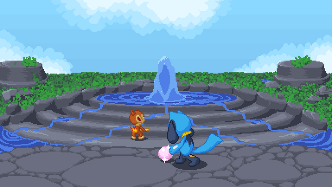
 Phalio — Drenched Bluff
by
Phalio — Drenched Bluff
by
#pixelart #pmd #pokemon #chimchar #riolu #pmd2
Published: 2020-12-11 23:18:37 +0000 UTC; Views: 723; Favourites: 8; Downloads: 1
Redirect to original
Description
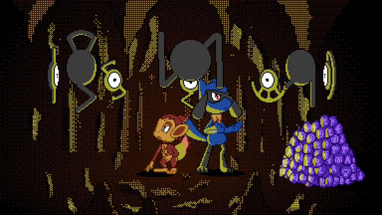
Chimchar was disappointed when our first task as members of Wigglytuff’s Guild was only to find Spoink’s dropped (stolen) pearl instead of hunting treasures in mysterious unknown places. But the interesting fountain formation at the heart of Drenched Bluff and Spoink’s thanks made up for the initial disappointment.
Drenched Face
As I already tooted , in the ingame art for the end of Drenched Bluff, at the very top in the middle, I see a face with eyes, nostrils, a mouth with teeth, possibly horns and the head’s outline. I said that it looks like a dragon or snake but now I think it looks even more like Sid from Ice age. Of course I integrated this weird face that I couldn’t stop thinking about into my drawing.
BackgroundJust like last time, I didn’t use the NES colour palette I’ve always been using before and used manual colours with multiple shades instead. I tried to stay close to how the ingame art is drawn regarding shades to try something different and to learn how the original artist did things. As always, the background of the drawing was what I had the least confidence in in the whole fideo. And by the least I mean none at all. I was convinced it looked and would continue looking horrible until the very end when it surpassed the quality shit. Now I think it doesn’t look ugly but not really good or interesting either. Boring, mostly. The shading partly doesn’t make sense but as I said, I tried to stick to the original’s shading. I have no idea what I’m doing, I really need more practice and some tutorials on how to draw landscapes.
The same goes for clouds. I used a 7 px circle brush for them and they do look quite fluffy but they looked weird with all sides visible, so I always hid one side at the edge of the drawing.
ForegroundJust like in Dialga, I used a lineless shaded style for the Pokémon, only using lines where it’s necessary to separate two overlapping things of the same colour. Riolu’s head looks weird but I think Chimchar looks alright, though different than usual. When they were done, I wanted to try outlines after all. First, I drew light black (as in a very dark blue-ish grey) outlines but only on the outside, keeping coloured lines for the inside of overlapping elements of the same colour and no lines otherwise. This looks quite interesting, almost like renders from a game with cel shading and black outlines. But since coloured outlines are my fwiend, I tried that as well, this time with outlines around all overlapping parts, even if they have different colours as especially Riolu’s left fake ear looked weird with no outline on just the bottom right part with the blue head next to it. And I settled for this version because 1. I felt like outlines were helpful in separating the characters from the environment and 2. I felt like the coloured lines made them look like they are still a part of the image instead of rendered 3D models on a map. I guess I could be happy that my drawn characters look so “good” as if they were 3D renders. But I don’t want that, I want an imperfect stylised drawing. Maybe not using 3D models as a reference would help against that. But I have no confidence that I could do the pose otherwise. And I saw that even professional artists use 3D modelling/animating software as reference for their drawings which is good to know. I’m not satisfied with the outline colours, especially for Chimchar. I love highly saturated outlines. I guess I should have saturated them more. I tooted the alternate line versions here .