HOME | DD
 Phalio — PMD2 Cover Cover
by
Phalio — PMD2 Cover Cover
by
#pokemon #grovyle #landscape #pixelart #wigglytuff #chatot #chimchar #riolu #pokemonmysterydungeon
Published: 2019-11-11 14:04:33 +0000 UTC; Views: 464; Favourites: 8; Downloads: 0
Redirect to original
Description
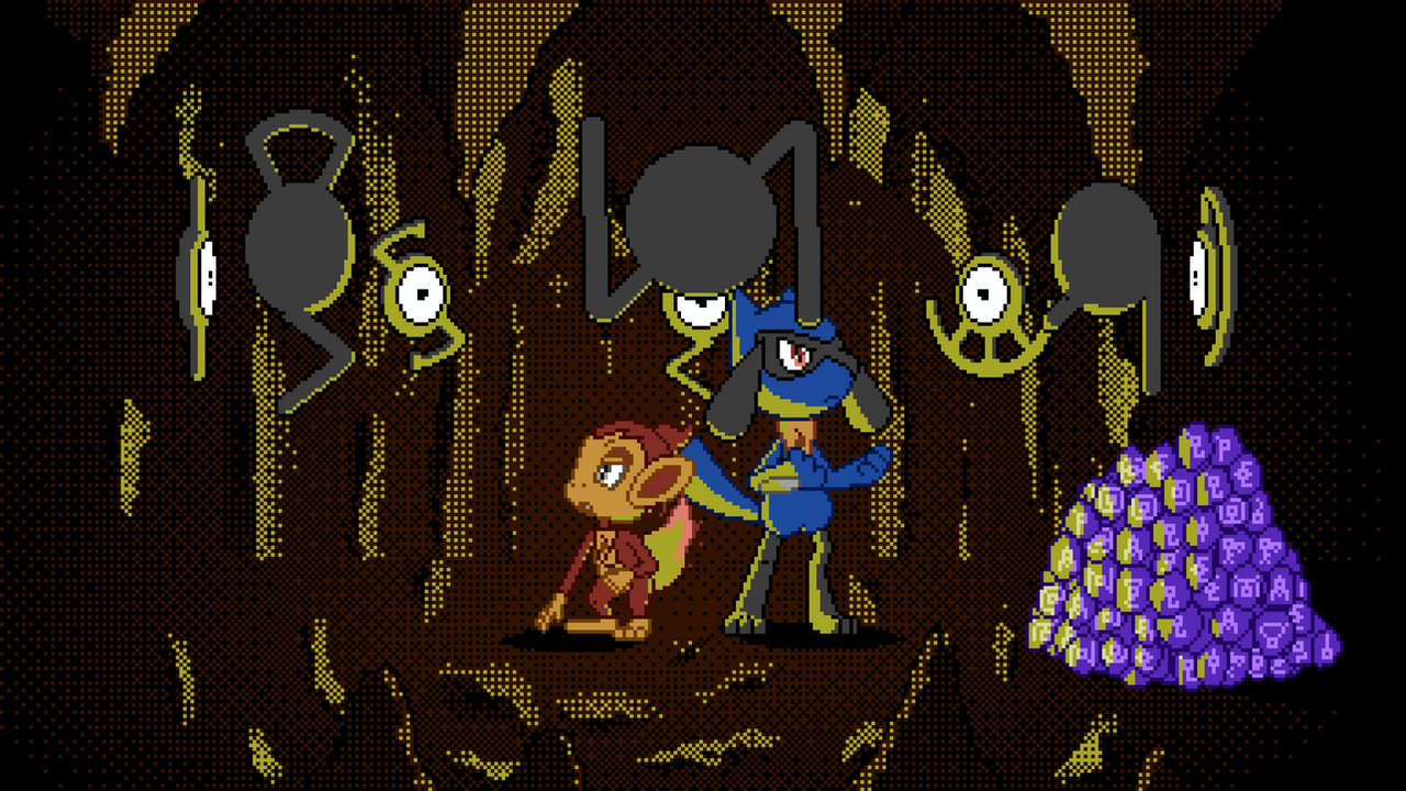
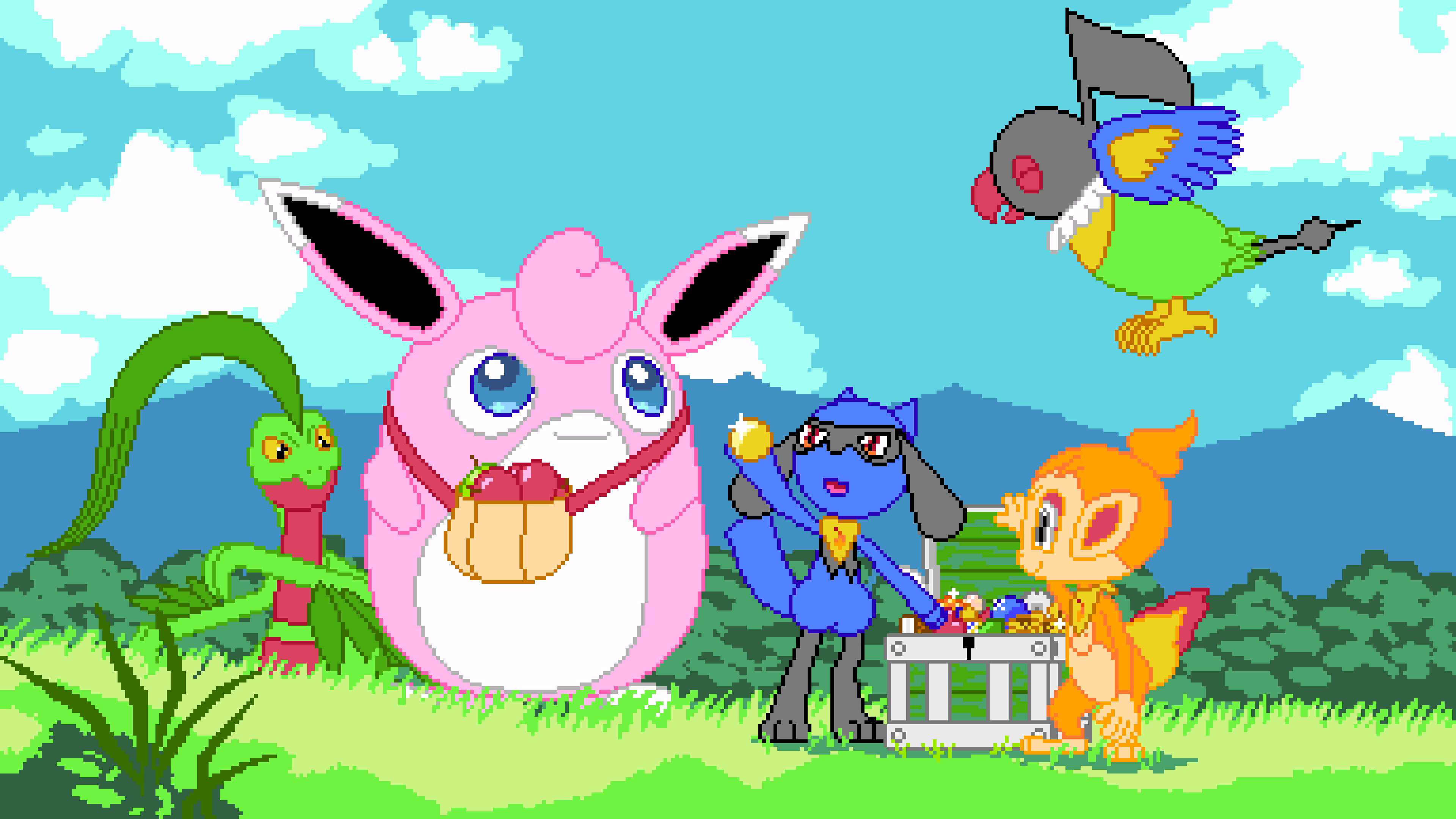
A year ago, I tried to draw a BotW landscape to use as my outro. It was supposed to have signs next to a pathwaytrailroutetrack with previous videos and everything. Unfortunately though, my pixel art abilities were not nearly good enough and after a couple of days, I gave up because it looked horrible. Then I had the idea of the stage that the video is being showed on and the standing signs turned into hanging signs. Now, with a lot more pixel art experience, I attempted to draw a landscape again and to my surprise it looked great. I’m always afraid to draw at higher resolutions because then one can see my non-existing drawing abilities in greater detail. I proceeded to draw Wigglytuff and it looked great, so did Riolu and Chimchar. I couldn’t believe that something I drew looked that great. I guess I did indeed improve and I shouldn’t be scared. Saying this feels very familiar.Then I drew Chatot though and it looked horrible. At first, I thought that was because I had reference poses of the other 3 Pokémon in SFM and apparently I could only draw something that looks good with a perfectly posed reference. Next was Grovyle and it looked just as good as the first 3 but there was no Grovyle model for SFM as well, so I guess it wasn’t the missing reference. Apparently, birds are just as impossible to draw as hands. I considered removing Chatot because it’s ruining this otherwise beautiful piece (I call it "Cover Cover"), but Chatot just fits perfectly in Shaymins spot being looked at by Wigglytuff and I can’t have Wigglytuff without Chatot. In the end, I gave up on improving Chatot and the ugliness is kind of needed, it would look too good for a drawing by me otherwise.
Using the NES colour palette was once again fun and looks great, it just doesn’t have enough colours to nicely shade things. I considered using dithering but sometimes the only fitting colour is the same as the outline and I also don’t know if dithering would look good with my coloured lines in general. Maybe I should just try it some time. This time though, I settled for no shading since I also like flat unshaded styles.