HOME | DD
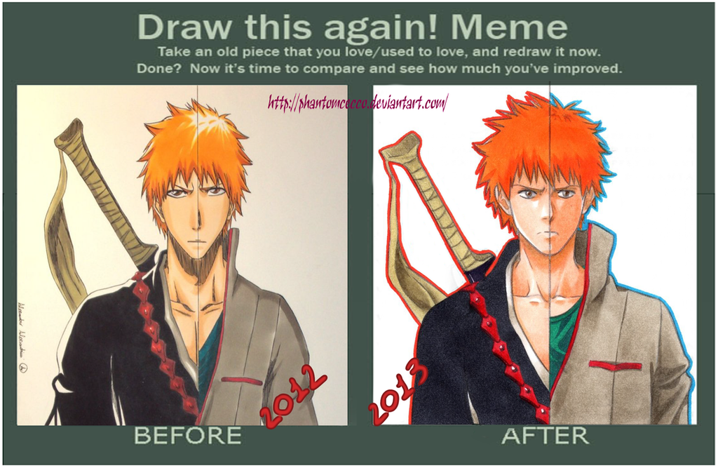
 phantomcecco — Draw this AGAIN!
by-nc-nd

Published: 2013-09-30 16:56:54 +0000 UTC; Views: 1153; Favourites: 25; Downloads: 2
Redirect to original
Description
My fan page : www.facebook.com/pages/Lantro-…Related content
Comments: 21

2013 doesn't seem like a copy and paste unlike 2012, but I can't help but prefer the 2012 more. The 2013 seems more... how we say, Ichigo looks less like his anime version, more realistic.
Still, very good!
👍: 0 ⏩: 0

yea 2012 definately looks better in the fact that it looks a lot like the anime , color, shape and everything. 2013 looks good to its just a different style
👍: 0 ⏩: 0

Amazing progress!
Love it, keep up the great work
👍: 0 ⏩: 1

I prefer your style now 


👍: 0 ⏩: 1

I think that each are great. The 2012 is definitely more towards how Tite Kubo actually draws Ichigo now, and the 2013 is more of your own style. But both are great.
👍: 0 ⏩: 1

Finally! someone said so! * ^ * Thank you very much
👍: 0 ⏩: 1

I like how you put the 2013 one in two halves, the drawing looks amazing, the improvement is visible too ^^
👍: 0 ⏩: 1

Actually I think the one for 2012 looks better then 2013, but that's just my opinion ^^
👍: 0 ⏩: 1

Under what point of view? òò
👍: 0 ⏩: 2

Dunno how to explain it XD I just think it looks better
👍: 0 ⏩: 1

Sorry for my bad English xD
👍: 0 ⏩: 0


