HOME | DD
 phantomphreaq — Sarah Conner

Published: 2012-01-11 07:50:40 +0000 UTC; Views: 1821; Favourites: 54; Downloads: 0
Redirect to original
Description
"Watching John with the machine, it was suddenly so clear. The terminator, would never stop. It would never leave him, and it would never hurt him, never shout at him, or get drunk and hit him, or say it was too busy to spend time with him. It would always be there. And it would die, to protect him."Sarah Conner
A4 Graphite
Related content


Comments: 8


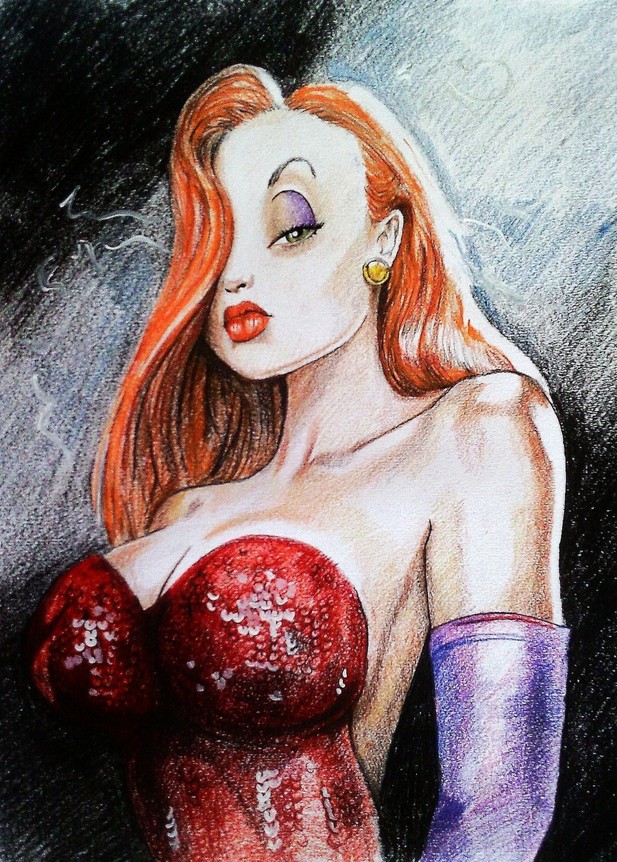
This critique has been left on behalf of Graphite-Gods, as requested.
Link to the photo you have used as reference: [link]
Firstly, I'd like to give you credit for working from such a challenging photo reference. I can see in the photo how a lot of supporting detail is lost in the bright sunlight, or lost in shadow and it's always tricky to know in these circumstances whether we should copy what we actually see, or to add invented supporting detail; if you wish to achieve a true realistic drawing, you should only draw what you can see. In the photo, the ear has no detail as the sunlight has bleached this out, but you have invented this detail in your drawing and it's causing the ear to look a little strange. Similarly, you have added extra detail in the nose area which is causing her nose to look wider than it actually is, and the added lines on the face make her look older in your drawing.
I think there is also an issue with there being a combination of styles or approaches in your drawing - you tackle the gun in a comic book style, and in the way you have given an approximation of her face and hair is consistant with this style, but in other areas you have used a realistic approach (e.g. the way you have faithfully shaded the sunburn upon her shoulders). I think you need to choose one approach and stick with it in the drawing. The white arm looks strange below the sunburned area and this is due to you having left out the subtle fine shading which would show the contours of the lower muscles (I also appreciate how some scanners can bleach out fine shading).
The leg and hip area in the reference photo is dark and a lot of detail is lost in shadow and this must have been a challenge to draw. I think the thigh area of her raised left leg needs to be darker in your drawing to help make sense of how her leg appears. Viewers might not realise that her right leg is partially covered by some crumpled fabric (or paper) - in your drawing, this looks more like it's part of the wooden table and this is making her right leg seem distorted, so this area needs a bit more work.
I like how you have treated the background, keeping it fairly out of focus.
I think you have achieved a lot in this drawing, but just need to consider in advance which style or approach you will use, & then stick with it.
👍: 0 ⏩: 0

awesome piece! I enjoyed it how she changed for her role as Sarah Connor...
👍: 0 ⏩: 0

")


 (Smile)")