HOME | DD
 PhantomSeptember — Inside World

Published: 2013-03-23 01:19:53 +0000 UTC; Views: 1255; Favourites: 71; Downloads: 0
Redirect to original
Description
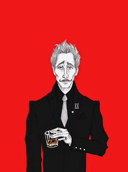
The latest piece I did for an art group I'm part of on tumblr.For some reason, I forget that bristol board is not good for painting until I’ve completely inked line art. This happens so often, I wonder why I can’t remember that bristol board is bad for painting on. It must be the allure of the perfect silky soft surface.
SO. I coloured it digitally. Clearly digital is not one of my strong suits and I have no intention of colouring anything else digitally if I can help it. This is the cropped version, since the whole version was compositionally awkward.
Self portraits have to be my least favourite art prompt. The prompt seems to follow me wherever I go. So this time I drew a sort of inside-self portrait of things that speak to my personality and things I like.
Related content


Comments: 20


Fantastic! This drawing in particular reminds me of the kind of art you'd see in a dynamic superhero comic book... Like Watchmen or something. I think it could be because of your use of solid color. But anyway, I like this one a lot, and I'd like to see some more digital coloring from you. :3
Is that a horse skull?
👍: 0 ⏩: 1

It is indeed a horse skull.
👍: 0 ⏩: 1
YAAAYYY I recognized it this time! Of course, it's a tad bit easier to figure out than a humpback whale skull.
👍: 0 ⏩: 1

Cool! It's neat to see some digital art from you! (of course I love your art no matter what medium you use!) This is a pretty neat self portrait! It's more fun to draw an alternate version of yourself then just a self portrait.
👍: 0 ⏩: 1
Thanks! It's not all that digital though, since all the inks were done traditionally. But at least what is digital came out well.
I finally finished that sketch for you by the way. It's in my scraps now.
👍: 0 ⏩: 1
You're welcome! Haha, I do that too with a lot of my art, I draw/ink the picture traditionally then color it on photoshop.
Yay! I can't wait to take a look at that sketch!
👍: 0 ⏩: 0


This almost reminds me of the pic you did about the end of the world sitting and sipping tea. I'm quite like this, especially the shelves.
👍: 0 ⏩: 1
Thank you for the feedback. I've missed it from you. It is similar to the End of the World picture. Except hopefully a little more anatomically accurate.  (Smile)")
👍: 0 ⏩: 1
Skulls and suits are pretty awesome.
Ever consider creating a skull suit? Ha.
👍: 0 ⏩: 0

Wow! Cannot get over how wonderful your style is! It's so crisp and clean. This is seriously just beautiful to look at... I love the intrigue and mystery of it. Really adore how you draw suits, and the black/white/gray/red color scheme. I really enjoy bursts of meaningful color in artwork. This has a really great atmosphere and I love the different textures of everything (especially that cross-hatching). I'd say you do just fine at digital coloring! Overall, seriously stunning!

👍: 0 ⏩: 1
Thanks! I personally think my style is anything but crisp. It seems like I distract people with as many lines as possible so that they don't notice how bad my work is. XD
Thank you for the positive feedback though. I do really like limited colour palettes and drawing suits. >.>
👍: 0 ⏩: 0

love the contrast of the red against the gray colors it automatically draws the eye
👍: 0 ⏩: 1

Nice, simple, and pleasantly creepy.
Excellent job with the touch of color, as always
👍: 0 ⏩: 1
Ehhehe, pleasantly creepy. I think I'll use that line whenever I'm asked to describe my art in future.
👍: 0 ⏩: 1


This is really cool! I love the colour scheme and the textures!
👍: 0 ⏩: 0