HOME | DD
 Pheenixorphan — Leading the Self Into Madness + SpeedPaint

#child #darkfantasy #demon #somber #phantomstory #macabre
Published: 2018-05-15 04:23:02 +0000 UTC; Views: 554; Favourites: 15; Downloads: 0
Redirect to original
Description
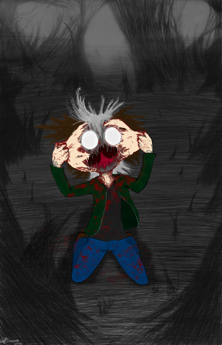
Link: www.youtube.com/watch?v=Np6GQ5…The kid shown here is just Daxx and the demon is just Daxx. That's about it.
Related content


Comments: 9

I love the idea here, but there are a few things I think could help with future pieces, but first I will start with what I like about this!
The concept is really cool, I can really feel the dark atmosphere, especially with the dark colors and the red. Also for some reason I really like the kids nose?? Idk why, its just really cute and clean, not too big not too small. Good job! Noses are hard for me. I also really like the highlights on the red guy, it makes his skin seem smooth and shiny. Okay now onto critique.
I think there isn't enough difference in texture, like, it kinda seems like everything is made with the same material, you know? it usually ends up looking somewhat muddy if you don't change up the texture. I actually did this a lot and is still something i'm working on myself. Also I'm not sure if you did this on purpose but the kid doesn't have eyelashes? Is it because he's a demon that he doesn't have eyelashes? It is just something I noticed.
Also for the background, it seems like you wanted to keep it simple, but I still can't really tell what's going on in the back. I think if you added some more colors, and defined objects I think it would look really cool
For the kids hair, I think you could have made it a bit lighter so that it doesn't blend so much with the background, ad add some details and highlights to make it look less flat, unless thats what you were going for?
Anyway concept is really cool! Keep up the good work!
👍: 0 ⏩: 1

Thanks ^^
Well I'm not good at noses either. I have worked around it by making my own stylized version of a nose. It works for this cartoony style, but I want to learn to draw real noses properly in case I need to draw in other styles. (like for my art career)
At first I was trying to make the skin stand out on the characters. Then I ended up just putting the same filters everywhere. Yeah I didn't know what to do with the textures honestly.
I was thinking of adding eyelashes, cept' on digital eyelashes usually come out ugly looking. So I refrained from putting them in. I figured since this style is cartoony it wouldn't matter anyway. It has nothing to do with his species. A lot of my characters don't have eyelashes unless they are supposed to be exaggerated like on this girl:
All I knew was I wanted it to look bleak and dark in the back. But not just slap in a pure black background. I tried to make the creatures in the back stand out yet not overbearing as I wanted them to look ghostly. It didn't work out though. :T
Well the hair stood out at first until I added in all the filters and layers, then it got loss. xD This whole process was me just debating what I should do with it.
At least you like the overall concept despite the flaws. I appreciate it.
👍: 0 ⏩: 1
I totally understand when things don't work out. All I can say is to just keep practicing the things that you think aren't "working out" and I swear it will eventually work out haha.
👍: 0 ⏩: 1
Yeah I know. xD
It's alright, I still like the picture anyway. But for sure when I improve I'll re-make it again. For now I think I'm going to attempt practicing shading by remaking screenshots from professionally made animations.
👍: 0 ⏩: 0

Just as a preface, I don't know these characters. I won't be commenting on how accurate these drawings are based on source material.
The most noticeable thing that I can see needs work is your shading. It doesn't look like the shading is on the character, but on top of the character. It almost seems as if the shading is smudged on top of the paper rather than being part of the drawing. It looks to me as if you used the burn tool. If so I'd highly suggest not using that tool. While I'm sure it can be used well, I haven't personally seen it.
I also can't tell if you were attempting to cell shade or soft shade. Based on how you drew, I don't think you had in mind what kind of shading you wanted to do. While creating your own method of shading can contribute to making your style unique, it should be based off an existing method. I think it'd help your art to look at and emulate cell shading. It'd work well with your cartoony style and allow you to deviate more fluidly if you so choose.
My third contention with your shading is that there's a weird lack of it. One prominent example would be the hair. Unless the light is almost directly below the face, his hair would have some shading across his face.
Your line art is too dark and too consistent. There's no line-weight that I can see, which makes the picture look really stiff. This on top of the line art being just plain black, makes it stick out in a bad way even though you did make it relatively thin. I'm not sure what you use to make your digital art. If you use a table, play around with brush opacity, size, and pressure sensitivity. That'll help your line art pop out in a good way and convey weight and to your art. If you're using a mouse, try to make the line art more sketchy. That'll hide the fact you can only do one width. Or you could lower the opacity to where it's almost not there and go for a more painterly feel.
👍: 0 ⏩: 1
Oh of course. I only need the art itself to be looked over anyway. So your critique is fine.^^
Heh my shading is the worse right now. You're right on the mark about me not knowing what I wanted to do with it. I ended up mixing it together and got a strange looking result.
I did use a burn layer because I liked how some things looked with it on. Though I probably should've left it out hmm.
You know this is the first time I've heard about line-weight. I looked up examples of this and I see what you mean. Heh I always thought the lines were supposed to be consistent. I guess I can play with that now. :>
FYI, I use a tablet so this should be no problem to fix.
Thanks for pointing these out! ")
👍: 0 ⏩: 0

The work makes you think about what price sometimes gives an awareness of yourself and your abilities.
It happens that the individual is forcibly confronted with the whole of his essence, which in the long run can not affect the person in the most radiant way.
When a person learns himself quickly and abruptly, a person can make the same premature and harsh conclusions about other people.
For people who are not indifferent to themselves, a sharp and impetuous self-awareness can be stressful and traumatic.
Regarding the technique of execution, this is a very thorough work in terms of color and expression of the reaction.
The demon could be more detailed, but this version is also quite good.
I personally like the color of the baby's skin, and it reflects the reaction to rapid and rapid, premature self-awareness.
The very concept of work can be developed by expressing the consequences of such awareness of oneself.
On the other hand, this in many ways can mean a clash with their vices in unexpected circumstances.
This is in any case a work that can influence, and it is simply impossible to take it from her with this concept.
And I can only wish you success in the future creative path.
👍: 0 ⏩: 1
Hm interesting comment.
You really went in another direction with the interpretation. 
The demon is a simple design for a reason in my comic. Although for this picture I should've tried to spice it up. He does look very bland here.
Anyway, thanks for commenting~
👍: 0 ⏩: 1
You did amazing work and you are very welcome anyway.
👍: 0 ⏩: 0