HOME | DD
 pho3nix-bf — C-laboratories Logo
Published: 2009-12-16 21:47:42 +0000 UTC; Views: 14594; Favourites: 78; Downloads: 349
Redirect to original
Description
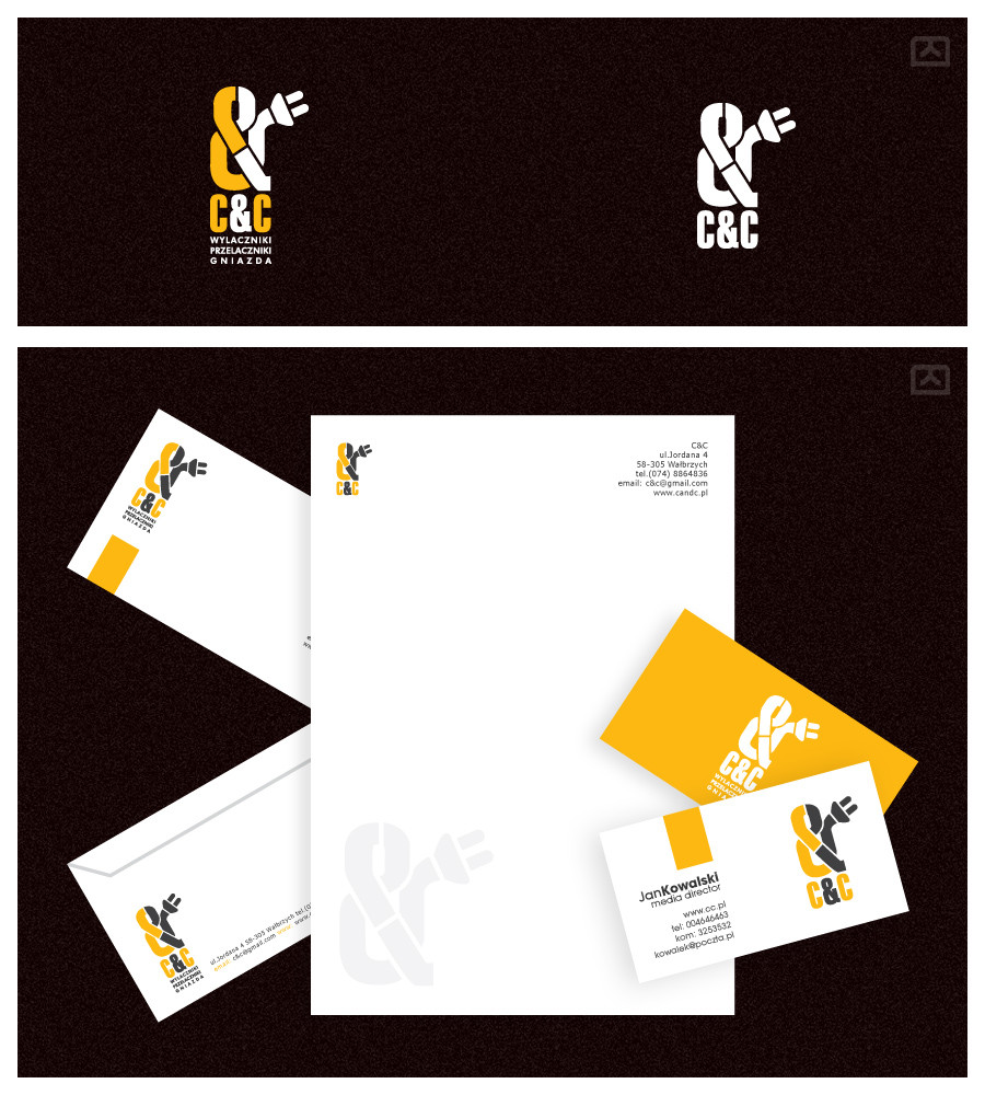
C-Laboratories LogoThey do medicines, pharmacy stuff -> Pill shapes, atoms, microscopes.
Related content


Comments: 13


the first option with the blu is the best, but the fist one is nice to, have more unity.
the one with the miscroscope, looks like a monster sorr for is funny , look at and see his toot´s xD
👍: 0 ⏩: 0


The first and second ones would be my top picks. Very well executed!
👍: 0 ⏩: 0

graficznie pierwsze zajebiste, ale podejrzewam, że merytorycznie te dolne będą bardziej zgodne z potrzebami klienta
 (Wink)")
👍: 0 ⏩: 1

a wlasnie nie  (Smile)")
👍: 0 ⏩: 1
No to tyle dobrego, bo logo naprawdę w pytkę
👍: 0 ⏩: 1

też pierwsze mi się najbardziej podoba, ale... hmmm... mam wrażenie, że gdzieś widziałam. może podobne, a może właśnie tą pracę na innym serwisie?
👍: 0 ⏩: 0