HOME | DD
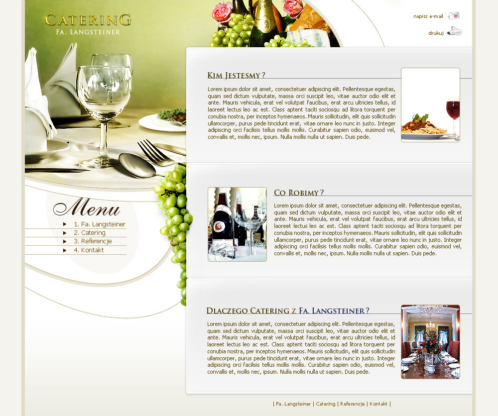
 pho3nix-bf — Catering - Design
Published: 2006-12-27 11:06:58 +0000 UTC; Views: 14964; Favourites: 66; Downloads: 2472
Redirect to original
Description
Design for a company that deals with catering (Wink)")
Related content


Comments: 16


I like this design. Very simple, and the grapes along the edge are a nice touch. I think it could do without the underlines for the navigation buttons though -- the straight lines seem to interrupt the flowing curves you have going on in that area.
👍: 0 ⏩: 1

really good point - thx
👍: 0 ⏩: 0

cool stuff.... how do u do tht gold effect to the text CATERING i really like it, can u tell
")
👍: 0 ⏩: 1
huh ... I cant really remember - and as I did flatten this "logo" I cant retrive this info  (Smile)")
👍: 0 ⏩: 0

Yeah,This is hot.Ive been thinking of doing a resturant design as well....Whats Your Source for the photographs such as the grapes and whatnot? is it sxc.hu?
👍: 0 ⏩: 1
yes it is
👍: 0 ⏩: 0

the layout design is very nice
but all that text in one place is too much.
ppl don't read that much.
you should make some words bigger some bolder. and some normal. and delete the rest
cheers .. and +watch, for the great layouts
👍: 0 ⏩: 1
I do read a lot - but ye - after 3 mins of thinking I came to the conclusion that u r absolutly right. Thx - ill try to rember it in my future works
👍: 0 ⏩: 0


Ohh very elegant ")
"I'm lovin it"
Better than this: [link] ^^
👍: 0 ⏩: 0

