HOME | DD

pho3nix-bf — Kanapki.net.pl - layout

Published: 2008-03-03 22:26:55 +0000 UTC; Views: 20583; Favourites: 137; Downloads: 838
Redirect to original
Description 
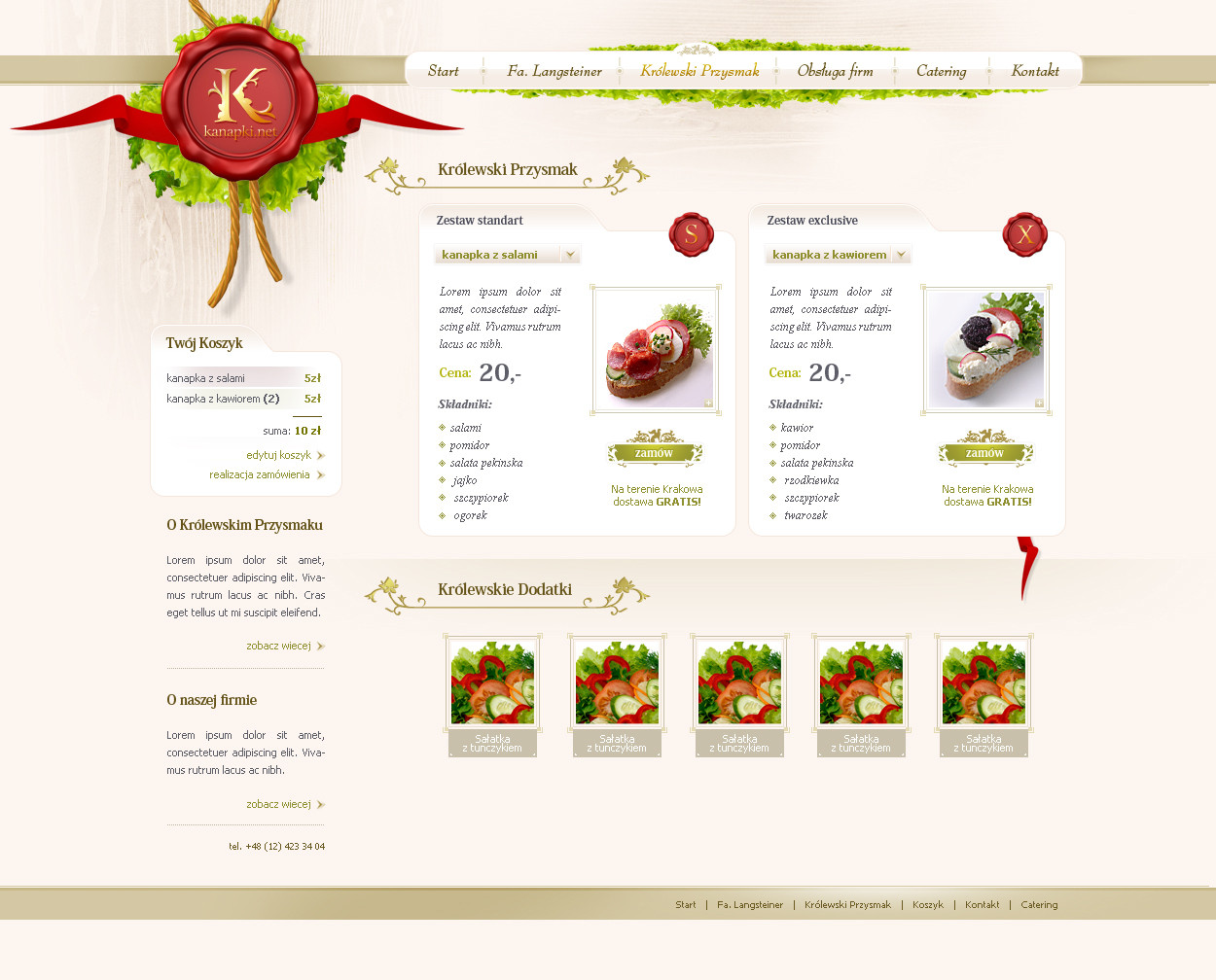
Another layout for a Fa. Langsteiner company (others can be seen here: [link] and [link] ).

This time is a 'shop' + cattering offer, tasty and healthy sandwiches for parties, conferences etc.

Logo (K) thing is also my design.
Related content
Comments: 41

basilart23 [2016-12-02 10:30:00 +0000 UTC]

Great idea!!
www.psd2html5.co/

👍: 0 ⏩: 0

silent-Princee [2011-06-07 17:43:15 +0000 UTC]

very nice

👍: 0 ⏩: 0

uorlicka [2011-01-24 07:57:56 +0000 UTC]

absolutne mistrzostwo! witam kolegę z mynetwork

👍: 0 ⏩: 1

pho3nix-bf In reply to uorlicka [2011-01-24 21:12:00 +0000 UTC]

Ło matko dzięki Praca mnie nawet na deviancie dogoniła - a które pięterko? Bo ja tak raczej średnio kojarzę jeszcze

👍: 0 ⏩: 1

uorlicka In reply to pho3nix-bf [2011-01-24 21:21:21 +0000 UTC]

piętro produkcyjne, Marcina P. kojarzysz na pewno, niedaleko niego siedze

👍: 0 ⏩: 0

sill-juliano [2010-05-25 16:53:49 +0000 UTC]

Amazing Job!
Clean and very beautiful

👍: 0 ⏩: 0

janoz5 [2009-04-12 10:06:31 +0000 UTC]

całkiem ciekawy lay, przejszysty i miły w patrzeniu

👍: 0 ⏩: 0

Nathan007 [2009-01-17 13:38:47 +0000 UTC]

Woow

👍: 0 ⏩: 0

x-way [2008-03-24 04:33:24 +0000 UTC]

looks nice i like it sir

👍: 0 ⏩: 0

balupton [2008-03-16 20:56:21 +0000 UTC]

Has a similar vibe to [link]

👍: 0 ⏩: 0

kaethor [2008-03-15 12:52:37 +0000 UTC]

Great!! excellent!!

👍: 0 ⏩: 0

musakv [2008-03-11 22:54:00 +0000 UTC]

świetne... czyste schludne i przejrzyste

👍: 0 ⏩: 0

Rev3ngeR [2008-03-08 20:59:37 +0000 UTC]

woOw, that's hot!

👍: 0 ⏩: 0

cooh-pl [2008-03-08 18:13:51 +0000 UTC]

Jestem ciekaw tego, co dzieje się w Twojej głowie. Nie mówię tu już o rewelacyjnej technice, ale o twórczości i innowacyjności.

Co do projektu [ośmielę się napisać]: drobinkę szersze menu, za to detal bierze górę!

👍: 0 ⏩: 1

cooh-pl In reply to cooh-pl [2008-03-08 18:14:50 +0000 UTC]

innowacyjnośc ;] bardziej innowacja..

👍: 0 ⏩: 1

pho3nix-bf In reply to cooh-pl [2008-03-08 18:24:55 +0000 UTC]

z tym menu to masz racje - zreszta pare osob juz o tym wspomnialo i dzieki - moj psychoterapeuta zadaje sobie nomen omen podobne pytanie

👍: 0 ⏩: 0

hinok [2008-03-04 18:34:24 +0000 UTC]

ładna sałata, jednak przydałoby się większe menu

👍: 0 ⏩: 0

tehacesequence [2008-03-04 16:05:18 +0000 UTC]

swietna sprawa, fajne detale.

👍: 0 ⏩: 0

frose [2008-03-04 13:29:45 +0000 UTC]

Very nice and clean work!

👍: 0 ⏩: 0

Drunkenvalley [2008-03-04 11:57:36 +0000 UTC]

Sweet. (Though I personally don't favor the slightly pixelated font that much.)

👍: 0 ⏩: 1

pho3nix-bf In reply to Drunkenvalley [2008-03-04 12:51:53 +0000 UTC]

huh - its normal - u can't make html text antialiased afaik

👍: 0 ⏩: 1

Drunkenvalley In reply to pho3nix-bf [2008-03-04 12:54:41 +0000 UTC]

Hehe. Well, I don't know about that. I've never had a problem with fonts turning up pixelated.

👍: 0 ⏩: 1

pho3nix-bf In reply to Drunkenvalley [2008-03-04 13:00:34 +0000 UTC]

if u try to code html and put a html text into it u will have pixelated fonts no matter what. Thats why its better to use no-antialiased fonts just from psd stage at least u'll know how it will look (more-less) like after coding

👍: 0 ⏩: 1

Drunkenvalley In reply to pho3nix-bf [2008-03-04 13:07:15 +0000 UTC]

Well, as I said, I've never really experienced any problems with non-antialiased fonts becoming pixelated on my websites. Now, do trust me when I say I do make websites, even if dynamic-content wise I'm not that far yet.

Then again, I don't tend to use that kind of font. What're they called again? "Script fonts"? I struggle to remember such things.

👍: 0 ⏩: 1

pho3nix-bf In reply to Drunkenvalley [2008-03-04 13:32:28 +0000 UTC]

nah its not a script font its just normal itallic of times new roman. And yes - I see in ur gallery u did not use any itallics for body text. Anyway I wrote before about using no-antialiased fonts from psd stage as for example on CrownedDesigns body text is definitly with antialiasing on - wich is kinda confusing.

👍: 0 ⏩: 2

Drunkenvalley In reply to pho3nix-bf [2008-03-04 13:51:55 +0000 UTC]

Hehe. Alright, then.
And well, hmm, speaking of which would you mind sharing where you turn antialias on/off for the text?

👍: 0 ⏩: 1

pho3nix-bf In reply to Drunkenvalley [2008-03-04 14:09:07 +0000 UTC]

Sure U can turn it off in characters pallete - there is a list with: crisp sharp smooth strong and none - these are methods for antyaliasing - and none - means its off

👍: 0 ⏩: 1

Drunkenvalley In reply to pho3nix-bf [2008-03-04 14:30:51 +0000 UTC]

Ah. Thanks.

👍: 0 ⏩: 0

pho3nix-bf In reply to pho3nix-bf [2008-03-04 13:33:18 +0000 UTC]

bah - there is italic in CrwonedDesigns - thou also with aa on

👍: 0 ⏩: 0

addgel [2008-03-04 11:03:28 +0000 UTC]

beautiful logo man, wonderful job.

👍: 0 ⏩: 0

B3rko [2008-03-04 09:48:54 +0000 UTC]

yep, great work,.Professional! Grat!

👍: 0 ⏩: 0

Torsten85 [2008-03-04 09:43:59 +0000 UTC]

wow great job mate!! I love it!!

👍: 0 ⏩: 0

SchoogI [2008-03-04 09:35:32 +0000 UTC]

zajebiste

👍: 0 ⏩: 0

WaterGlass [2008-03-04 08:51:39 +0000 UTC]

Wygląda smakowicie ^^", świetna praca.

👍: 0 ⏩: 0

wideo [2008-03-04 07:35:10 +0000 UTC]

Clean and beautiful work. Well done!

👍: 0 ⏩: 0

pixelzeesh [2008-03-04 06:35:13 +0000 UTC]

color choice looks great

👍: 0 ⏩: 0

EnzuDes1gn [2008-03-04 02:24:29 +0000 UTC]

OMG !! that logo sweet christ that logo is soo nice man ................

👍: 0 ⏩: 0

meenaxi [2008-03-04 02:23:15 +0000 UTC]

This looks amazing. Great job on the logo!

👍: 0 ⏩: 0

neilan [2008-03-03 23:17:50 +0000 UTC]

bardzo ładnie moim zdaniem. świetnie wyszedł ten sygnet (logo). Cały projekt trzyma klimat
Pozdrawiam

👍: 0 ⏩: 1

pho3nix-bf In reply to neilan [2008-03-04 14:10:46 +0000 UTC]

A dziekuje

👍: 0 ⏩: 0

Carl06 [2008-03-03 23:04:33 +0000 UTC]

great work! nice job man.

👍: 0 ⏩: 0