HOME | DD
 Phoenix-22 — Time and Space

Published: 2009-02-22 23:17:11 +0000 UTC; Views: 1151; Favourites: 36; Downloads: 27
Redirect to original
Description
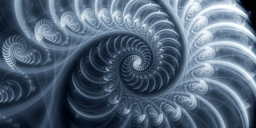
A re-worked version of "Gothic Insignia" [link]
Related content


Comments: 16


 (Smile)")

I like this one a little better than the Gothic Insignia. I like how this one has a rather cartographic appearance to it; the title compliments this attribute in my opinion.
👍: 0 ⏩: 1


Wow, this is seriously goodlooking, looks a tad like a million clocks emerging from the center, or maybe planets, whatever, i really enjoyed watching it, have a nice day
👍: 0 ⏩: 1

Yeah I was thinking about clocks, or just time in general, but there was a space element in there as well.
")
👍: 0 ⏩: 0

real nice matt, a little more dirty than the previous one, which works quite well

👍: 0 ⏩: 1
I have no idea how the previous one is so sharp and clear, if I knew how to get it that way again, this one would look like that as well.

👍: 0 ⏩: 0
