HOME | DD
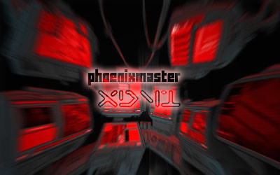
 phoenixmaster — Overload.X

Published: 2005-02-17 07:20:13 +0000 UTC; Views: 550; Favourites: 3; Downloads: 133
Redirect to original
Description
I hope u like pink! (Smile)")
actually i initially wanted blue, but i realized its an overused colour (just take a look at my gallery, 3/4 stuffs blue)
many thanks to Korpus- for the render, his page is here [link]
please comment, favs and watches really appreciated!
Related content


Comments: 17

The site won't let me see the full-sized version of this right now, but it looks great - I think inverting the colours (ie. green for pink and white for black) could look super
 (Wink)")
👍: 0 ⏩: 1


I think it would look awesome in green!
👍: 0 ⏩: 1

Heh, i got requests for blue, too!
Maybe i'll do multicoloured
")
👍: 0 ⏩: 1
*Imagines it* Hmm...I think it looks best if it's just one color, but that's just me and my imagination. The real thing would look way better than what my brain could come up with.
👍: 0 ⏩: 1
hahah, i\'m glad u like my work.
just wish more people liked it
👍: 0 ⏩: 0

A brilliant, colorful and lively piece. The feeling of freedom abounds in the design. The colors and shades are mind boggling, and the 3D nature of the center is a great attraction. Although the appearence is somewhat pixelated with little squares throughout, I find that this feature adds more interest.
👍: 0 ⏩: 1
Scanlines pattern set on colour burn or something
👍: 0 ⏩: 1
Ooh...I've never tried those effects before. The Dodge and Burn stuff is still all very foreign to me.
👍: 0 ⏩: 1
It was to me too, so i just experimented.
Basically most of the stuff i get in my photoshop creations are plain experimentation!
The names are just names to me, so wheneva i feel like blending two layers, i just try each and every single one of the filters; its a slow process but it ensures that i can select the best possible result.
Of course, the pros are pros because when they experiment they notice a particular filter gives a particular result with a particular layer's composition, etc etc... so this allows them to narrow down their guessing when they wish to blend layers.
hope i didnt bore u!
👍: 0 ⏩: 1
Yeah, I understand the point about experimentation...it might even be the best way to go because the Help file can't successfully cover everything. And some things are much better applied only in certain scenarios.
👍: 0 ⏩: 0


I don't like pink, but if I did, this would be very cool. It would be better in blue
👍: 0 ⏩: 1
o.O
time to play with the hue and sat
👍: 0 ⏩: 0

Thanks for the comment, tho actually its only one colour
")
👍: 0 ⏩: 0