HOME | DD
 phoenixq — Loudon-Studios version 6
Published: 2007-03-03 00:30:40 +0000 UTC; Views: 1902; Favourites: 17; Downloads: 86
Redirect to original
Description
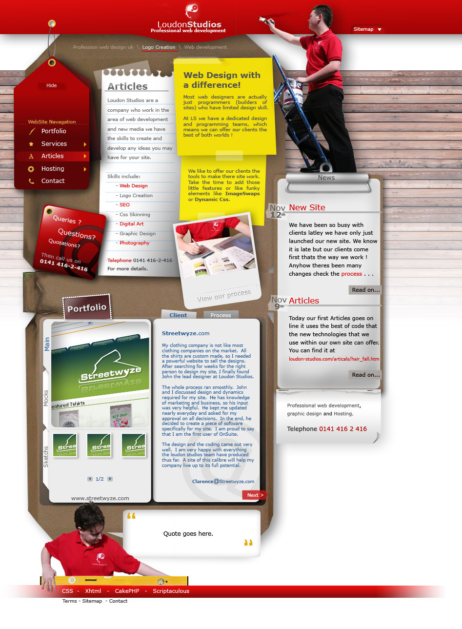
Been working on this for over a week now started from a random brainstorm sketch. The site is not yet live but the design is that way we want it for now. Thanks to Calum Morrell for the great shots he took, All editing painting carried out by myself, 458 layers in photoshop 53 of which having masks.Please give comments on what you think about the site it would be good to hear some more views on people opinions.
Note: although it looks like it will be done in flash it won't have any flast atall all effects and styling will be done in code.
Related content


Comments: 24


I like the fact, that the site "lives."
It might give the impression, that it's a construction site, or the site itself is under construction. But I'm thinking, that after further inspection, the visitor discoveres the fun idea behind it. So that shouldn't be a thing to be worried about.
The other thing, that bothered me, was the footer. The red bar. It somehow doesn't fit the rest of the site. An idea would be to make it like the red bar at the top. Well, something like deviantart has down here.
Other than that, I like it.
👍: 0 ⏩: 0


very nice design. great ideas with the photos cool layout and colors.
i'm not put off by the fact that it may look a little busy, i think it fits with the concept of a busy hectic big city webdev company
👍: 0 ⏩: 0


It's waaay too buisy. Too many details and too little whitespace. Also, the mix of concepts in this is confusing me. Are you a carpenter / painter company, or web developers?
👍: 0 ⏩: 1

All three ")
👍: 0 ⏩: 0

I really love the idea...it's a nice concept ")

👍: 0 ⏩: 0


the site is very professional and very estetichally appealing..however I wonder how much the loading time will be on this page?
👍: 0 ⏩: 1
you don't think so ? it loads in about 10 seconds just now and there is files that have not even been optimized yet  (Smile)")
👍: 0 ⏩: 0

The over all concept i Think is cool but I think it is wrong for the business. When I first looked at it I saw the painter and the guy with the level along with the scraps and clipboards and imediatly thought "Handy Man" or "Small Construction Repair Company". I did not think web design....so you might have a really cool site that conveys the wrong message.
Maybe remove the painter and level guy and replace them with some artists in a studio or a developer at his computer. Visiually let people know you are Artissts and Designers...not construction workers.
👍: 0 ⏩: 0


 (Wink)")

I also believe previous versions were better as it had simplicity and aimed at services. They were straightforward. This isn't. It's too busy in my opinon. Articles get lost in the mix, I don't know what to look at first and there seems to be no struture because of the style you went for. Seems like a collage actually.
What are you painting exactly? Just seems like you sticked that in there to add to visual, not like how the guy at the bottom actually has a purpose.
What I really love is the menu, it's nice and clean. Too much goin on for my liking though. Best part is seeing this coded, that'd would be cool.
👍: 0 ⏩: 1
We were going for a website with a lot of stuff going on. A website that could challenge us in both code and layout in an attempt to take on flash design principles without using Flash itself.
The main purpose of our site moving away from the minimalist/Corporate look is so that people (ideally our target audience and clientele) can see, we are different from the rest of the companies that have a stranglehold on the web design market.
Yes simple looks pro... but simplicity is just that... simple. Although the page is cluttered... it is still well formed and your eyes can make sense of the content on display
The answer to your question is I am repainting the banner I am the designer i.e. The creator of the sites face, I keep it looking good, and the programmer is down the bottom making sure it is displayed correctly (hence the spirit level).
👍: 0 ⏩: 1
hehe, lots of reasoning to it I see but you don't look like your're painting the banner. It could have been executed better.
👍: 0 ⏩: 0


i think personally that some of your previous versions looked better. enough said..
👍: 0 ⏩: 0

very impressive. A little AA at the portfolio section, but other than that, perfect!
👍: 0 ⏩: 0
