HOME | DD
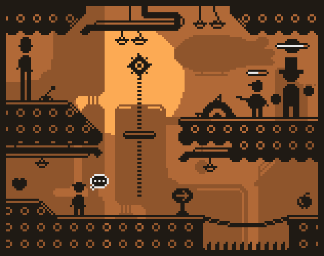
 Pix3M — Clocktower environment practice
Published: 2013-04-16 17:10:21 +0000 UTC; Views: 3126; Favourites: 62; Downloads: 23
Redirect to original
Description
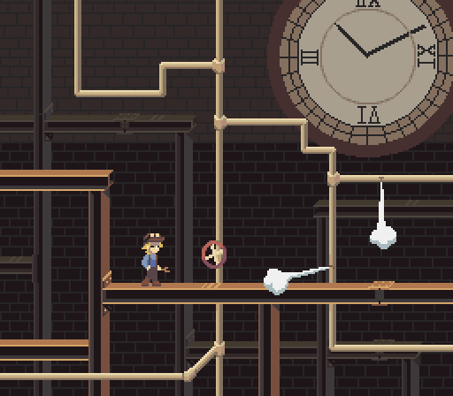
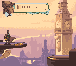
Me and a musician friend decided to practice a bit with an upcoming Ludum Dare Jam, and we thought we should make a mockup and music that goes with it. Three of four words given by a random noun generator were 'Mechanic, clock, tower', interestingly in that exact order. So, that's the general direction we went.Obviously unpolished, but I mainly focused on the big picture since I would have time mostly for the big picture, not small details. I would be nice if I worked fast enough to draw gears quickly though. I also worked with a different perspective than a plain side-view.
Related content


Comments: 21

i say the dimension for the whatchamcallits doesnt quite add up right if you look carefully possibly why you feel your still not a master.
Even with that being said its a small detail. Although i still think it looks good
👍: 0 ⏩: 1

Do you know who the contemporary masters of pixel art are?

👍: 0 ⏩: 0

You have earned my respect as a master pixel artist.
👍: 0 ⏩: 1
As much as I want to call myself a master, I don't quite feel that I am here yet.

👍: 0 ⏩: 1
Alright, very good pixel artist. I mean, look at me compared to you, even with my improvements today. [link]
👍: 0 ⏩: 0


This does look like a nice practice piece in my opinion. I think the only thing that catches my eye though are the numbers on the clock. Would 1px of shading work on them if you used a colour a bit brighter than what they are on, but lighter than the inner circle.
👍: 0 ⏩: 0

Aaah, I love machine art, especially clocks (for some reason)! Can't wait to see more of it.
I love this lineless style you're trying too. ^^
👍: 0 ⏩: 0

I'm digging the look of this. Even though this is only a hypothetical mockup, I would play the heck out of a game that looks like this.
👍: 0 ⏩: 0

I think your noun generator is broken. That or extremely awesome.
I know you said you don't have time for details, but maybe a few cobweb scribbles would add a sense of antiquity? It just looks a little too clean... Nice colors and stylization though!
👍: 0 ⏩: 1
I intended that this take place in a time in which the clocktower would be pretty new, though the broken pipes were a spontaneous decision for the sake of making something happen.
👍: 0 ⏩: 1
Hrm... ")

👍: 0 ⏩: 0


The pipes are a bit bright. This isn't a problem if used properly, but if other foreground gameplay elements existed in the theoretical game, they could be confuseable with each other for walk-through/solid objects depending on execution.
Looks good, though
👍: 0 ⏩: 1
This hypothetical game uses only the steel I-beams as platforms. Interestingly I would think that the player would have the contextual information to know that pipes by themselves aren't interactable.
Or, were there games that had something similar to my pipes that caused a bit of confusion?
👍: 0 ⏩: 1
None come to mind, but it is a big problem among amateur Super Mario World level makers who have no real sense for these things. I know you'd know way better, of course, but the most common problem basically comes when the level maker uses too many bright elements where some are solid and some aren't. Or when a blatantly dark element is used and is actually solid despite blending with the background. It messes with a player's normal expectations, and is worse around hazards like pits/spikes.
👍: 0 ⏩: 0
Funny because semitransparency isn't a pixel art tool so stuff like that isn't in my typical toolbox. I suppose semitransparency would be totally okay to use though.
👍: 0 ⏩: 2
CraftyPixel In reply to Pix3M [2013-04-16 20:33:51 +0000 UTC]
- In-game there's transparencies, even in games like gameboy advancegames. But I know what you mean. -
👍: 0 ⏩: 1
Some GBA games use downsampled 3D for their graphics.
👍: 0 ⏩: 0

Yeah, I don't normally use it either, but it can look good in games sometimes.
👍: 0 ⏩: 0