HOME | DD
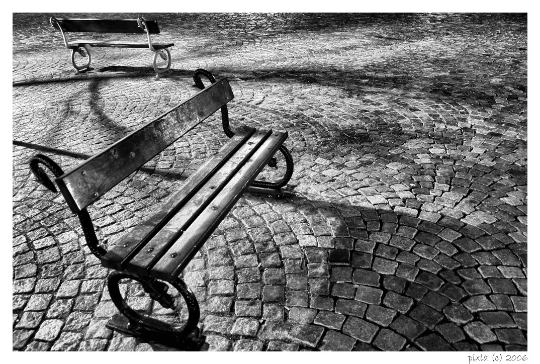
 Pixla — two friends
Published: 2006-01-16 21:10:22 +0000 UTC; Views: 539; Favourites: 17; Downloads: 72
Redirect to original
Description
...Related content


Comments: 21


amaaaaaaaaazing textures!!
you made it stronger with that framing, even with the title
much meaning in this way
but I guess that the best thing are the shadows
good job!
👍: 0 ⏩: 1

what a dAmn compliment, many thanks
👍: 0 ⏩: 1
your great work worth it, no prob
and thank you a lot for adding me to your devwatch! I'm glad you liked my stuff
regards from Spain
👍: 0 ⏩: 0

This is quite good. It's got the classic quality feel. If that makes sense.
I like it.
👍: 0 ⏩: 1
sure it makes sense (Smile)")
👍: 0 ⏩: 0

This is a fantastic shot, great composition and cracking contrast, really well captured
👍: 0 ⏩: 0


jesus... what a fucking shot... perfect, in all aspects, and that's the most advanced critique i'm able to make.
👍: 0 ⏩: 1

wow. im liking that. not much to it but just so good.
👍: 0 ⏩: 0

very interesting benches, and really nice lines from the brick paving leads you right to them. nice composition.. also, i usually hate b&ws adapted from digital, but you actually know how to use the curves feature of PS appropriately it would seem, so there's not too much of a loss in contrast. great job.
👍: 0 ⏩: 1
the hate of digital color-b&w conversions - why? principle of old school or simply the picture quality?
👍: 0 ⏩: 1
simply picture quality.. it takes a lot more work to make a digital image look like a real black and white than people want to believe. 90% of the time you end up with no real black or white, and about 5 shades of gray tops.
👍: 0 ⏩: 1
hmmm, that's probably true. sometimes, however, it's worth the time and effort I guess
👍: 0 ⏩: 0

I really like how you composed the shot and the exposure is excellent.
👍: 0 ⏩: 0


I think the composition is pretty nice. The disposition of the two bench make a kind of circle trough the pictuer.
Excelent choice for the black and white. The lighting is superb.
Excelent photograph my friend.
👍: 0 ⏩: 1
thnx for comment. the color version was also ok, but this one is better I guess
👍: 0 ⏩: 0