HOME | DD
 PlatypusGreen — swords

Published: 2004-08-05 13:18:37 +0000 UTC; Views: 1976; Favourites: 55; Downloads: 125
Redirect to original
Description
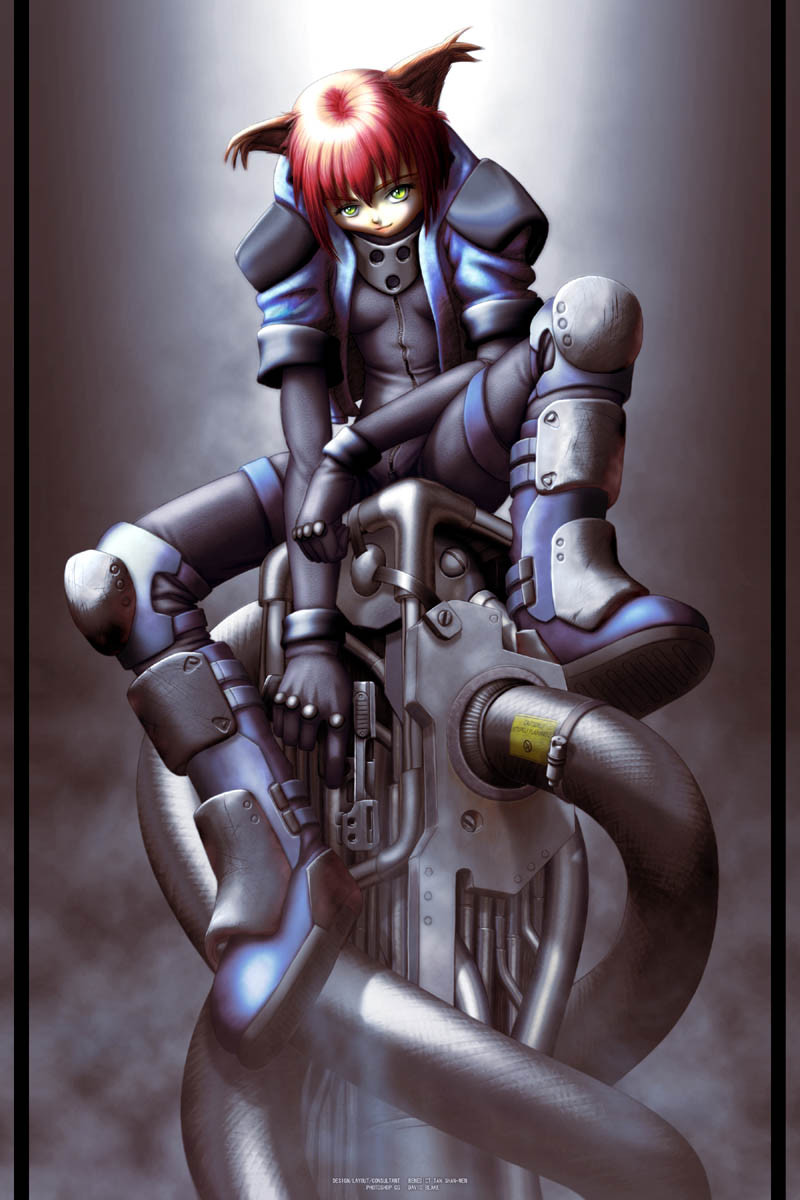
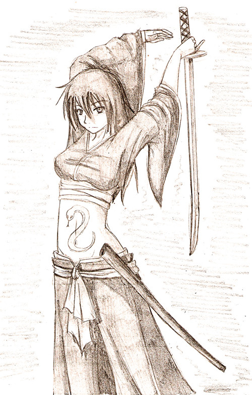
Was watching Azumi yesterday (by the Versus director) and I suppose that inspired this doodle a tad.Drew this while half watching Dune (1984 version) this morning.
Pencil on paper, with slight Photoshop colour tinting and smokey background added.
Related content


Comments: 31


guh...smuh...bluh...i'm just insanely speechless. this is so AMAZINGLY GOOD!
👍: 0 ⏩: 0

Great pic. I'll just have to harness your talent by sucking out your ki wiht a straw
👍: 0 ⏩: 0

damn, I love the simplicity of the colors and lines. Beautiful work.
👍: 0 ⏩: 0

I love it - I always love to see the original sketches - I'm almost more interested in the process of art than the final product itself.
👍: 0 ⏩: 0

 (Smile)")

Great pic, very nice.
I love your simple use of colour, they work really well together.
The character is also very well drawn.
Kudos!
")
👍: 0 ⏩: 0


love that hair! but you know, i think people don't really hold the sword like she does with her right hand....i know....
strange...she kind of reminds me of Mulan.....
👍: 0 ⏩: 1

I know, but it works better for the image. Needed something at roughly that angle and not far from the body.
👍: 0 ⏩: 0

Very nice, the colour matches the mood perfectly! Well done.
👍: 0 ⏩: 0

Azumi's a good movie ")
👍: 0 ⏩: 1
Thanks.
In my opinion Azumi wasn't as good as Versus, But it did have the added benefit of a high body count and ninjas. Can't wait to see what the director does with the new Godzilla film.
👍: 0 ⏩: 0

Whee i likey, she doesn't seem to be the build to do all that much swordwork though
Ciao!
~Mince
👍: 0 ⏩: 0


This is quite interesting....and I liked how you seemed to use softer pencil lines in conjunction with harder/darker lines to create the image.....it really softens the overall feel of the character....especially with the tinted paper.
Only major flaw within the piece is, if she's supposed to be wielding a pair of swords in the traditional way, they're on the wrong hip....unless it was an intentional thing, for then, that's all up to the artists discretion...and ingore what I just said.
ryan
👍: 0 ⏩: 1
Umm... didn't know about the correct hip thing. Anywho thanks.
(p.s. I used plain cheap printer paper, the tint was added in PS)
👍: 0 ⏩: 0


WoW! Thats really good. I like it a lot. The only thing that i see that can be fixed is the left hand also the cloth in her torso doesn't have the full affect making it look more like her stomach. Its no biggy though. Its just a skecth. Nice work!!
👍: 0 ⏩: 1
Thanks. Yeah, I noticed those faults too. I don't like using an eraser, so mistakes are bound to arrise.
👍: 0 ⏩: 1
ah cool. now we have something greatly in common. I never use erasers. I find that not using them stresses you more to be a better drawer
👍: 0 ⏩: 1
Exactly. The only time I use an eraser is if i'm inking something and I no longer need the pencil lines.
👍: 0 ⏩: 0


ummm.... very easily, create new layer, set to multiply, filter>render>clouds, create a mask filled with black and then just brush in the rough shape of the smoke using white on the mask channel.
I also added a very slight second smoke layer on the front of the skirt using same method as above, but the layer set to screen.
👍: 0 ⏩: 1

ooooohhhh... O.O
(okay, so I think I'm a little slow... or maybe I should steal mom's photoshop bible... what do that multiply, screen, and all that do? I think I need to go home and fiddle with photoshop some more... O.O)
^.~
👍: 0 ⏩: 0

ooo! nice job! haha i wish i could draw like u!
👍: 0 ⏩: 0