HOME | DD
 Platypusofdoom — PM2D- Title Screen (Version 4)

#pm2d #fangame #papermario #supermario
Published: 2019-12-31 22:04:53 +0000 UTC; Views: 2944; Favourites: 44; Downloads: 2
Redirect to original
Description
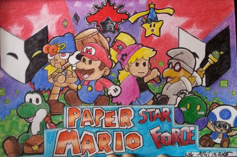
I've started working on a new revision of Paper Mario: Double Darkness, and with that comes a new title page!Since the previous version of the title screen from 2015, not a lot has changed with the visual design of the characters and environment here, but I have gotten better at drawing and composition. This version of the title screen, I would say, is a lot more interesting to look at. The placement of the characters is less haphazard; there's a nice horizontal symmetry going on; the colors are brighter but still create an appealing color scheme. My favorite touch in this piece was drawing all the characters and the game logo on separate pieces of paper, then gluing them to the background at the end; it really helped make everything in the foreground pop out.
Related content


Comments: 5

👍: 0 ⏩: 0

👍: 0 ⏩: 0

oh that was a fantastic idea, making the cover out of actual paper craft techniques like that! it does really make the characters stand out.
👍: 0 ⏩: 0

This looks amazing! It really does look like it came straight from Nintendo. I think it'd also be interesting if they used this style, too. Well done!
👍: 0 ⏩: 0

Looks pretty neat  (Smile)")
I really like how you coloured it; the blues and purples work really well, and the characters are cute ^^
👍: 0 ⏩: 0