HOME | DD
 Plugin848y — Riddle Me This...

Published: 2011-10-28 19:04:42 +0000 UTC; Views: 421; Favourites: 25; Downloads: 0
Redirect to original
Description
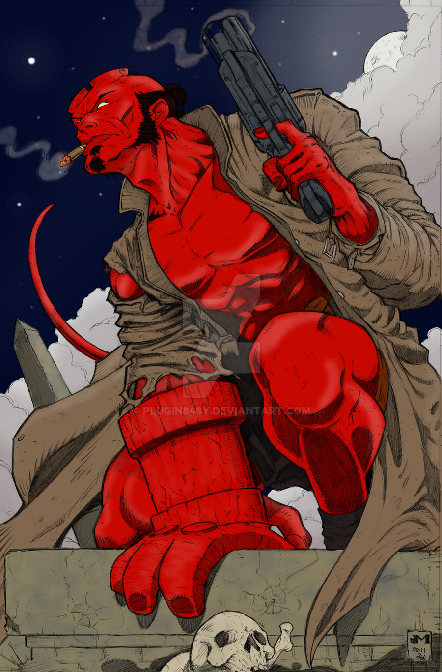
Had a ton of fun with this!!!Original lines : here [link]
Colours : me
Please let me know what you think now it's finished
")
Debs
Related content


Comments: 25

👍: 0 ⏩: 0


Thanks very much  (Smile)")
👍: 0 ⏩: 1

The coloring is perfect too. Did you do it by hand, or computer?
👍: 0 ⏩: 1
Thanks very much!
👍: 0 ⏩: 0

Thanks, mine too, it's what made me want to get involved lol
👍: 0 ⏩: 0

Cool Debs, but I think you could push yourself a bit more with the shadows and highlights on some of it to really get the feel for the lighting.
👍: 0 ⏩: 1
I was looking at it now and wondering if it's my choice of shadow colour that's causing it to look less that it could? There's an entire folder of shadows and highlights on there, the glow around Bats took a while for me to get going
👍: 0 ⏩: 1
Yeah the reddening of Riddler's face is nice. I think if you when a little darker, more contrasted, as well as with highlights it might help.
It seems a bit flat in some areas.
👍: 0 ⏩: 1
I'm working on it now to see if I can get it looking right. I'm always worried about getting too far the other way and it looking too dark, but that worry about things is holding me back, so here goes!
👍: 0 ⏩: 1
haha, go for it! I think part of it is that the lines aren't inked so it can feel over powering a bit.
👍: 0 ⏩: 1
I think that's what it is, I'm scared of it being too dark and not being good enough
👍: 0 ⏩: 1
Well even the nobodies and somebodies have that fear with out it and pushing past it there's no growth.
👍: 0 ⏩: 1
That's very true! I do need to just go for it sometimes, no fear! As Yoda says "Fear makes the cold colder and the dark darker."
👍: 0 ⏩: 1
I always liked "Do or do not...there is no try."
👍: 0 ⏩: 1


Thanks, I'm glad you like it
👍: 0 ⏩: 0

Thanks Bro, I'm pleased with it

👍: 0 ⏩: 1

yvw sis and I think if there wasnt a techie word for it,you just named it shadowy

👍: 0 ⏩: 1