HOME | DD
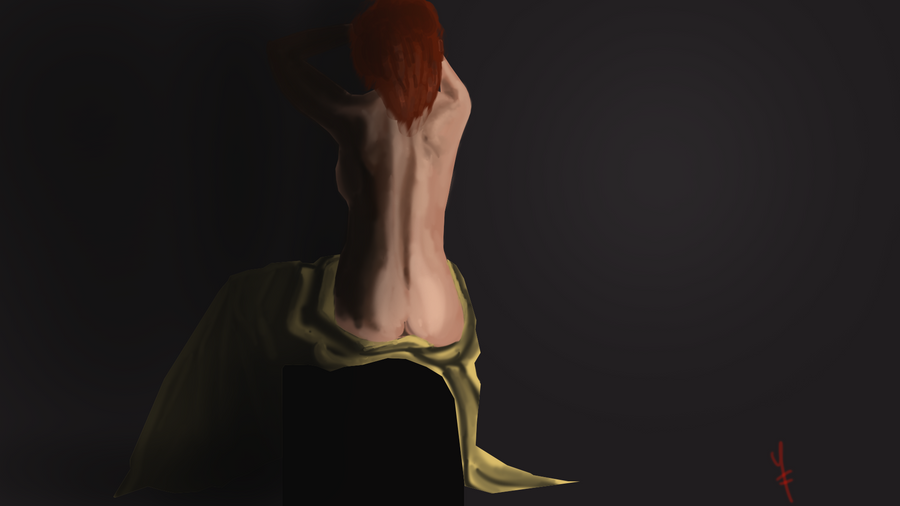
 plusplusKid — Colour pratice
Published: 2012-06-28 00:00:48 +0000 UTC; Views: 116; Favourites: 1; Downloads: 6
Redirect to original
Description
Aside from some minor colour theory I have not really touched upon doing much blending and mixing with colour. This was a practice in that. Any critique would be most welcome.Done in photoshop at 1920x1080 at 300 dpp mostly coz i look working full screen.
My workflow usually goes, sketch > layer on top with base colours > Layer on top of that and start blending using eye dropper tool. I don't really have much experience with using multiply or anything like that so tips would be welcome.
-just noticed, cloth looks atrocious.
Related content


Comments: 5

I just realized after writing this that this isn't so much of a critique as I would want it to be, but... I think it's useful to you nevertheless
A really great thing to learn is to put away the whole base-color thing. Especially when painting skin. Skin never contains of only a base color, shadow and light, there are several different tones and hues depending on the area you're painting. It's very tricky and takes time to master, but your art definitly takes a jump when you do.
The great tutorial that taught me this: [link]
It's very hard to understand at first, especially if you're pretty new to it, but I'm sure you'll get the principles over time.
But to sum it up, when painting skin, try to choose many colors and experiment a lot with them. Try to maybe paint the shadow in a blueish hue instead of just black, since shadows never are just black or grey, but very saturated colors.
Setting your brush to multiply is very useful to add colors to an area you've already painted that looks dull or maybe needs to have a different color. Your technique is very useful through, so keep doing that. One thing you might want to do is to blend your brush strokes a bit more and maybe have a harder brush at lower opacity, since fuzzy brushes tend to look, well... Fuzzy.
Feel free to ask if anything was unclear, it's pretty late here so I'm pretty tired
 (Smile)")

👍: 0 ⏩: 1

Wow thank you!
This is exactly what i was looking for. See my thoughts on it before were that there was one main colour and then a lighter version of that along with shadows, i didnt think to use more than 4 on my palette, i see how that way of thinkings is way off.
So i guess my question is, when choosing skin colours, say you pick out a reference for your colours, how many colours do you roughly want to use? a few per shade? lol
The problem i have with low opacity hard brushes are that they sort of overlap a lot and then im having to go around and fix the overlapping colours, maybe its just the way i paint, I will look to blend that a bit better. I get a bit too worried and start using the soft brushes and then i get a pastel-ly look to it which ruins it for me.
Thank you for your help, ill be sure to post another one this morning with.
I think i'll do away with what i know and go into the tutorial as a blank slate.
")
👍: 0 ⏩: 1
Glad it was helpful
Ah, it's a common mistake to do, especially in digital art it seems.
It's very different, and depends on how you blend them, so I would say just as many as you need, just not too few. Rather too many than too few. Start with deciding which result you're going for, which tone the skin is in and where the light comes from and such, and then pick a lot of colors that leaves space for experimenting. Just don't limit yourself to those colors you choose, look at what you're painting and use what it needs, not those colors you chose way before getting to the point where you are now.
Ah, I know, I have the same problem. Try doing the hard brushes at first and then blend the visible stokes, it takes a bit of time but the result tends to look better and more well-done.
I'm glad it helped you, good luck in the future

👍: 0 ⏩: 1
Thanks, i've uploaded another version baring in mind the advice you gave and following parts of the tutorial. Used the hard brush with various opacity and ive gotta say it wasnt so bad lol, dont know why i was so worried.
👍: 0 ⏩: 1
Ah, I'll check it out!
It all comes with practice and experimenting
👍: 0 ⏩: 0