HOME | DD
 pochrzas — Fathom: DOW v2 - Coloring -
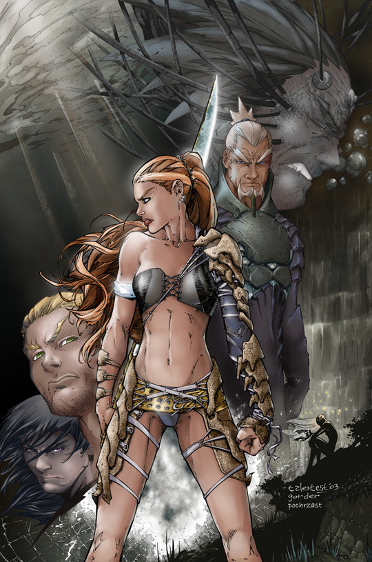
Published: 2004-10-11 23:18:14 +0000 UTC; Views: 5904; Favourites: 46; Downloads: 405
Redirect to original
Description
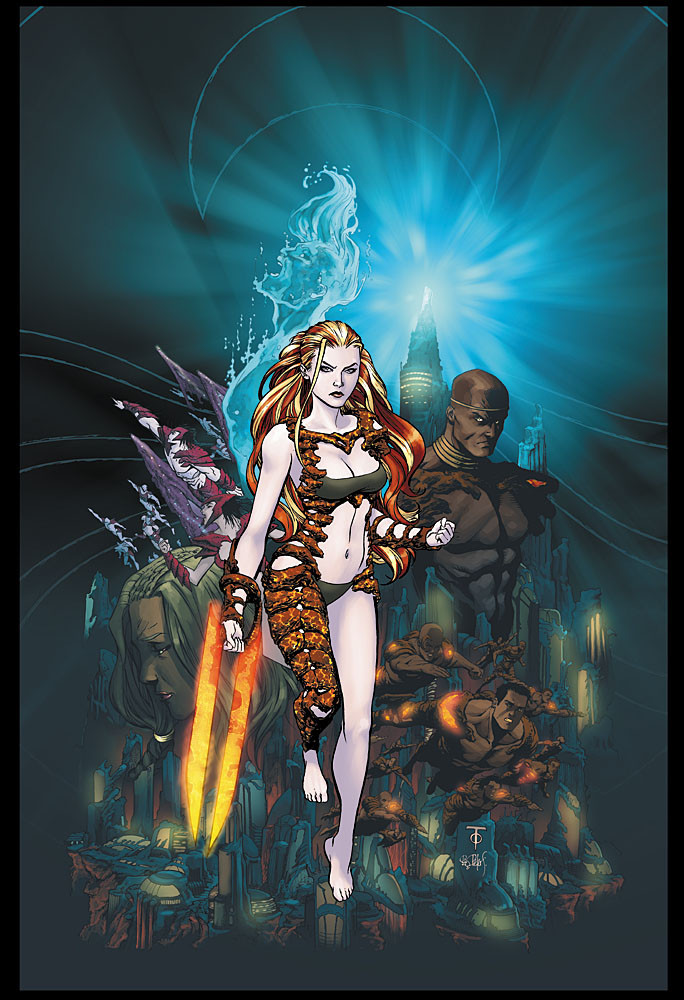
By request, I'm adding this piece to my gallery - it is a slight color variation of my first Fathom: DOW coloring attempt (I submitted both of them for the contest, but I'm not quite sure which one actually earned me first place (Smile)") ).
).Pencils: Talent Caldwell
Inks: Jason Gorder
Colors: Me
Let me know which one y'all like more
Thanks!
Phil
P.S. "Fathom: Dawn of War" and associated characters are (c) Aspen MLT Inc.
Related content


Comments: 22


hi, i love this one is awesome if u put tutorials about the anatomy of the chars i'll love...
👍: 0 ⏩: 0

i like the way kiani stands out in the forground, nice job on both!
👍: 0 ⏩: 0


Wow she looks really awesome. Her anatomy is very well done. I like the waterfall in the back!
👍: 0 ⏩: 1

I agree, nice job on this. I like how you did the water fall the most.
👍: 0 ⏩: 1

Well, the only reason I took part in the contest was because I stumbled across your piece one day and was inspired, so that means a lot - thanks!!!
👍: 0 ⏩: 0

The contours of her body look really awesome and the waterfalls on the right look really dreamlike. You are really imaginative!
👍: 0 ⏩: 1
Thank you! I'm glad you liked it
👍: 0 ⏩: 0

i think the diagonal of people is more apparent in this one, and the chick has a certain glow to her because of the lighting, but i still like the blue version better 
👍: 0 ⏩: 1
Agreed - I think the blue version has a little more "punch" to it (and compliments the water theme more)
👍: 0 ⏩: 0


Oooh, I like this one! Loved the other one too though!
👍: 0 ⏩: 1
Thanks! This was somewhat insipred by Lord of the Rings movie posters - not quite how I wanted it turn out, but this was Talent Caldwell's (the penciller) favourite
👍: 0 ⏩: 1
Well, for something that didn't turn out how you planned, it was a terrific job!
👍: 0 ⏩: 0
Thanks for the kind words!
One of the judges (the artist, Talent Caldwell) was looking for a movie poster feel to the piece - my first version was how I imagined a movie poster for Fathom: Dawn of War - this version was influenced by the Lord of the Rings posters
P.S. I used Photoshop CS only for this piece - I'm experimenting with Painter now, and so we'll see how the two apps work together
👍: 0 ⏩: 0

love the lights... the colors aren't too bright either, wich is a good thing ")
👍: 0 ⏩: 0

very good. the lighting, how the faces go down from the top right to bottom left. all of its really good.
👍: 0 ⏩: 0