HOME | DD
 Pokeaday — color experiments

Published: 2012-03-25 23:51:48 +0000 UTC; Views: 399; Favourites: 25; Downloads: 2
Redirect to original
Description
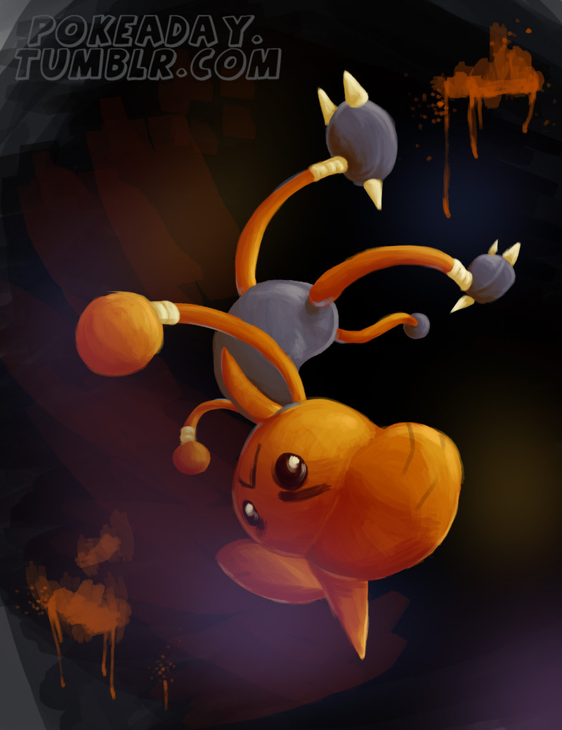
Trying out some digital painting styles and colors.Related content
Comments: 3


Firstly may I say I do not normally write these.. so please be patient with me! e.deviantart.net/emoticons/b/b… " width="15" height="15" alt="


Now this is lovely! The composition is excellent and i love hitmontops' pose! There is also a nice sense of perspective with the legs being further away in the piece..
I can offer you a few constructive critisisms however, your edges look a little rough and undefined, if this is the technique you were going for thats great! Though if not, maybe just go over using a small brush with 100% hardness and use your colour picker to choose colours already in the piece so your palette isnt compomised.
Also your highlights are spot on and I can see a rather convincing light source, but maybe you should add some darker shades into the shadows? I won't suggest colour because we artists tend to differ on opinions when it comes to that subject,, I would say green/blue shadows while other would say different.. You could also lower opacity on the shadows so the dark tones dont look so harsh on your mostly light colourscheme?
I love the painterly style and this is great so far! I scored you high on vision because I can see where you are going with this and you have clearly thought our how to place hitmontop and thought about perspective too.
I docked you marks in originality, simply because it is a pokemon but you get some bonus points as this is an experiment with colour and paint techniques so thats your own unique style, if you get me?
Your technique is good but i just think this could use a little tidying up, but I have already mentioned that e.deviantart.net/emoticons/let… " width="15" height="15" alt="


The impact is great so far too! Though like i said before i think some darker shadows will really make those highlights 'pop'
I hope you get some useful things from this critique and my apologies if it is bad... I did try my best to be fair and both positive and constructive!
👍: 0 ⏩: 0

I'm a newbie to art in general so I can't give an in-depth critique, but I do agree that you should make the shadows a bit darker, but not too dark. Maybe use different colors in the shadows, so as to make sure that people see variance, although I could see a little blue in there. I love this piece! Ma fav!
👍: 0 ⏩: 1


