HOME | DD
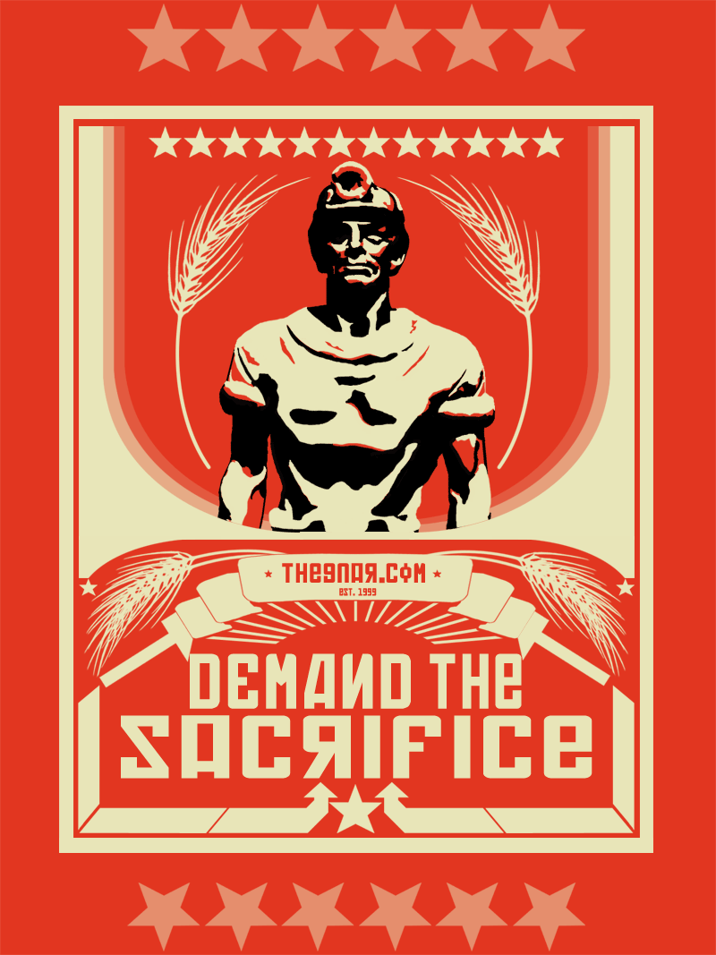
 polaris — PROPAGANDA - Sacrifice
Published: 2001-12-02 11:39:42 +0000 UTC; Views: 3975; Favourites: 30; Downloads: 357
Redirect to original
Description
New version of the propagand poster... god i loved making this... i love the colors so much power and energy coming off it...I have a 18"X24" version im gonna try and print off at Kinkos tomorrow...
enjoy
Related content


Comments: 30


Very strong piece...makes me want to go out and farm the land for the good for the people!
Serriously, this is a great piece. Very solid design.
👍: 0 ⏩: 0


Thats F'n cool, awesome Soviet Propaganda style there. Excellent work.
👍: 0 ⏩: 0


This is top quality design - I'm speechless! This is going in2 my fav's, and I'm check your gallery now
👍: 0 ⏩: 0


mint but you know that!
-----
ohh yeah, i can spell sorry
👍: 0 ⏩: 0

wooow i love this. such power. this is my sort of art. what font is that could you please please send it me thx so much. hehe i sound like a right n00b
-----
SPONGEART [link]
👍: 0 ⏩: 0


you did not just say kinkos? god they suck. I don't even deal with them in Canada.
👍: 0 ⏩: 0

Love this. I am a big fan of communist stuff it always looks so cool. Love the constructivist stylings (arrows etc.) This is a highly effective poster which looks like the old russian propaganda. Nice pic.
👍: 0 ⏩: 0

same opinion as on the other prop posters, great color choice and everything just screams power.
-----
-we are the parasites of creation and we all deserve to die-
👍: 0 ⏩: 0

Me marching to the gates and breaking the bones of my enemies.
Me like naked chicks also.
-----
👍: 0 ⏩: 0

hell, i'd put this up all over the new train stations being constructed down here!
this is my favorite of your propoganda pieces!
-----
Reality is a constant source of pain -- Anaïs Nin
👍: 0 ⏩: 0

u really got that style, nice! i esp. love the font!
👍: 0 ⏩: 0

That'd go in my room for sure. Powerful, for shure. Very well done.
:::Alkaline:::
:::A single spark can start a spectral fire :::
👍: 0 ⏩: 0

Likin' your work!
Jen H.
http://www.popstalin.com
👍: 0 ⏩: 0


wow man, this is awesome, the power coming off it...wow
Even less than you wished for: https://www.deviantart.com/deviation.php? id=127287
👍: 0 ⏩: 0


niceness.
wooah.
https://recklesswalker.deviantart.com
👍: 0 ⏩: 0

a good remix on the last version.. but i really dont like the phrase 'demand the sacrafice' it just doesn't seem to work that well... I understand the meaning behind it, but it just didn't seem to work out. Otherwise good work very impressive color scheme and style.
👍: 0 ⏩: 0

ok man .. THAT type works sooooo much better ...... imho, of course ...
you the russian propoganda poster god round these here DA parts baby .....
i would definitely hang this in my room .. love it!!
raaaaaaaaaah
👍: 0 ⏩: 0

I just watche dthe movie "enemy at the gate" So this kinda remind so fthat movie, very nice.....
::Till all are one::
👍: 0 ⏩: 0

This really looks like the old posters. Reminds me a bit of comunistic and nationalsocialistic proclamations, like you can find them in history books.
Good work man!
👍: 0 ⏩: 0