HOME | DD
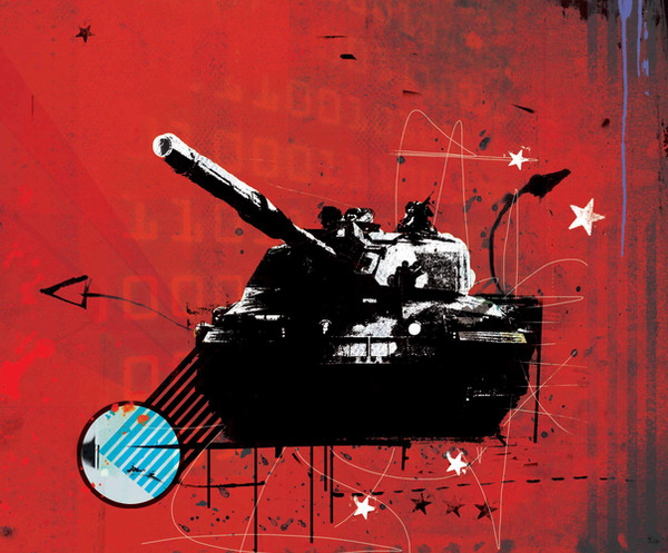
 polaris — Tank Ralley - Color Correction

Published: 2002-03-07 10:07:12 +0000 UTC; Views: 841; Favourites: 8; Downloads: 108
Redirect to original
Description
Ok.. i tryed a different color for the tanks, and i think its WAY stronger than the weak sauce orange..It makes it more crisp, and all those cool adjectives that make something sound better...
Related content


Comments: 17


too jumbled and cluttered. what the hell is this propaganda
-----
nope
👍: 0 ⏩: 0


This is awesome..finally someone who appreciates the good ole soviet stuff ..I like the idea bout using maroons and olive drab for this piece though
👍: 0 ⏩: 0

Werd, this is ownage... I love the style you got with this kinda stuff.
👍: 0 ⏩: 0

oh lovely, great color choise and the shapes are awesome
-----
-we are the parasites of creation and we all deserve to die-
👍: 0 ⏩: 0

ya communism blowz...but i love the style
-----
- Demand the Sacrifice -
👍: 0 ⏩: 0

communism...grrr....great pic though! hehe
-----
:watching the world through SLR:
-=[Nitsuj-EX]=-
👍: 0 ⏩: 0

how about a combo of maroons, oranges, and military green?
go tanks go!
👍: 0 ⏩: 0


Good touch on the color correction, I tend to like this one more than the original. Looking good
👍: 0 ⏩: 0

Cool, let's drive tanks My favorite part was definately the tank, it looks very technical and cool, but i also like the star on the forehead (what does it symoblize?)
-----
my name is lumotek
👍: 0 ⏩: 0

very good work, these colors go together really well...talking about politics...fascist party is getting big in here
I wish I could vote it would be NCPN straight away (New Communist Party Netherlands)
👍: 0 ⏩: 0

Cool. appeals to the socialist in me!
-----
Simon
http://www.roadkillart.com
👍: 0 ⏩: 0

Big up communism
I like it, promote Russia more, a great country.
-----
--------------------
(¯`·.,¸CRY0G3N1X¸,.·`¯)
£V3rYwh3r£ Y0u L0ok 1Ts l1k3 tH3y Kn0w...
👍: 0 ⏩: 0

He He I like that a lot.
Communism is good for your health
-----
👍: 0 ⏩: 0