HOME | DD
 PolymerWantACracker — What I Learned in Boating School Is...

#afternoon #anthro #boat #boating #boats #chaotix #charmy #charmybee #crocodile #espio #espiothechameleon #floating #furry #grass #knuckleschaotix #lagoon #lake #log #murky #plain #pond #reptile #ripples #sailboat #sailboats #sailing #sega #sonic #sonicteam #sonicthehedgehog #spongebob #spongebobsquarepants #trees #vector #vectorthecrocodile #videogame #water #waves
Published: 2016-03-13 21:02:25 +0000 UTC; Views: 9417; Favourites: 162; Downloads: 23
Redirect to original
Description
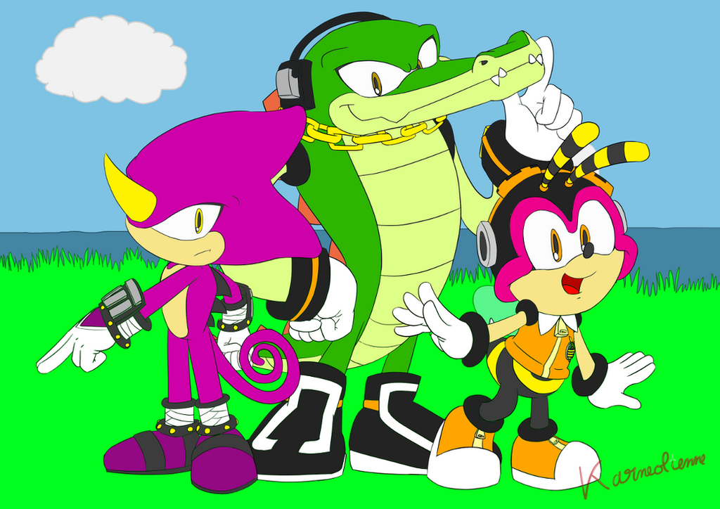
MAN is Vector ever hard to draw, especially from a weird angle. But crocs make great flotation devices, so I guess for his friends' sake it was worth it!I'm pretty proud of the way the water came out, though. If you're wondering how to do it (I use PhotoShop, but these directions should apply to most programs):
- Color the water brown/blue/whatever else you want the base color to be.
- Create a layer on top of it and quickly sketch out a reflection of everything above the water at any given point - including sky, clouds, trees, characters, and everything else major in the picture.
- Make the reflection layer twice as tall by scaling/transforming it.
- Apply a ripple effect.
- Shrink the layer back down to its normal height - now the ripples aren't so tall.
- Reduce the opacity of the reflection layer by some amount, depending on how murky you want the water to be.
- Finally, create one more layer to draw waves and stuff on (I did it in a dull tan color), then reduce the opacity of that as needed.
Related content


Comments: 39

👍: 0 ⏩: 0

👍: 0 ⏩: 0

👍: 0 ⏩: 0

Overall
Vision
Originality
Technique
Impact
Hi, this is Simon from a.deviantart.net/avatars/p/r/p… " alt=" " title="ProjectComment" />
e.deviantart.net/emoticons/s/s… " width="37" height="25" alt="

e.deviantart.net/emoticons/s/s… " width="15" height="24" alt="

e.deviantart.net/emoticons/b/b… " width="37" height="15" alt="

This work to me is an impressive reflection on the meaning of life and death. I love how you express the ying-yang nature of life through the bee character. The black symbolizes the dark moments of life, and how we sometimes cannot seem to see where we are going. The yellow evokes the lemons that life sometimes gives us. The target pattern in yellow and black questions: is nothingness life's only goal?
But the rest of the bee shows us the other side of life. Just as bees fly freely around in zigzag patterns, life doesn't need a target-like goal, life goes in multiple directions yet always arrives where it needs to. Just like bees buzz from flower to flower, collecting pollen, we should learn to make the most of each situation. The happy expression on the bee's face further emphasizes how life can really be beautiful and happy. But how? The answer is by looking at life with love in your eyes. Look at the bee's brow. It forms the upper part of a pink heart. Pink and hearts are famous symbols of love. Therefore we clearly understand that she (or he? idk e.deviantart.net/emoticons/s/s… " width="19" height="19" alt="

The importance of love to the artist is made clear by its central position in the image. Pink is everywhere in the centre of the image. The middle character happens to be pink and have a heart shape (again!) on his belly, the central part of his body. Coincidence? I think not! He clearly is the embodiment of love. His determined expression shows you how love isn't just for teletubbies but is a real strength that allows him to look past the lemons of his life symbolized by his nose and into the future.
I also like how the crocodile Vector, lying down in the water, symbolizes death, reminiscent of Greek mythology, where the dead would cross the river Styx into the underworld. But here the tone isn't affirming a myth like Plato would, rather questioning what awaits us after death. The surface of the water indeed symbolizes the limit between life and the afterlife. The water is murky; we cannot know what we will become.
Overall a very deep and metaphysical work of art! Just as the view is slanted, the viewer is invited to lose his traditional point of view on life and death and look at things differently.
...
...
April fools!!
More seriously, a lot of what I said in my previous critique still applies.
To me, the theme of this deviation is friendship and I really like how you portrayed it. The character's playful expressions, each showing a different personality; the tilted angle of view; the bright colours (I do question the idea of making the water look so dirty here); everything works very well together to make a joyful friendship scene. Hence the high vision and impact score.
Friendship isn't quite as original as homelessness, but I feel like the scene is very unique - I've never seen anything like it - and it shows quite a bit of imagination. So even though I think there is nothing original about sonic characters, I gave you e.deviantart.net/emoticons/s/s… " width="17" height="16" alt="

e.deviantart.net/emoticons/s/s… " width="17" height="16" alt="
e.deviantart.net/emoticons/s/s… " width="17" height="16" alt="
e.deviantart.net/emoticons/s/s… " width="17" height="16" alt="
" data-embed-type="emoticon" data-embed-id="451" title="No Star"/>
e.deviantart.net/emoticons/s/s… " width="17" height="16" alt="
" data-embed-type="emoticon" data-embed-id="451" title="No Star"/>.
On technique you won a whole extra e.deviantart.net/emoticons/s/s… " width="17" height="16" alt="
Oh and ABSOLUTELY don't highlight white eyes with a darker yellow. That makes no sense at all! HighLIGHTs are made with lighter colours. Sounds obvious, no?... e.deviantart.net/emoticons/s/s… " width="19" height="19" alt="
Concerning water, the ripple technique is a brilliant idea, but you missed the fact that due to perspective, ripples are always perpendicular to the viewer's line of sight (look at any photo and you'll see I'm right). Also, the waves are in my opinion the perfect example where lasso tool+soft brush would have given a superbly better effect. Apparent standard round brush strokes will *nearly* always look amateurish and out of place (Look at some of FUNKYMONKEY1945
's sketches for some awesome use of the standard round brush: it mostly relies on using it in a cross-hatching way).
Hope this helps! Cheers e.deviantart.net/emoticons/w/w… " width="25" height="20" alt="

e.deviantart.net/emoticons/r/r… " width="15" height="15" alt="
")
👍: 0 ⏩: 0

Overall

Technique
Impact
I think this art is above all really cute. I think it fits team Chaotix pretty well. Even though Vector would be that type of guy that would say " hey what's the big idea get off me" lol
Anyway. I like the atmosphere you placed them in a simple lake as if there at a park in New York or something. Now what really caught my eye was the water. I really love the way you did the water, and you adding reflections is just icing on the cake. I think this is a very cute work now.
Now I think you could do a bit more shading in this there are a ton of places that could use some shadows. For example behind vectors arms or a little under charmy and espio. And a little lighting wouldn't hurt either.
Above all I like this drawing its cute. I think you done a fantastic job on it. Just keep on practicing and drawing.
ProjectComment
👍: 0 ⏩: 1

I can see that; Charmy's arm isn't leaving a shadow on his leg, for example. Thank you for noticing that!
👍: 0 ⏩: 1
Your very welcome dear
👍: 0 ⏩: 0

This is a pretty cute scene! ^^ Vector's pretty nice to let his teammates float on his stomach like that! ^^
👍: 0 ⏩: 0

This is a good piece you did here. Add human feet to the characters, and see if what Charmy would look like without his helmet. That would be interesting.
👍: 0 ⏩: 1
I always thought human feet looked weird on Mobians, and I thought this was Charmy without his helmet, heh.
👍: 0 ⏩: 0

Curious to see Vector with dark green arms. It must be fun to float like that, so this picture is very in vocative of fun.
Of course Charmy can't be seen without a helmet
")
👍: 0 ⏩: 0

I feel the fun and nature for this pond really ><
The angle of camera is catchy so far
👍: 0 ⏩: 0

way cute I like the soft yellow tone you added to tie the picure together. The ourple guy iss too cute and his nose totes reminds me of a penguin's!
👍: 0 ⏩: 1
It's a horn (he's a chameleon), but I can see that, thanks for noticing the sun-baking effect!
👍: 0 ⏩: 1
Cool and no prob
👍: 0 ⏩: 0

What I learned in boating school is that even penguins can figure out what's a boat and what's a crocodile. (Sorry if I'm being mean.)
👍: 0 ⏩: 1
Nah, you at least used the word "penguin".
👍: 0 ⏩: 0

This is a fun, relaxing piece. I particularly like the lighting on the sails of the little boats. The character designs are charming and I enjoy the little details like the shading on the croc's toe claws. I like that the body types are very different and emulate a similar design to each other but still have big differences. Hmmm If you're looking for concrit in return the only thing I could think of is possibly find a way to make the lines just a tad smoother. It's almost there. The line work is more naturally noticeable in a cartoon piece. Nice art.  (Smile)")
👍: 0 ⏩: 0

Good job, the water is done great as with the characters. A nice carure of a lazy afternoon.
👍: 0 ⏩: 0
Thanks, I hope at least one person actually uses it. Glad to know people actually read the descriptions, heh.
👍: 0 ⏩: 1

Welcome, I'm sure they do.
👍: 0 ⏩: 0

Oh my goodness this is so cute! I love the characters expression, they look so happy! The green hue of color over the whole art makes it look so soft and relaxing to look at!
👍: 0 ⏩: 1
I've been trying to incorporate both hard (e.g. shadows and highlights on objects and the waves in the water) and soft (e.g. the overall light pouring in) color overlays into my drawings lately to make them more attractive from a distance; I'm glad it's working. Thanks!
👍: 0 ⏩: 1
It definitely is!
👍: 0 ⏩: 0
You can add those outside Facebook?!
👍: 0 ⏩: 1

The emoji's? Yes they work on here too
👍: 0 ⏩: 0

I really like the composition of this piece as the atmosphere is very much relaxed and fun. Very nicely done! ^^
👍: 0 ⏩: 0


That title......Nice Spongebob reference
👍: 0 ⏩: 1
That's right! I mean, this picture doesn't have anything to do with that other than the activity of "boating", of course.
👍: 0 ⏩: 1
*www.youtube.com/watch?v=g-4-gL… *

👍: 0 ⏩: 0

"OOOOW! MY HAND IS CRAMPING, MRS. PUFF! MAKE IT STOOOOP!" Sorry, I had to reference that. XD
Nice job on the effects!
👍: 0 ⏩: 1
"Hey, Patrick, you know what's funnier than 24? Pfft... hehe... 25!!"
👍: 0 ⏩: 1
"LIGHT! DEATH! LIGHT! DEATH! LIGHT! DEATH! LIGHT! DEATH!" XD
👍: 0 ⏩: 1


Heh... I was just about to send you a note, actually.
Cool! I like the Chaotix. They're alright.
👍: 0 ⏩: 0
