HOME | DD
 Ponce — Abstract Revolution

Published: 2004-02-14 19:48:25 +0000 UTC; Views: 678; Favourites: 7; Downloads: 370
Redirect to original
Description
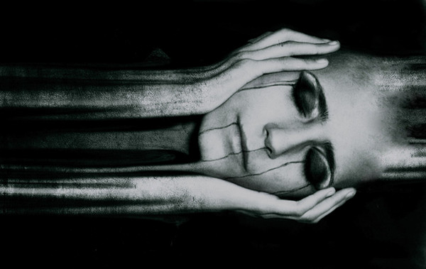
WOAH! turned out lot better than i though! anyway i used cinema4D plus PS brushing.PLeaz FEEDBACK
")
Related content


Comments: 42

When I look at it, it makes me think of aquatic machinery, or a mechanical fish because of the way the pipes fin out in the corners (mostly the top right one). Overall, I really like the color scheme. Anything blue is good in my book.
👍: 0 ⏩: 0

I like this so much, the colours, the almost organinc shapes, its just great.
So nice
👍: 0 ⏩: 0


not a huge fan of this style of art. but this one has some very interesting lines and looks well designed. the colors seem a bit dull though. like they were out in the sun to long :/
👍: 0 ⏩: 0

wow! youve really got a talent 4 this stuff. this is even better than the other one... it great, well done!
👍: 0 ⏩: 0

Very beautiful. There isn't as much negative space as you could have had, but thats because it is a small image. The render is pretty interesting, and the radial blur gives it a nice glow. Overall good job.
👍: 0 ⏩: 0


Wow (Smile)")

👍: 0 ⏩: 0

Very cool man. I really love the render but I'm not sure about the blue color around it. Maybe a bit too bright for my taste
Good job!
👍: 0 ⏩: 0

This peice is hella kool!! I love the 3d effect with the liquid blue feel!! I also like the font you used and that logo rox!! What font is that?
👍: 0 ⏩: 1

heh thx, btw the font's called: 04b_03b
but its so simple to make that u can actually make it with the pencil tool
👍: 0 ⏩: 0

awesome. i love the lines and the shades of blue. nice work
👍: 0 ⏩: 0


lol 
👍: 0 ⏩: 0

Weird piece, but I definitely like it. Good work.
👍: 0 ⏩: 0

I love it. Very cool. I usually don't like that rendering stuff but the marine feel on this is great. Marvellous lighting.
👍: 0 ⏩: 0

how to comment something thats strange yet good.. ?
great job.. never give up!
👍: 0 ⏩: 0
mmm, sometimes jpg kinda screws up with colours so ill try and if it works alright jpg if not srry :S
👍: 0 ⏩: 0

very nice bit of work. my ONE sujestion. Use a JPG format next time...it would look as good, and not take over five minutes to download on dialup.
👍: 0 ⏩: 0

i can`t figure out how to look at this, but it is awesome, i really like it.
👍: 0 ⏩: 0

Wooah. It just screams "look at me!" it reminds me of regeneration, power, and determination (don't ask why, lol it just does).
Awesome work!
👍: 0 ⏩: 0


Man, that looks really awesome! Reminds me of ribs, or scales. I love the smooth text and borders, too. Very clean work.
👍: 0 ⏩: 0

this is an awesome render ")
👍: 0 ⏩: 0


there is not much to say my friend. amazing. tnx for posting in the forum tis a treat 
👍: 0 ⏩: 0

nice render this is great, you gotta teach me how to model like that
👍: 0 ⏩: 0

very interesting im trying to figure out how im trying to look at this...and i dont know i cant tell if im being pulled in or pushed out...very nice work
👍: 0 ⏩: 0


Very abstract. I just love it. The middle of this piece just brings me in and attracts me. I would say though, I don't like the super light spot at the top left. I think It could be less light and have a little more shadowing there. But seriously, I don't even know how to graphic design, I'm just trying to figure out something to say. This is just so cool.
👍: 0 ⏩: 1

i agree my only real comment about this is i dont like the blown out bit in the top corner, other then that, i think this is one of the best works i've seen well done
👍: 0 ⏩: 0

wow man. badass. No suggestions on this one. i like it.
👍: 0 ⏩: 0


Wow, it amazes me to see what kind of wonders people can make with a computer. Although I myself prefer to take the old fashioned road, I really like this one..nice work!
👍: 0 ⏩: 0

I really love the colours of this piece. Very unusual and oceanic. Your shapes are distinct as well. I think mic, sea shells and an ocean liner. Don't ask why. Good work.
👍: 0 ⏩: 0
serene never thought i would get that comment, thx btw, more comments? n.n
👍: 0 ⏩: 0

It's very serene, I like how it reminds me of birds and machinery all at the same time. Very cool.
👍: 0 ⏩: 0