HOME | DD
 Pontiff-of-Zargos — Coffee time redux

Published: 2004-01-29 03:56:22 +0000 UTC; Views: 1344; Favourites: 25; Downloads: 173
Redirect to original
Description
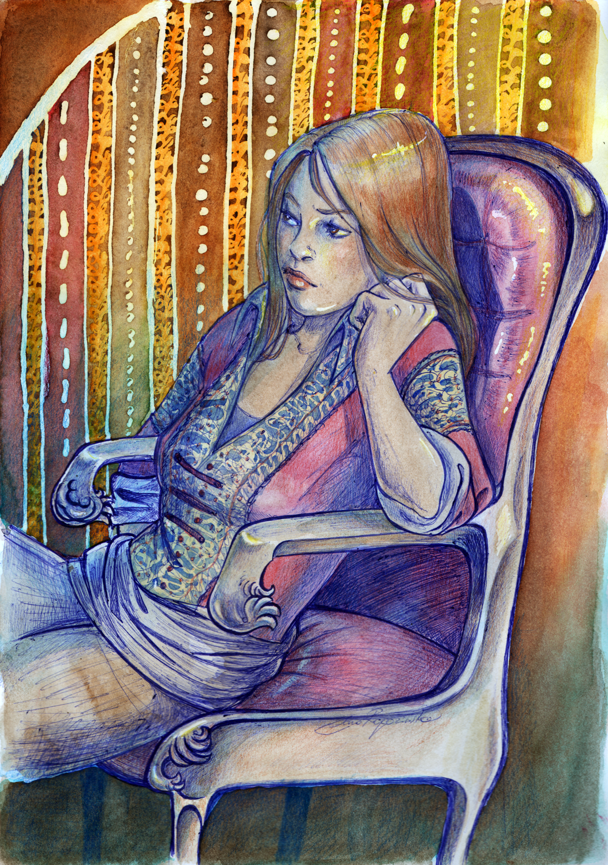
This is yet another in a somewhat continuing series of me getting irritated with an old drawing and re-doing it. The orrigonal is also in my gallery here [link] . The face had always really annoyed me. I like it a lot better now. I'm still not entirely happy and may work on it more later, but for now it's finished.Related content


Comments: 12

I like the face, now. It has a certain expression... that is very lifely, realistic, sceptic.
I especially like the coloration... it fits the all-day-cut-otu theme of the whole painting.
👍: 0 ⏩: 0

Well, I think her face turned out lovely. It's a cute kind of sullen expression.
👍: 0 ⏩: 0

very nice composition, mixed witht he colours it draws the viewer in, wondeful work.
what kind of paints do you use?
Heiko
👍: 0 ⏩: 0

a much better version of the last. unlike the coffee shop ones, this one's better in all aspects. wonderful wonderful.
👍: 0 ⏩: 0

This is a very strong painting; it barely resembles the original. I think you should continue in this vein - this painting is a lot stronger & richer with meaning than your fantasy genre paintings. The viewer can see a lot more of you as artist in this piece than in the others.
👍: 0 ⏩: 0


 (Smile)")

Dammit Jim
Why all the digital art?
I knew it wasnt real watercolor, but I had to look to be sure.
Your drawing style is A+, your design style is A.
I'm gonna look at your gallery a little closer
THIS ONE: 

👍: 0 ⏩: 1

Yeah, for some reason when DA changed some of the category headings these got stuck in Digital Art, when clearly they shouldn't be. But you're right the're not digital, it's all watercolour etc. I've changed a couple but it seems like a lot of bather, Ill get around to the rest eventually.
👍: 0 ⏩: 0

This is very good. The colouring style of this one is better. Nice work.
👍: 0 ⏩: 0


This new version is much much better than the old. You did a great job with this!
👍: 0 ⏩: 0

i love it.. but i also like the other one.. this one looks more american though..
it's very good. good enough to inspire me to look at the rest of yur stuff.. yay.
👍: 0 ⏩: 0