HOME | DD
 Powerkitty — Prom Date
Published: 2009-08-13 13:09:24 +0000 UTC; Views: 721; Favourites: 18; Downloads: 20
Redirect to original
Description
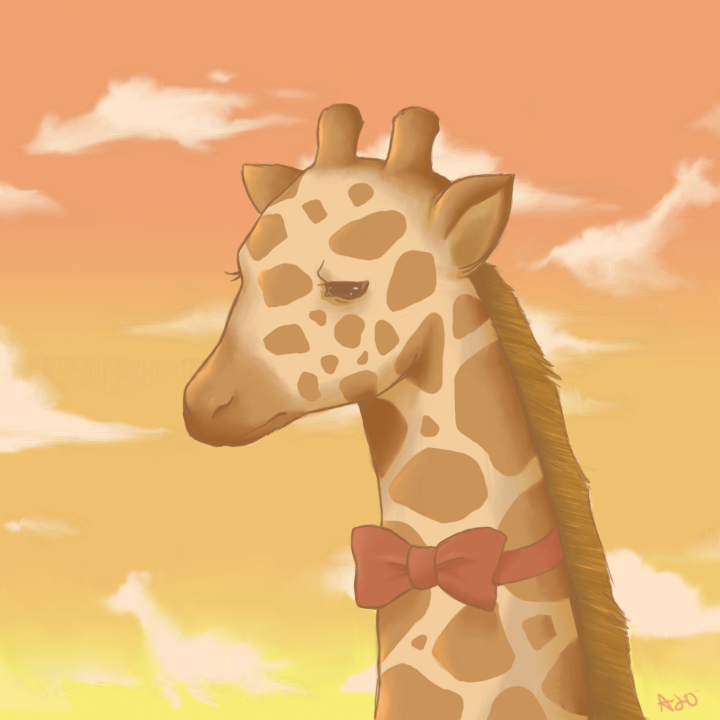
HDBJBDwj284ujqo40
This has been the most frustrating picture I have ever worked on. It took me forever, and it still looks like crap! But I guess you can say it was a learning process. I learned that I can't draw giraffes.
Anyway, this was for an art trade with . They wanted a giraffe in a bow tie.
 (Smile)")
I'm not done with this...critiques, please? I really want to make this better, and I know there are a lot of things that need to be fixed, I just need to know what, exactly.
Thanks
")
's picture: [link]
Related content


Comments: 21


Awwww!!
I wish I could have taken him to my prom!!
👍: 0 ⏩: 0


aww i think he looks soo adorable! >o<
i cant find anything wrong with it.. it looks so amazing ^___^
oh & i loveee the little giraffe clouds how cutee!! :3
👍: 0 ⏩: 1

Yay! I'm glad someone noticed the clouds...I wasn't sure how obvious they were! Lol.

👍: 0 ⏩: 1
^___^ hehe totally cute!
👍: 0 ⏩: 0

OMG It's so adorable! 8D I love it so much~ 
The giraffe clouds are a nice touch. :>
The eyes and the nose, oh man! I want to hug it so bad. You have me fangirlin' and I don't fangirl EVER.
Yours is pretty terrible compared to the awesome giraffe: [Link]
>:
👍: 0 ⏩: 1
Yay!
And NO, I love yours! It's so gooood!
👍: 0 ⏩: 0

Hmm, maybe there should be a little more contrast somewhere to make the subject POP ? i like the colour scheme (and you can draw giraffes way better than my sorry attempts) but if you just look at it, i guess it's all sort of blended in??
akdfjlajf i dunno. still fav'd -shot- xD
👍: 0 ⏩: 1
Hmm...I did a version earlier with a blue sky instead of the orange-ish one...that did help the contrast, but I figured that I paint blue skies waaaaay too often. :/ Thanks, though!
👍: 0 ⏩: 0


Since you want a critique, the shading and coloring is brilliant, but the picture has little flow to it. Its really a pretty peice tho.
👍: 0 ⏩: 1
Eh...but how should I add more 'flow'? HALP. ;A;
👍: 0 ⏩: 1
Dun really know, I need work myself on improving flow, but a smoother lineart and such I guess, I need work on mine too. >.<
👍: 0 ⏩: 0

XD I'm totllay in love with your drawings XD realy-I realy am!!
👍: 0 ⏩: 1

