HOME | DD
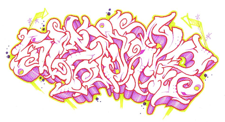
 preform — Sketch 12
Published: 2005-12-28 13:35:16 +0000 UTC; Views: 61; Favourites: 1; Downloads: 4
Redirect to original
Description
Another sketch for skapeRelated content


Comments: 3

i really like this one
anyways
[link]
this is one of my better ones in ms paint
what do you think?
")
👍: 0 ⏩: 1
wait
[link]
forget that last link....
👍: 0 ⏩: 1

Oh man MSpaint, thats oldschool for real. Well, the colors are really strong, a little too strong maybe. Some of the colors are good but there are too many of them and it looks like a rainbow of sorts. the letters are simple, just a little bunched up on top of each other. The best advice; use four or five colors, and space the letters so you can read them clearly. Now you made me want to go and play with paint.
👍: 0 ⏩: 0