HOME | DD
 princepal — Minimal Think360 Studio Temp

Published: 2011-03-09 08:58:17 +0000 UTC; Views: 31195; Favourites: 239; Downloads: 44
Redirect to original
Description
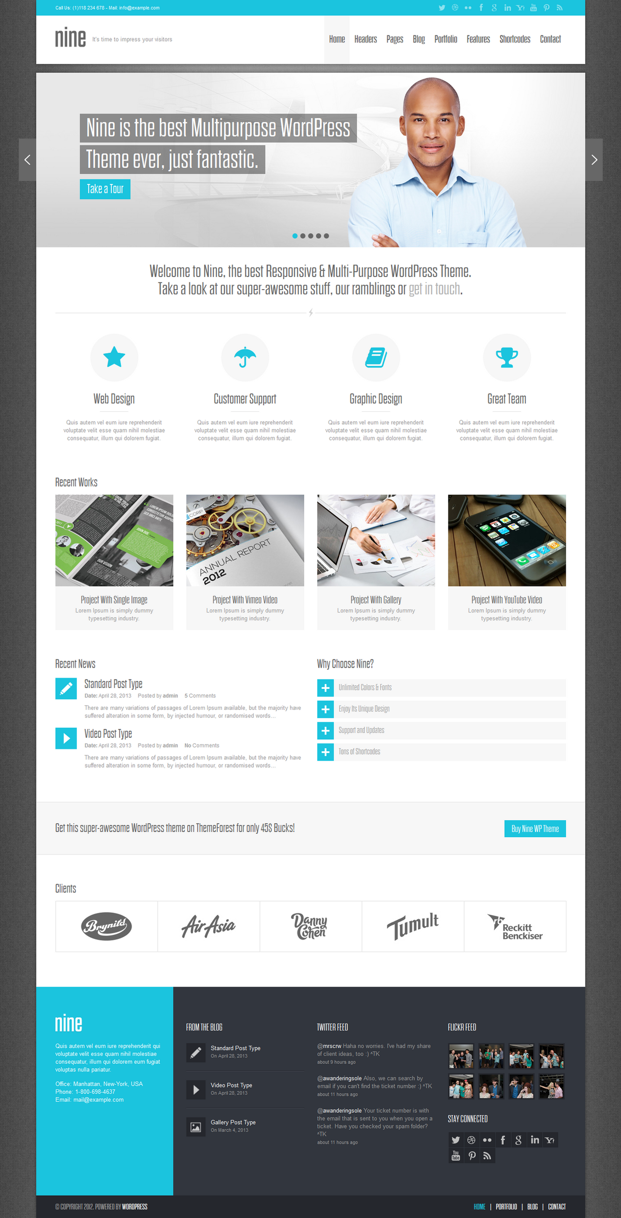
In this template i did experiments on minimal techniques. I tried to fuse cleanly minimal and web2.0 elements.This template can easily implement in wordpress. If anyone interested email me or skype me.
Let me know your comments.
Edit::
1. Changed Portfolio button.
2. Decreased glow in read more text.
Note:All images are used for presentation purposes only.
Also check my other minimal designs-
Follow Me @ Facebook - [link] || Twitter - [link] || DesignersCouch - [link]
For design consultation - Email - palprince@gmail.com || Skype - princepal-designer
Related content


Comments: 68

👍: 0 ⏩: 0

Hi, nice work ")
👍: 0 ⏩: 1

I used 3-4 fonts, which fond you wanna know. Please specify.
👍: 0 ⏩: 1
sorry, the font of the title, Think360Studio
👍: 0 ⏩: 1
thks a lot  (Smile)")
👍: 0 ⏩: 1

You should allow large view.
It is hard to really give a comment when you can not see thew detail of the work,
👍: 0 ⏩: 1
actually some people copied design, so thats why its small
👍: 0 ⏩: 1
Yep but you can not tell quality or actually give any form of feed back when the design is this size.
Looks great small but blow it up to regular size and it may look really crap.
👍: 0 ⏩: 1
The issue is with the size reduced a large amount of quality can be lost. Also a design when in full size may look completely different. A graident that does not look right when small may make complete sense when full. Patterns on backgrounds and textures do not show up the same when large also.
So any one who says awesome or amazing to your work is really just saying it based on what they think rather than what is.
Why the design you have does look well done in small I can not really say it is great when in its original quality size it may not work
👍: 0 ⏩: 0


Hi, i add your design here [link] hope you don't mind
👍: 0 ⏩: 1


i like your style. Its simple but with a sense of occasion to it. If you know what i mean
")
👍: 0 ⏩: 1


Don't the buttons at all, they look tacky by comparison to the rest imo
The rest of layout, looks great though, nice use of space in content
")
👍: 0 ⏩: 1
lol you are right, i changed that button.
👍: 0 ⏩: 1
hmm much better, but still i was thinking more along the lines of a similar look color wise to the color bar in the very top of the header, just thought it would make it all blend more
 (Wink)")
👍: 0 ⏩: 1


Gorgeous, the only things that concern me is the outer glow on the read more buttons seems a bit strong, and the check our portfolio link doesn't feel right with the rest of the layout.
great job!
👍: 0 ⏩: 1
thanks for comments, all makes sense
👍: 0 ⏩: 1
so much better, excellent job!
👍: 0 ⏩: 1

I like the footer, logo, nav and banner. not keen on the three icons they looks to "stock" if you get me. I would also alight the text left on the services part and give the paragraphs (through the full site) a little more line spacing. makes a big difference on the feeling of the text.
A very nice concept though. Good work.
👍: 0 ⏩: 1
yes 3icon are stock. thanks for comments John...
👍: 0 ⏩: 0

Cool layout.
One think I don't really like is the Check Our Portfolio... It doesn't sound right.
Maybe Visit or View Our Portfolio?
👍: 0 ⏩: 1
| Next =>