HOME | DD
 prkdeviant —
Job Portal - wordpress
by-nc-nd
prkdeviant —
Job Portal - wordpress
by-nc-nd

Published: 2010-11-26 13:12:31 +0000 UTC; Views: 32580; Favourites: 242; Downloads: 758
Redirect to original
Description
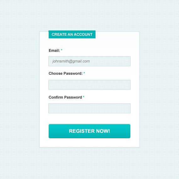
this is the latest wordpress theme that I was working on.. this is our home project which our company going to launch soon.. a job portal where you will find all kind of jobs...will update the link soon and keep you update... please be update and visit my portfolio..
visit our website [link]
please give your valuable feedback it will help us to improve
-----------------------------------------------------------------------------
Updates :
- Login
- Added browse by
-********************************************
Ohh my I got my first DD thank you so much Lilyas.
Related content


Comments: 76

Great use of color, especially in the gray mockup.
👍: 0 ⏩: 0


thanks man  (Smile)")
👍: 0 ⏩: 1
")

I love it! Even the vector-y feel is wonderful :3
👍: 0 ⏩: 1


Thank you so much
👍: 0 ⏩: 0


very nice! I love the color scheme and the typography is nice too. It's good to see real web design on deviant art.
👍: 0 ⏩: 1

Thanks ma friend.. r u from india?
👍: 0 ⏩: 1
hmm good one
👍: 0 ⏩: 0

Nice, simple design and good colour mix. I think that dark one is much better.
👍: 0 ⏩: 1

This one is really really good ! Love the brown version. I would just lighten the text
👍: 0 ⏩: 1
yeah I thinks that too.. but right now the text is gray and not readable will upload the revised version soon
👍: 0 ⏩: 0

header is great but text is reaaaally hard to read. It needs different color and maybe size.
👍: 0 ⏩: 1
thanks for the suggestion will work on it and upload it again
👍: 0 ⏩: 0


very nice. I like the dark version myself.
👍: 0 ⏩: 1


Cool style ;D
Nice to see some innovation in webdesign ^^
👍: 0 ⏩: 1
thanks man I am glad you liked it
👍: 0 ⏩: 0


yeah, I like all the colors. but I wouldn't use dat bit 'glossy' effect on "popular jobs" button but anyway it's great ; ) use it on : D
👍: 0 ⏩: 1
thanks.. will try to remove that glossy effect.. still working on the design
👍: 0 ⏩: 1
 (Wink)")
👍: 0 ⏩: 1
| Next =>