HOME | DD
 Process-junkie — Magazine Spread test -1
Published: 2010-03-16 02:08:12 +0000 UTC; Views: 5543; Favourites: 22; Downloads: 3095
Redirect to original
Description
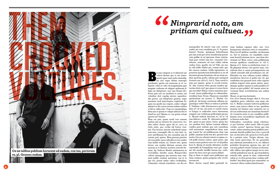
just fooling around.Related content


Comments: 21

Sorry I just figured out right after posting the message… I was in the "paragraph style"window and not in the "paragraph" one, ffs.
👍: 0 ⏩: 0
Hey there. Just want a tip if you don't mind. As I bet you did this with InDesign, I was just wondering how did you manage to set the drop cap so it does not apply to every paragraph in the text. Thank you !
👍: 0 ⏩: 0


Ahh I love TCV, so This immediately caught my eye in my deviation stack
 - :P")
👍: 0 ⏩: 1
 (Smile)")

great layout!I love the combination of gray photo and transparency type...and I really like the idea of the white space in the right page!!!the only I can see different is the double black line at the top...nice work though!
👍: 0 ⏩: 1

Hey, thank you for the comment. Cheers.
👍: 0 ⏩: 0


this is really gorgeous. i don't think it would be a bad idea to lower the opacity of the foos, but everything is pretty much perfect..
👍: 0 ⏩: 1
thank you so much.It means a lot to me.
👍: 0 ⏩: 0

it's simple, but effective. my eye went straight to it, so it's done its job.
👍: 0 ⏩: 1

Nice piece of work, caught my eye because it's similar to what im working on atm ^^
👍: 0 ⏩: 1

Do you mind if I ask for advice on creating really beautiful columns of text?
I have projects in class right now where I'm required to create different columns of text, [justified] and I'm not sure how. I've tried making some lines with too much space at a slightly smaller size, expanding letters for other lines with too MUCH space [as well as adding extra kern].
Any tips or advice for an aspiring graphic designer?
[I love your columns of text!]
👍: 0 ⏩: 1
Hey, thank you for your comment. What software do you use? Both Indesign and Illustrator have options for making columms and justify the texto (make all lines with the same width)You can see a little more about it in this [link]
Hope i could help.
👍: 0 ⏩: 1
Thank you! My professor wants justification to be done manually AFTER all the adobe stuff, which is difficult [ie: kerning/condensing lines based on how much white space there is]
👍: 0 ⏩: 0

cool!
foo fighters rulz
(small thing: i maybe bring the 'B' little more to the left)
👍: 0 ⏩: 1
Thank you for stopping by.
👍: 0 ⏩: 0