HOME | DD
 ProgressingArtistry — Kath

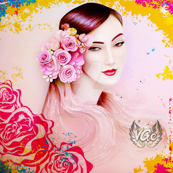
#kathrynbernardo #beautifulgirl #beautifulwoman #kathryn #girlpink
Published: 2017-12-20 20:27:25 +0000 UTC; Views: 1741; Favourites: 27; Downloads: 1
Redirect to original
Description
Was trying different style. I don't know if it turned out good or bad.I had fun making this one though.
Feel free to express your thoughts in the comment section.
Related content


Comments: 7

Hey! I'm here from :iconprojectcomment:
None of this is intended to be mean!
I really like this piece. The shirt color looks nice with her skin tone. One thing is that her lips look a little wonky, if you look, you can see that they don't quite match up. I like the detail in the skin, it looks like actual skin. But another thing is you could use work on the details on the lips, or around the corners of her eyes. You don't have to do that if you're not going for a fully realistic look, but if you are, you should try to do the piece of skin between the bottom of the nose and lips. If you don't want to do that, then that's okay. I like the line colors that you used, as well as her eye color. The color of the lips looks a little bit too light, but it's okay if you're going for a more natural lip color instead of lipstick. Also, her lips look kind of bumpy, but that's okay if you're trying to make it that way. The shading on the shirt looks a bit thick for the little strands of hair, though. You could use less pressure on your brush if you use pen pressure, or make the brush smaller.
Overall, this is a great piece of art, and I'd love to see what you'll do in the future!
👍: 0 ⏩: 0

Hi there! I'm from ProjectComment
I love the realism you experimented with here! Although the hair looks sort of off, I really like every part of this piece of art.
The shading is quite amazing, though the eyes and lips look sort of weird because of the way you shaded them. I'm not going to say much on the shading, because of the cartoon look it gives I'm just going to assume that you were trying to make it look cartoony. If you do want more tips on the shading however, then you could take a look at this tutorial that was very helpful to me:
www.youtube.com/watch?v=PDt4PD…
The palette is great, but the colour of the lips and the colour you used to shade the cheeks look a bit off and out of place. Maybe if you used a colour that better fit your palette, it'd look much better.
Another thing I noticed is that the shoulders look too large and it's up a little bit too high, not a pose that would be comfortable in real life. Try lifting your shoulders that high. Uncomfortable, right?
The hair is really round, bouncy and fluffy looking while the rest of the piece looks sharper and has more edges. If the hair was sharper looking and had highlights it'd match the rest of the piece much better. The eyes are a tad bit too big, as well as the lips. You should always use a reference by the way, if you did then try to look at it more often.
I hope you have a lovely day/night/afternoon!


👍: 0 ⏩: 0

Hi from ProjectComment ! I'm here as part of the Everything Must Go contest
I think that the lines for this drawing are really clean and varied. I like that you gave the major features of the woman's face, such as her chin and nose, thicker lines, while giving the areas that one would expect to be more subtle, like the eyelids, thinner lines. I also like the boldness and sharpness of the shadows on the lady's face and how they complement the sharpness of the lines; that said, I'm not sure that the light source would be able to produce the Z-shaped shadow between her eye and eyebrow. Given the relatively smaller and tamer shadows in the rest of your drawing, this unfortunately becomes a bit distracting. I'd suggest looking at pictures of high-contrast lighting, such as this one , for a guideline on where the shadows should be.
I personally prefer how you did the hair in the below piece. The strong highlights, coupled with strong shadows in the hair made it look both voluminous and flashy.
Here, the hair looks nice as well, and it's of a level of detail and realism that fits the rest of the piece. However, the lack of strong highlights also makes it look flatter, and it looks like a different style was used to paint it. I would suggest coupling similar levels of blending together - for example, because you use a lot of sharp lines and shadows in this piece, the hair would be more consistent with the rest of the lady's features if you added sharp highlights and shadows to it.
Overall, your new style looks promising, but needs a bit of refinement. I think that your experimenting with new styles and techniques has helped you improve very quickly in a short period of time, and I look forward to seeing what you will do next 
Hope this helps, and keep up the excellent work!
 (Wink)")
 (Smile)")
👍: 0 ⏩: 0
I am commenting here on behalf of
Also I am a warrior of the critique CRITmas Ninja force
My first impression is that it is a beautiful and lively girl's portrait.
I like the detailed facial features like the lips (the little indents) and the eyes. You have drawn her eyes looking directly at the observer of the picture. Also the shadings between the eyebrow and the eye are fine.
But most artistic I find the freckles on her cheeks: They are barely noticeable but they are there. Great work
Also the black background highlights the "light" portrait in the foreground better.
The only thing is that I miss the neck of this young lady. I can make out a shoulder directly at the ear. Perhaps here should work out a little better to distinct body from face.
Overall, it is a really colourful and cheerful picture. Keep up your good work.
Merry CRITmas
👍: 0 ⏩: 0

Hi! your art style is absolutely beautiful i cant get over it!! i think it would be really cool if you ever decided to sell your art to do a mini zine collection of art! or stickers so i could cover everything i own with them ♡ Have a nice day!
👍: 0 ⏩: 0


Beautiful stuff! Maybe the hair could use a little more depth on the dark side, but that might overpower your pastel-ish palette. Or, some higher hi-lites. Applause!
Call me picky, but something seemed off to me about the mouth. I put it into GIMP and rotated the face vertical and stacked a reversal to match pupils. It looks like the mouth might not be wide enough toward the right side, or it's tilted slightly compared to the eyes. At first I thought it was the chin, but that works well with the rest of the structure. You asked for thoughts, and symmetry is one of my weak points, so maybe I'm just sensitive. Have fun!
👍: 0 ⏩: 0