HOME | DD
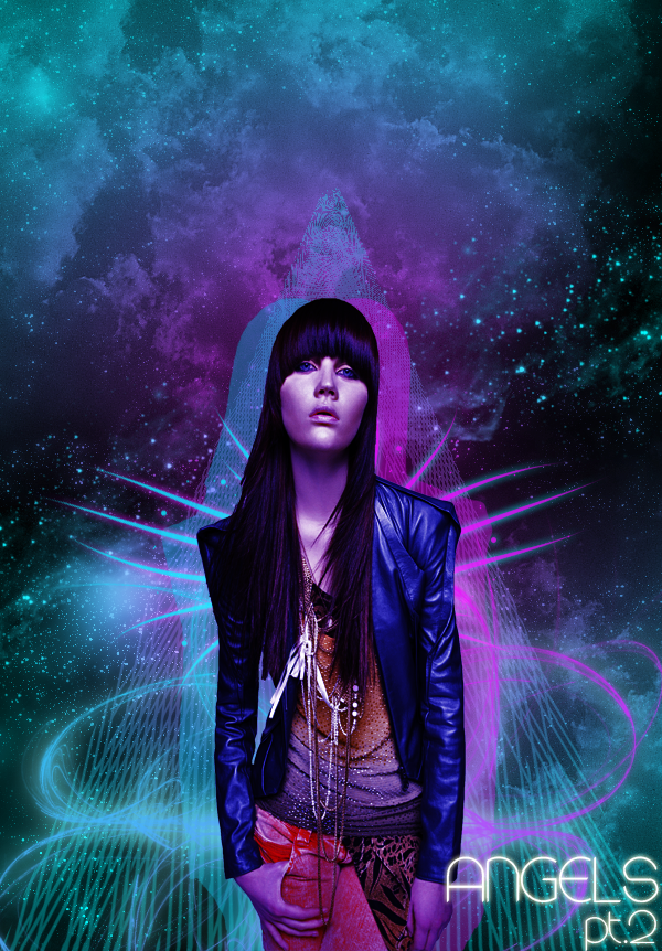
 Puggernaut — Angels Part 2.
Published: 2009-08-07 00:52:34 +0000 UTC; Views: 742; Favourites: 10; Downloads: 34
Redirect to original
Description
Okay I think this piece tops my last!This is the sequel!
I hope you like!
Critique if you can!
;]
Dedicated to the song: Angelface by Atmosphere.
Stock provided by:
[link]
and brushes found on DA!
Related content


Comments: 29


")

Hey already lots of good comments. I'm no graphic designer the only thing i would say i think the girl looks a bit somber in the face! the art work is great!!!!
👍: 0 ⏩: 1

Looks absolutely great! The colors are amazing!
👍: 0 ⏩: 1


Thanks!
Nice gallery yourself! ;]
👍: 0 ⏩: 1

Ok, I'll critque your work. First off, great color scheme. The blues and violets complement each other nicely. Also, it's good how you how have your subject in the dead center of your photograph, because your artwork's middle section should always be occupied with something. The negative and positive space balances well because of this. I can also tell you like traingles because it's a repeating shape in your artwork. That's cool 8) I can't really find anything I need to pick at besides maybe the title being in the work itself? But that's just me, I like art to not have any labels or titles...but it's presented in a way that's not too overpowering.
All in all, great! Keep it up!
👍: 0 ⏩: 1
Thanks!
Ill take everything into consideration! ;]
👍: 0 ⏩: 0


That looks really cool! I love the colour scheme you used its really bold!!

👍: 0 ⏩: 1


👍: 0 ⏩: 1
Thanks so much!
I tried to take everything into consideration and tried to blend the stock image in.
👍: 0 ⏩: 1
for sure, you can definately see that. it looks like a complete image rather than model on top of a background. I don't really have any more suggestions so now you can just keep on improving and try new tools, techniques, and or the stock images you work with.
👍: 0 ⏩: 1
fer sures.
thanks for all your help dude!
👍: 0 ⏩: 0
thanks!
yeah thats probably like my favorite color scheme.
so electro! ;]
👍: 0 ⏩: 1

Your Welcome and hehe then you must have been listening to some Electro/Techno Music while working on it xP
👍: 0 ⏩: 1
Yeah I love electro.
But its actually dedicated to an underground rap song.
It's an effinn' sick song!
👍: 0 ⏩: 1
hehe then Mind Sharing? ^_^
got me interested xP
👍: 0 ⏩: 0