HOME | DD
 Purity05 — Counting Down to Infinity

Published: 2005-06-21 01:24:35 +0000 UTC; Views: 1441; Favourites: 37; Downloads: 371
Redirect to original
Description
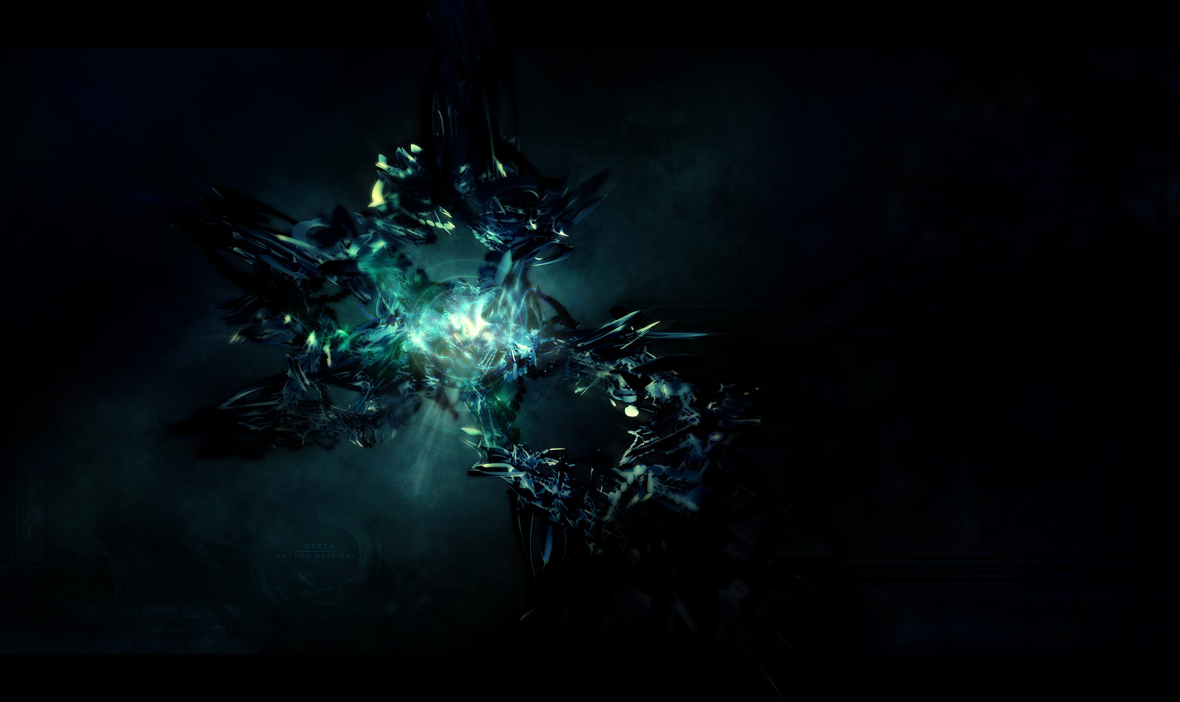
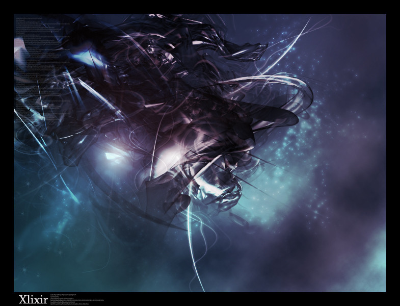
well, i haven't made anything good in a while, figured i'd submit something before i head off to florida (Smile)")
This one was pretty fun to make, i used to have a bunch of different colors but just decided to leave it with the subtle greens and blues
comments and
 are appreciated
also, i don't like to hear that it's too grungy, because i don't want this being labled as the typical abstract (i just didn't know where else to put it)
i felt that it added a darker feel than softer airbrushing would, and i think it turned out pretty well
Related content


Comments: 30


nice work ... its rough around the edges :claps:
👍: 0 ⏩: 0


Very nice job. Looks great. I like the overall color theme a lot. Only problem would be the super trendyness... you have so much talent, put something super orignal in your next piece, I know it will be great.
👍: 0 ⏩: 0

Nice job
I see you hit the fee dead on.
It has a nice dark but soft feel to it.
Did you do the render yourself?
What I really like is the background and the surrounding atmosphere.
Nice job
👍: 0 ⏩: 0

I Love it. I Love Green and I love the Render! Great Job!

👍: 0 ⏩: 0


[link]
coming soon, it'll pwn your ass
👍: 0 ⏩: 0
well its a shame that the admin doesn't.
👍: 0 ⏩: 0


Very, very nice...can't find any faults, one of your best pieces.
👍: 0 ⏩: 0


wowza thas awesome unlike everyone else i like the numbers lol not sure if they go with the piece but i still like them
👍: 0 ⏩: 1
thanks lol.. they actually are there to add to the "counting down to infinity" which makes no sense, because infinity is a large number, so it is backwards because i am trippy lol
but i thought it fit anyways
👍: 0 ⏩: 1

actually infinity isnt a large number. its not a number at all. its just an idea or a theory. nothing can be infinite or it is mathmatically impossible. but the name is catchy....i understood what you meant (:
👍: 0 ⏩: 0

that is awesome!! i like the "chaoticness" of the brushing
👍: 0 ⏩: 0

Awesome work pur, great composition of render and brushing
👍: 0 ⏩: 0


i love the sharpness, reminds me of jashin's brushes.
+fav. nj.
👍: 0 ⏩: 0

awsome man, yea i dislike the numbers
but im glad u took out the original green and blue and went in this direction
👍: 0 ⏩: 0

very nice, love the colors and the grungy feel, i would tone down the omni text though, it stands out to much (maybe just lower the opacity) as compared to the other text and the render, as it is the only white thing on the whole canvas.
very nice overall.
👍: 0 ⏩: 0


i love it
my only complaint is the size ")
👍: 0 ⏩: 0


the brushing, the colors, the composition, the position, everythings look so awesome bro! Your a lucky bitch your going to florida and gonna eat plenty of good oranges ")
 (Wink)")


👍: 0 ⏩: 0
