HOME | DD
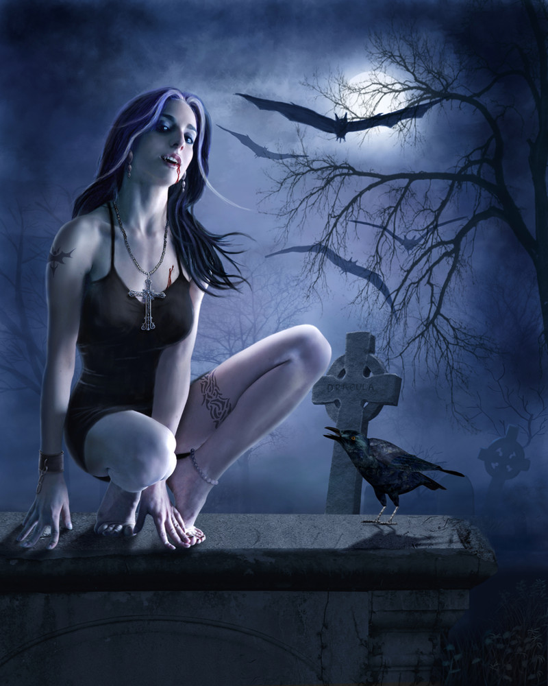
 Pygar — Vampires

Published: 2010-02-26 09:58:05 +0000 UTC; Views: 37920; Favourites: 809; Downloads: 0
Redirect to original
Description
It's a long time since I did anything gothic\vampirish so I feel this is well overdue!Everything painted although I used a texture for the pattern on the bodice.
This took about 30 hours over two weeks but I'm rather pleased how it turned out!
Related content


Comments: 193


 (Smile) - :)")


wow this is amazing hon, she is gorgeous
👍: 0 ⏩: 1

Thanks very much and thanks too for the 
👍: 0 ⏩: 1


Fantastic work, Derek!
Are you using this as an interface or in print? Just curious because of the category
It's really great...your digital painting skills just keep improving!!


👍: 0 ⏩: 1
Thanks! Haha, I only put it in that category as I've seen others use it and it's sort of an under used category especially compared to Painting and Airbrushing! I was to be honest a bit disappointed with my last three even though I'd put a lot of work into them, I'm much happier with this one though so hopefully it starts a trend lol!
👍: 0 ⏩: 1
You should join
Also, did you know that ImagineFX is on dA now??
And I just ran across a really interesting blog entry about artists and learning curves here: [link] 

👍: 0 ⏩: 1
Haha, I joined #PaintingDigital a few weeks ago but they rejected all my submissions! I may have one more go and submit this one tomorrow and it it gets rejected I'll give up on them!
No, I didn't know ImagineFX was here, by far the best magazine and the only one I have a sub with at the moment!
I'll take a look at the blog!
Totally spammed out!!!
👍: 0 ⏩: 1
They rejected you??? Really?? Well, that's crazy...
yeah, try the latest one...it's really good...don't give up!! Your stuff is really good!!
 - :p")
👍: 0 ⏩: 0

oo I love her outfit. Your digital drawing just keeps getting better and better.
👍: 0 ⏩: 1
I'm pleased you think so, thank you!
👍: 0 ⏩: 0


great stuff man  - :D")
👍: 0 ⏩: 1
Thanks, the size was supposed to be due to the perspective. Anyway, maybe I'll shrink it down a bit now!
👍: 0 ⏩: 1
oh, maybe i'm mis-seeing the perspective  - :?")
👍: 0 ⏩: 1

oooh ok, yah it is difficult to tell

👍: 0 ⏩: 1
Even though I sort of have an excuse for how things were I've now shrank down the hand as I do think first impressions are important and I value your opinion!
👍: 0 ⏩: 1
yay! 
👍: 0 ⏩: 0

i do really like it but- (i have to say somthing not so positive even though i cant do anything even a fraction as good.)-the like arm part thats like joing to the wrist looks a little chubby if u kno wat i meen comapred to the rest of her body
👍: 0 ⏩: 1
Thanks for the comment, the thickness of the wrist was due the the angle but since you think it looks wrong I may shrink it down a bit!
👍: 0 ⏩: 1
oh sorry no dont change it  - :O")
👍: 0 ⏩: 1
It's ok, I was a little unsure myself so your comment just convinced me to shave a small amount off!
👍: 0 ⏩: 1
oh .. i suppose thats ok then
👍: 0 ⏩: 0


Hi dear!
Is there a contest going on?
I saw Elena's and while not the same - the concept is similar and the category hers was in was initially "Designs and Interfaces".
Just curious if it's for a contest.
Lovely work!
Claudia
👍: 0 ⏩: 1
There's no contest I'm aware of! I saw Elena's yesterday with some similarities but purely a coincidence!
Thanks for the fav Claudia!
👍: 0 ⏩: 1

It's truly a thrilling and enchanting piece of art. I'd say my favorite part is the background; the shading compliments the chilly feeling it recalls. I'm totally into the bigger tree and the mist thing.
As for critique, I'd say the moonlight seems a little unnaturally light, and thus the light doesn't seem to truly accomplish the spooky effect you were undoubtely wanting to obtain. Furthermore, the front leg and arms appear quite odd, and I'd work on the skull anatomy.
The overall picture pleases me though - keep up the good work.
👍: 0 ⏩: 1
Thanks for your comment, I have made some changes to her arms and the skulls!
👍: 0 ⏩: 1
Woahh, I can see that. It's looking beyond awesome now : D
👍: 0 ⏩: 1

<= Prev | | Next =>