HOME | DD
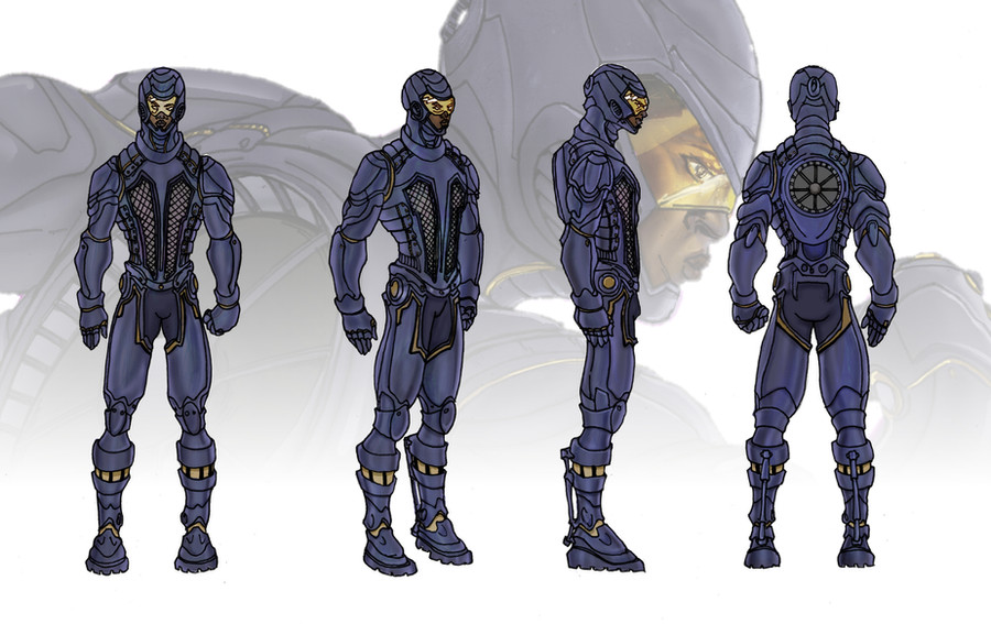
 pyroglyphics1 — Aizan Color Test

Published: 2012-09-27 15:43:27 +0000 UTC; Views: 2302; Favourites: 63; Downloads: 0
Redirect to original
Description
Ok, peeps, it's crunch time. After A LOT of meditation, staring at screens, and tallying polls, my OC character Aizan's color scheme was narrowed down. What say the masses? Which one is your fav?Related content


Comments: 33

Id say B. its more mercenary like that would seem to suit the character design.
👍: 0 ⏩: 0

One day, i hope i can draw stuff like you. ")
 (Smile)")
👍: 0 ⏩: 1

If a schmuck like me can do it I don't doubt you can make it happen.
 (Wink)")
👍: 0 ⏩: 1
Really?! Thanks! You are inspirational!
👍: 0 ⏩: 0

After looking over this again I gotta go with A since the black helps with the ninja look and it better complements the design all together.
👍: 0 ⏩: 1
Thanks for the input, fam.
👍: 0 ⏩: 0

I vote A. I prefer the darker scheme, also will probably help her blend in more as you mentioned at the Hershey Con that she'd be a ninja-like person.
Made a Deviantart account just to chime in, lol. Aizan looks much better on my screen at home than trying to see the details at the con due to the expansion making it hard to detect.
👍: 0 ⏩: 1
That's the dedication I'm talking about. lol Thanks for the feedback.
👍: 0 ⏩: 0

I used to prefer B, but Gavin makes some great points. I'm switching to A.
👍: 0 ⏩: 1

Peace!
My son (8yrs old) likes A because he says the darker pants suits the armor.
I agree
👍: 0 ⏩: 1

B feels like it is popping off the page, maybe because of the gray backdrop. B has that urban/military vibe and the white top feels less out of place. I would think if you are gonna be all gray in A, you'd prolly wear a gray top? Sheeeeet, I dunno. Bright yellow scarf!
👍: 0 ⏩: 1
You just changed the game, Wally!! Consider my mind BLOWN!
👍: 0 ⏩: 0

I voted A on FB and I'm voting A here. I like the more unified color scheme of A. B doesn't look bad, but the brown feels out of place.
👍: 0 ⏩: 1
Interesting analysis. Thanks, bruh.
👍: 0 ⏩: 0

Looking at A, but I feel if B had a darker color sash that would be cool too.
👍: 0 ⏩: 1

If everyone says A, I say B. Gotta be different, bro.
👍: 0 ⏩: 1
Thanks Chris. And oh yeah, some contributing art from you would be SICK!!
👍: 0 ⏩: 1

Sure thing. Just let me know when!
👍: 0 ⏩: 0

I bow before your wisdom, sir.
👍: 0 ⏩: 1

Thanks for chiming in, Nate.
👍: 0 ⏩: 0

I'm liking A. The whole ninja vibe comes of strong with that one lol but to be honest It has just the right amount of color. With B i feel as if it's too busy.
👍: 0 ⏩: 1
Can't thank you enough for the feedback.
👍: 0 ⏩: 0

Gotta say, I prefer A (that rhymed!). On the B version, my eye just kinda gravitates to the brown pants without moving. With the gray pants, I find myself looking at the face first (which is, I assume, what you want
👍: 0 ⏩: 1
Great breakdown, thanks.
👍: 0 ⏩: 1