HOME | DD
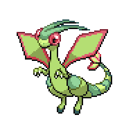
 Quanyails — Flygon

Published: 2012-09-05 19:26:22 +0000 UTC; Views: 1926; Favourites: 155; Downloads: 16
Redirect to original
Description
I'd like reception on this, in a nutshell--that lighting that I'm trying out (and the lack of overlaying colors due to one layer only) and perspective (mostly on the wings).Gah, those wings were annoying, since they're flat rather than textured so I can't find miniature shadows without looking at the entirety at the shape, and how light applies to that. I ended up with really wonky gradients.
At least it's something I like drawing and is relatively easy to draw.
") That doesn't plummet the drawing into entire chaos.
That doesn't plummet the drawing into entire chaos.Edit: Updated with that shape changing.
Flygon's design is under intellectual copyright from Game Freak; I only used it for testing and nothing for gain.
Related content


Comments: 28


Far from it. @_@ Maybe I'll settle for demigod, and in the sense of a divined person rather than half-human, half-god.
👍: 0 ⏩: 0

You are an amazing artist! I could never pixel something like this!
👍: 0 ⏩: 1
Hey, you probably could with practice!
👍: 0 ⏩: 1
I guess you're right. Practice makes perfect! :3
👍: 0 ⏩: 0


It does seem thin around the torso, but good job nonetheless
👍: 0 ⏩: 0

It looks pretty good, but the only problem is that it's body is a bit too thin
")
👍: 0 ⏩: 1
Thin? O.o I can see that around the torso, but it's a bit otherwise by the neck.
👍: 0 ⏩: 0

I think the gradients on the wings are actually really nice.
the soft orange lighting works really well too. My only complaint is that his hips aren't wide enough; Flygon has something of a pear-shaped body.
👍: 0 ⏩: 1
The body is rather tube-like, isn't it, perspective aside? :/
👍: 0 ⏩: 1
Actually now that I look at flygon more I see the pear-shape is due to the large thighs. I think what's gone wrong here is that the neck is much too wide, making the whole body look too uniformly thick.
👍: 0 ⏩: 1
I wonder how to simultaneously make the neck look thinner while keeping the head's appearance of being directed forward. :/
👍: 0 ⏩: 0

I really dislike this style, I think it's far too smooth and it just looks like the pixel art equivalent of adding a gradient in Flash or something...I know that's not very helpful, I'm sorry! D:
👍: 0 ⏩: 1
Hey, smooth is good. Better than jagged. Perhaps the fact that it's not sharp is what you intend to say?
👍: 0 ⏩: 1
Nah, I meant to say that I think the amount of dithering makes it look like there are more colours than there are, which is normally a good thing but on something so small it just makes it look to smooth and unrealistic. I'm not expert though, please dont quote me on that!
👍: 0 ⏩: 1
Heh, cel-shading isn't realistic in of itself, either.
👍: 0 ⏩: 0

this is an interesting way to shade; very different from your normal style!! I hadn't even realized it was you! :0
👍: 0 ⏩: 1
I was contemplating having a light from the back and some colored reflected light, but some of it worked, and some of it didn't. But it's at least okay?
👍: 0 ⏩: 1
hmm wonder how that would have looked like; and yeah its still good!
👍: 0 ⏩: 1
Would've taken a lot more colors. XD
👍: 0 ⏩: 0

Well after noticing what folder you put this in you deserve props for making this in MS paint..... My only complaint is that the light changing on the wings look a bit too obvious and that I can see the dots in between each shade change. Then again it is ms paint and there's only so mutch you can do but other then that its great
👍: 0 ⏩: 1
I could add more shades rather than dithering. X3 But my palette, I figure, is good enough.
👍: 0 ⏩: 0