HOME | DD
 Queen-KittyKat —
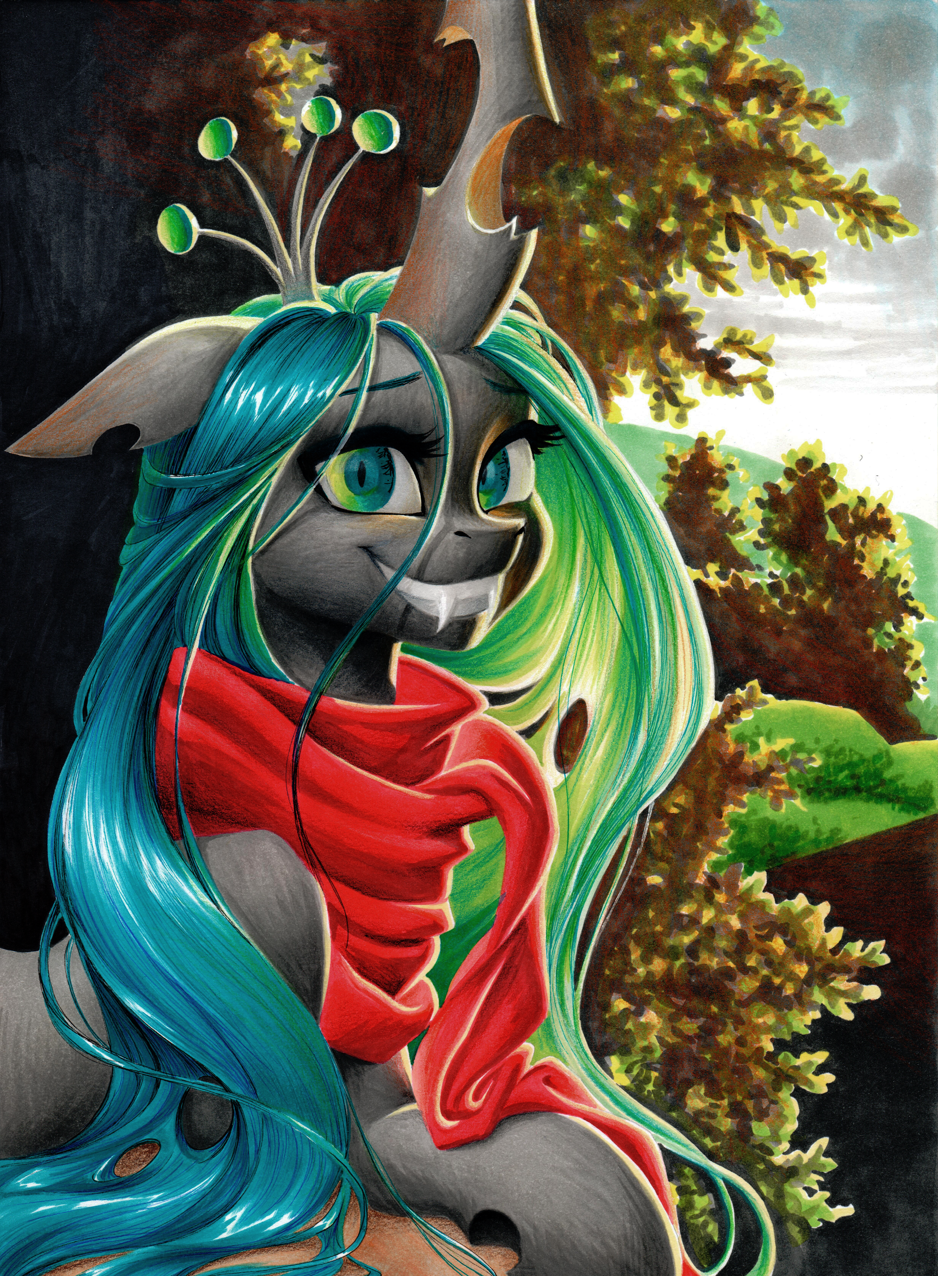
No Risk No Fun
Queen-KittyKat —
No Risk No Fun

Published: 2014-09-27 16:43:52 +0000 UTC; Views: 92464; Favourites: 5440; Downloads: 1824
Redirect to original
Description
The title fits this drawing perfectly, because Celestia tatooed her arm and because this was my first tryon drawing with copic markers
I got a few shades as a gift for my confirmation, two weeks ago c:
Okay... I must say, I really made myself proud this time

I've never done something more realistic looking in traditional art ...well at least in my eyes it looks realistic xp
I love it so much! ;w;
Please critique this drawing, because I'm blinded by pride right now
")
Tools: Fineliners(black, light blue and purple), colored pencils, 8B pencil, felt pens for children, copicmarkers, promarkers
Paper size: DIN A4
Time: 8-10 hours
Update: My first DD omg omg omg!!! hooowww???? GAAHHH
Thank you so much, TheCreativeJenn , for the DD award!!!

And also a big big thank you to AviAlexis25 for suggesting it! You are the best sweetie ;A;
I can't believe it ><
And everyone, thank you for the sweet comments and faves <3
Thank you thank you thank you!!!! I WUV ALL YALL!!!!!

Related content


Comments: 564

👍: 0 ⏩: 0

👍: 0 ⏩: 0


Vision
Technique

First off, let me just say that this is far better than I can do, but "better than what I can do" isn't very good feedback on a critique. I'm not much of a critic, because everything is art in its own right in which that no matter the artist and no matter the art work, it's still something that takes effort. So, that being said, onto the critique. Don't take any of this to heart, as it's not meant to be offensive.
Positive:
-I like the curvature of what I can make of her body.
-The hair is gorgeous, as is that dress.
-The tattoo is pretty dope, I kinda like it.
Negative: (okay, now it gets hairy)
-Her boob seems a little too...large, I want to say? As if it's somewhat out of proportion.
-Her arm doesn't exactly have much form to it, it's more like a white log that comes from her shoulder. It looks like it could have used more shaping and conditioning.
-Her chin: her chin looks like it's not even part of her muzzle, and makes her muzzle look like it's a large nose. Try bringing the chin and mouth out a little bit to meet with the muzzle.
-Her jaw line and head are a little wide, but I can tell that's your style of drawing. e.deviantart.net/emoticons/s/s… " width="15" height="15" alt="
 (Smile)")
-Her ear, like her jaw line, is a little too wide and looks like it could have been a little taller.
-Her eyes are too large, it kinda makes her look like an alien more than a pony.
-Her crown is missing, but that's probably intentional :3
-The color of her eyes: Celestia's eyes are really more of a magenta than purple/blue. Try combining magenta and dark pink next time. e.deviantart.net/emoticons/s/s… " width="15" height="15" alt="
-Her horn: like her boob, it just looks a little out of proportion is all.
Overall:
Over all, I still REALLY like it. Like I said, I'm not much of a critic, but if some one asks for a critique, assuming they want feedback both positive and negative, I try and do my best to focus on more of the negative than positive; I find it may help out more.
Don't get me wrong, it's an AWESOME piece of art work. Over all, great job!
👍: 0 ⏩: 0

I have to say, this deviation is the most beautiful artwork I've ever seen.
The expression, the shading, the pose.
Those eyes, they say so many things!
I Absolutely love the effort you put into your artworks, the hair is lovely!
But the face,oh, the face, it express such a feeling! You make your artworks come to life.
It is truly beautiful,the tattoo is very attractive to the eye, the landscape is so eye catching.
You made the wings look like if they actually had feathers on them!
This is so life like, I love it, keep up with the amazing work.
👍: 0 ⏩: 0

Overall
Originality
Impact
This is a beautiful drawings. It really is. It's well-made and the style is absolutely gorgeous and you used your tools very well, but... It's kinda creepy. REALLY GOOD, but I can't get over that like... Smooshed pony face. And the breasts. There, something on the negative side to even it out. I know its supposed to be an anthropomorphic animal and "Furry", but I always thought detailed Furries looked a little creepy because they can fall into the unvanny valley due to their ALMOST human features. I'm also not the biggest pony fan. But please, keep up the good work! You are a very talented artist and you should be very proud of your work. Pride and confidence in your art is important.
👍: 0 ⏩: 0

Vision
The hair king of just flops around everywhere in the drawing, plus the bushes do not look real(love the bright colors on them though!).
Overall the drawing is great thought, but i would recommend fixing these things, instead of just having dots on the bushes, show texture, but keep the colors bright, don't make it look say e.deviantart.net/emoticons/s/s… " width="15" height="15" alt="
The hair does flop around in the picture, not sure where you were going with that? But overall the image is fabulous and you should keep up the good work, just make it mare realistic for me if you can Please e.deviantart.net/emoticons/s/s… " width="15" height="15" alt="
~ArtContestsForAj
👍: 0 ⏩: 0

Overall
Vision
Originality
Impact
Overall,you did a great job.The hair texture is really well-done and the consistence of the lighting makes the drawing look realistic. A thing I rarely see in the fandom's artists that I like a lot is the light bounce. It adds a whole lot more realism to the piece. The occlusion shadows are well-placed as well.
However, we gotta go to the boring part,but a necessary one for growth: The details.
First,we don't want the attention on the background.The focus is on Celestia. So I'd recommend making the background colors less saturated so that it doesn't catch our eyes that much. Also I see there is a Rim light reflecting on the hair,however you missed that light on the exposed parts of the body,as in the chest.
The wing would look better if you add some depth to the feathers,as they look flat(as if they were printed on the wing)
As the horn comes directly from her forehead, its perspective looks a bit off. You may try making horns pointing more to the front(not directly,though) adding a bit of foreshortening. (man,I hope you get what i mean...that's difficult to explain)
I may have missed some smaller details,but I guess that's it for now. You did a great job here. Keep it up and become even greater!
Brohoof! /)
👍: 0 ⏩: 0

To be quite honest it is possibly one of the top 10 mlp fan made art works the ever be produced! The lines, curves, eyes, etc are all as perfect as a human can get. Your sading and your blending is truly a remarkable feat. This master piece is as close to if not one of the top 5 most life like mlp drawing out there. I believe that this should have no trouble getting know in the community. I look forward to you next work so long as you improve and put your all into it!
Sincerely yours,
Moonlight the Starbringer
👍: 0 ⏩: 2
6 grammar mistakes lol
👍: 0 ⏩: 0
Omg I made a couple of grammar mistakes gosh I'm a nub! Lol
👍: 0 ⏩: 0

Originality
Wow.
I don't even know how to describe it.
When I saw this I thought it was computer generated, then I read your description, showing the tools you used, and HAND MADE!? WTH! I can't even shade properly, nor color, but I'm practicing.
Really loving the details you have on the hair, grass and clothing, it looks really realistic. I'd rate 5/5 for everything, but, it's MLP based, so 4 for how kewl it looks e.deviantart.net/emoticons/let… " width="15" height="15" alt="
I'd wanna rate 5+ for everything else e.deviantart.net/emoticons/b/b… " width="15" height="15" alt="
")
A small suggestion, you should create a signature on a separate, blank sheet, scan it in, and add that to future drawings. It'll help against those pesky plagiarizers.
👍: 0 ⏩: 0

Originality
I think this is absolutely amazing. I always want to see the best out of My Little Pony fanart, and I have to say, this hit the nail on the head. I'm sorta jealous now xD I wish I were this good!
Of course, it is MLP, so there is not really that much originality there. However, the way that you created this overlooks that. The intricate detail in the strokes of the mane is what I like the most. It has a nice shine to it, and I can see the individual hairs. The dress does indeed look like fabric. However, I wish the gray shawl? was not as grainy-looking, maybe a bit smoother.
Now looking at it from a basic shape point-of-view, I can see that maybe the arm is a little tiny bit too thick. That would apply to both from a standing pony's arm and also an anthropomorphic pony's arm. The definition of the arm near the wing should probably stand out a little bit more, I feel like the arm slightly blends into the wing.
Going away from the arm, the horn is the right proportional size. The muzzle is just right, not too small and not too big, makes her look feminine. The ear is also fine, any bigger and it would have drawn away from the rest of the artwork.
I think I've listed things long enough. I shall finish off with GOOD JOB! e.deviantart.net/emoticons/b/b… " width="15" height="15" alt="
👍: 0 ⏩: 0

Vision
What really staggered me was the facial expression, shadings, and respect of the proportions. Then goes the numerous details.
I never saw a better example of talent. This IS truly an amazing drawing.
Even having an objective and fair way of thinking, there is no flaw I can come up with. The emphasis was at the right place, there wasn't too much details on the background, yet it still looks awesome, and the realism is... almost too realistic. Not in a bad way though. The hair is looking very great, as well as for the eyes.
As for my personal judgement, I am... flabbergasted. I love this drawing without a counterpart, even if it reminds me of how silly my drawings look beside this one piece of art. So I can only say: Amazing.
I know many people will be envious of your talent, but I know this will be also an inspiration to many others. Please continue to make this awesome work of yours.
👍: 0 ⏩: 1

Thank you so much
That was a nice/decent, yet very inspiring critique <3 ^w^

👍: 0 ⏩: 1
I'm glad to make you happy ^-^
👍: 0 ⏩: 0

Originality
It's hard to comment on any one particular thing about this piece, such as lighting and technical skill etc., because it all ties into each other.
What I enjoy the most about this piece is that it's done using a variety of traditional media; I can certainly appreciate the finesse required to more or less get things right the first time instead of having an undo function to fall back on.
Your technical skill, especially with the varying mediums shown here, is fantastic, and you demonstrate a sound understanding of lighting fundamentals (the lighting and shading on the head and face is especially nice).
The eyes are wonderfully rendered, and the red top creates a very nice contrast against the colors in the rest of the piece.
Rendering out the numerous individual strands of hair lends quite well to the piece as well, although the hair forward of her ear to her chest feels a bit sharp, and almost too well defined against the softness of her head and torso.
My only complaints are that the wing could use some slightly stronger shadows to help emphasize the individual feathers, and that there's some artifacting in places around the picture, particularly on her red top; I noticed the piece was uploaded in its PSD format, which defaulted to JPEG for the preview (it's the JPEG compression that's causing the artifacts). I'm left to wonder how much better it would look if it were saved and uploaded as a PNG instead perhaps?
It's still quite a nicely rendered piece however, and I'm quite fond of your stylistic choices. Very nicely done!
👍: 0 ⏩: 0

Originality
to start off I'm not the biggest MLP fan in the world, but i just gotta say, WOW. this is beautiful. Absolutely enchanting. and stunning. and every other positive adjective you can think of.
as for vision I give you five stars because the title and the picture go well together. how she's got the whole tat sleeve and everything made me squee. although i cant tell what the thing on the side of the grey cloth is. marijuana leaf?? but yeah, the vision for this pic is fantastic. i can tell you really did know what you were going for.
I'm sorry about originality only being three and a half stars, but with all the MLP FIM fan art out there it's hard to even BE original in the first place. The character doesn't look like one iv'e seen on the show though. I'll give you that.
It took me FOREVER to find even one flaw in this beautiful art piece. But after a while of searching I did notice that the perspective on her unicorn horn looks just a little off. but as for the overall colors, proportions, detail and shading everything is PERFECT. so...... drum roll please... four and a half stars!
As for impact.... oh my goodness. DROP A BOMB. I cant stop thinking about this picture its just so. so..... so.... IMMENSE. It's SO believable! I can feel the warm light that's falling on her shoulders just as if it were falling on my own. I can imagine this person as a REAL person! (I'll stop there or I might begin to get a crush on her. {she is pretty though [yeah, i have a crush now.*) She reminds me of a sweet melody like Johann Sebastian Bach's "Aria in G". Or Vince Guaraldi's "Linus and Lucy".
So without further ado, Ladies and gentleman lets give a round of applause for the amazing, the fabulous, the talented, the one and only, Ukulilia!!!! WOOO!!!!!
*yeah, definitely a crush.
👍: 0 ⏩: 0

Vision
Originality
She really is beautiful! I read one of the other reviews on this and I agree that the underside of the wing could have used a bit more of defined detail. But other than that, the rest of the drawing is great with all the vibrant color. The face is adorable and I love all the little details in the tattoo. The mane is beautiful and her body is in amazing proportion. You did an amazing job overall! I can see why it took you so long to complete, but the time was definitely well spent. I just wish I could draw like that!
👍: 0 ⏩: 0

I love how you added so much detail in your lines, The shading is done very well 100% beautiful. I love the colors and the designs you did, I am also a big fan of the tattoos they are well done on such a small canvas and I love how easy they are to see. I also like how you have made the trees look so much more different from the actually drawing of Celestia, Keep up the good work I think you did a beautiful job and I would love to see more of this from you! -D•R (2014 )
👍: 0 ⏩: 0

I think I'm going to heaven, because I've just seen an angel.
A significant aspect of this drawing, which makes it incredible, is the fact that it is done traditionally. No post editing, no erasing and no computerized support. 100% paper, tools and skills, which in current times, is an uncommon, yet important skill.
A brilliant piece contrasting the original, more purified Celestia. The attention to detail among her fur and mane is ridiculously amazing. Brining out lovely texture as well as depth to such an extent is extremely difficult, but you have been able to do so magnificently, placing individual textures to each item (fur, feather, hair etc).
Retreating back to the mane/hair, the detail is flawless. They movement and flow, how it waves around the canvas, like another character altogether, rather than falling straight and dead, is wonderful. Her hair even seems to hug her cheek.
The expressive eyes are beautiful, very unique and gorgeous. It would have been nice to use some (slightly) brighter colours, although seeing as how the main feature isn't supposed to be the face, my argument completely redundant.
A fantastic and original design on Celestia's arm looks glorious. With such symbolic art within another drawing, one may call this "Art-ception." I'm unsure of what to say about the tattoo, other than it presents an extreme amount of skill and competence. There is a clear "red" colour focus that could either display a secret story, or be coincedence. 'All the same' magical art within art, even on her... Pullover?
Lastly, a simple yet still intricate background to match the rest of the drawing. I do find it a little strange how there seems to be a grey sky in comparison to the bright green grass. Although it may take attention away from Celestia, any sort of colour would have been preferable to a dark sky.
A drawing that creates individuality and expression in a character who seemed to be as obvious as a black sheet of paper. Very clever and nothing less than incredibly pretty.
👍: 0 ⏩: 0

At first, I thought this was drawn by somebody who has been able to master the technical entanglements of Photoshop or what-not, but when I discovered that this was drawn by hand, I didn't even know what to say.
You have an extremely rare talent, that much is obvious.
I like it when artists place an enjoyable character into a setting that is natural, mundane, and just plain realistic.
Whether its waiting for a bus, eating in a diner, or sitting at the bar, when you portray Celestia in a situation like this, we see a side of Celestia that will never exist in canon, but can exist in our imagination, and when artists like you decide to show the world a side of Celestia we all have been longing to see, than it gives us great pleasure to view and admire an art piece like this.
The tattoo on her arm is just breathtaking.
You add a quality of realism that is very hard to find in a lot of anthromorphic characters, and the tattoo, the red dress, and that lustful glare that she's giving just makes this character more genuine and less generic. She actually seems approachable if she wasn't a fictitious character.
Above all, You have an amazing talent, and you have a unique vision. Don't ever lose sight of those things, and do something with your talent, if you want to.
👍: 0 ⏩: 0

I may not be a Brony, but this is really amazing. I love the facial proportions and shape. The hair is outstanding.
The background is a good thing in my eyes, it's like blurry edges in a photograph, the less detail there is in the background the more focus is Kept on the subject. If the sky were the "correct" color then there wouldn't be such a contrast for the hair to show through.
You wouldn't see points removed for a white background if the centerpiece was this good, so why would you if the artist has gone to this much effort?
👍: 0 ⏩: 0

Vision
Originality
Technique
You, as always, managed to apply your decent knowledge of light and shadow and created a great 3D felling in this piece. But what I like the most is the way you treated the background. I speak about the disaturated black part of it right now . It really helps to hold an overall feeling of depth and what is even cooler, it`s simple.
The first thing which seems wrong to me, is her horn. Imo, it`s a bit off perspective. Also the bush is distracting a bit because of its high saturation, which also harmes the feeling of depth in piece in a way.
If to be too nagging, I would also say that the shadow on her neck seems a bit wrong to me, I suppose that there should be a little bit more light. Also , the wing. I think it`s too low and looks kinda strange to me. As it`s an anthro, I would refer to an angel, who is ordinary displayed with wings situated higher.
Also I would like to give a piece of advice, about you digital works. There`re two things I would change about them. The first thing is, you paint your characters too smooth, it looks kinda artificial, imo. When I look at this piece, the fact that it was made on paper and has a paper texture is already enough to make it looks richer. The second thing is, you paint too much details where it`s not necessary. It disturbs an eye see what you want it to to see in your pieces. And instead, it`s just wandering around without knowing where exectly it should stay.
Anyway I must say you`ve done a really great job here. And the speed of your development does make me jealous e.deviantart.net/emoticons/let… " width="15" height="15" alt="
e.deviantart.net/emoticons/let… " width="15" height="15" alt="
e.deviantart.net/emoticons/let… " width="15" height="15" alt="
e.deviantart.net/emoticons/s/s… " width="15" height="15" alt="
👍: 0 ⏩: 0

Originality
Honestly, this is one of the best drawings I have ever seen. It's so beautiful, I can't even. The only thing I would change and brush up just the slightest bit is the wing, the shadows aren't totally noticeable and It looks kind of flat, and 2D instead of 3D. Other than that though, It looks so amazingly great. I love all the detail on the tattoo, the face and her hair. You have a right to feel proud, and it if was me, I'd be like flaunting it everywhere i could so people could see. You are amazing at drawing. e.deviantart.net/emoticons/s/s… " width="15" height="15" alt="
e.deviantart.net/emoticons/s/s… " width="15" height="15" alt="
👍: 0 ⏩: 0

very good! the hair texture is beautiful and the tattoos are very detailed a tee. the eyes are beautiful and all around a great job was done.i have not found anything wrong with this beautifully detailed art. the texture is very well done all through the art in the hair,shirt,wings and the background detail is very much paid attention to. so i saw job well done and five out of five in all the category.i love the detail in the tattoos like the nightmare night symbol and the scroll. my hats goes off to you because this is a job well done.
👍: 0 ⏩: 0

Wow! Seriously! This is so perfect, I mean, the shading is amazing, I LOVE IT!
It looks so real, Celestia looks very very pretty ^-^
Your technique is super cool! I don't know how can you draw so easily ^0^ the colors look so beautiful, really! You know so well how to combine dark colors and bright colors in a super cool way!!!
It looks very original, I have never seen before Celestia with tatoos XD she looks a little rebel, heheh.
Seriously, keep doing this amazing artworks, I love them so much! e.deviantart.net/emoticons/b/b… " width="15" height="15" alt="
Sorry if I have grammar mistakes......I don't speak english so well XD
👍: 0 ⏩: 0

Originality
Technique
I keep zooming in on this and seeing beautiful, beautiful detail. If anyone's reading this and hasn't: do. It's worth it.
Because you asked, I'm looking around for things to critique and not coming up with much!
The bushes and grasses in the background are very saturated green, which looks odd compared to the grey sky. Normally, vegetation isn't like that unless it's in very intense sunshine that can punch through the leaves and be coloured by it - but I think you're trying to convey a sense of a leaden grey day with a beam of intense, brilliant sunshine illuminating the character and her surroundings briefly. And I appreciate what you're doing dotting in other shades to modulate the greens' intensity.
There's a spot by her armpit where her white coat is picking up the reflected red of her dress, and parts of her neck and shoulder do the same for colours in her hair too. That works really well and breaks up the monotony of all those whites and light greys, but the same attention seems missing around her face; there are strands of green hair nearby which would affect the colour. Are you intentionally reducing the effect (to nil) to give a warmer look to her face by any change? Colour contrast from warm sunlit areas to cool shaded shadows might be a thing to try if you feel safe experimenting.
Even princesses have red blood. The insides of her ear in such intense sunshine would pick up a gorgeous gentle pink tint due to subsurface scattering.
Her hair seems very over-detailed and strandy still, but this doesn't detract so much compared to your recent digital Luna pic. The edges seem softened visually by some of the thinner strands, which is great, and give it lots of life and lightness: they break up an otherwise continuous contour. The edges of the pink strands near her ear are especially effective at this, aided by softening of the background and general lightness of touch in the area.
I'm uncertain about the structure of her upper arm, which seems rather ruler-straight. I'm assuming you're going for curvy and strong protector-goddess rather than muscular and low body fat warrior-princess, but there seems to be little tapering towards the elbow joint (needed for bending!) or hints at triceps or deltoid contributions (which could be more minor if muscle mass is not being emphasiszed).
On the absolutely brilliant side:
Her eyes have a sort of mother-of-pearl pointilist shimmer to them, and it is *gorgeous*. Bit in love now.
I'm an absolute sucker for backlighting. 'Nuff said.
The folds of the textile areas look wonderful, contrasting tight and formal vs. loose and casual.
The sun shining partly through her wing's primaries *and further softening the shadows beyond* is just lovely, both technically and aesthetically. There's depth and variation from intensity of lighting leading towards her face all along her new tats, which is perfect, fun composition.
👍: 0 ⏩: 2
You've made some very precise points there, especially with the reflected light upon Celestia's white fur. However, I do think that you have zoomed in a little too far and have not taken the time to appreciate the image as a whole, rather, have picked out minute details and forgotten how it contributes to the drawing overall (<
P.S I'm not professional, just wanting to help out.
👍: 0 ⏩: 1
I think this is my first critique using the system, so thank you for the hint to step back and appreciate. Good advice, and absolutely necessary for discussing composition! I'll remember that.
(I mightn't go as far as "don't zoom" when an image is as intentionally rich and rewarding as this one close up ☺ But thank you again for the advice to step back and appreciate works primarily as a whole.)
👍: 0 ⏩: 0
Thank you so much for the critique! <3
I just wanted to point out, that the tips you gave on the lighting are perfectly understandable and reasonable
I'll definitely consider them in my next drawing ^^
👍: 0 ⏩: 1
Not at all, and I hope it's useful. And apologies for clumsy writing; I've said "shade" instead of "hue" in a few places :/
👍: 0 ⏩: 0

Originality
I seriously thought at first it was a photoshopped photo, that you simply ponified, since it looks so realistic.
I would personally like some more details on the wings, since the feathers look like they were printed on the white surface, but the face and hair (not to mention the background) are near perfect. I really love the tatoos as well. You should indeed feel very proud.
It is one of the most realistic drawings I have seen in the pony world. The clothes are well done, the cloth hanging on her arm is so detailed and adds so much to the feeling of the image, and the white and red colors blend very nice.
I am not a fan of the different colored eyes though, but they still look very beatiful. The gray background at top adds some simplicity to it all, but I still think I would have enjoyed it more if it was simple sky instead.
Overall, pretty damn amazing. I hope to see more like this from you.
👍: 0 ⏩: 1

Different coloured eyes is something called Heterochromia, in case you didn't know
I think so many different colours for the eyes were chosen because Celestia sort of symbolizes the whole Harmony thing, and the seven colours of the rainbow... You get the idea. An aesthetic touch to amplify a concept of her character, is what I'd call it.
👍: 0 ⏩: 0

The drawins is amaizing. 'Nuff said.
Honestly. It is one of the most amaizing drawings I've seen. And I've seen a lot.
I love how the tattoo looks, how detailed it is. And all the symbolism behind it.
Her hair looks soooo good tha I can't even begin to find words to describe how much I like them.
But noting is perfect. And there are a few minor bit's that I don't like so much.
Most of the shading is great but in my opinion the inside part of the wing and some other bits are a bit too light.
Plus the grey sky background is feels a bit lazy, with all this incredible details on everything else.
But all in all it's a great piece of art.
👍: 0 ⏩: 2

I don't mean to be rude, but...symbolism? It's a freaking pony from children's cartoon in human form. XD Any attempt to make it seem like so much more/take it seriously is going to fail miserably.
As for the drawing itself, it's pretty amazing. I especially like the wings.
👍: 0 ⏩: 1
You obviously don't watch the show, or just don't pay attention to details. For someone who knows what there talking about there is a lot of bits and pieces in the tattoo that have a meaning and contribute to the drawing as a whole. So yes, the tatto does add "so much more" depth to the pony from a childrens show.
👍: 0 ⏩: 1
Nope, I don't see it. To me, it just looks like a bunch of random images from the show stuffed together to look nice. Definitely don't see anything deeper there.
I guess you're one of those people who sees "deep" messages in everything out there. SOMETIMES authors add blue curtains to a house because it looks nice, or they like blue curtains - not because it symbolises anything.
👍: 0 ⏩: 1
True xD
I just like to look for the meaning in the things I see.
Still, I have my opinion and you have yours. And lets leave it at that, shall we ?
👍: 0 ⏩: 1
Never. How dare you have your own opinion? Who do you think you are? D:< I FORBID YOU, UNDERSTAND?
BLARGGHGHGHGHGH...
Okay, I'm calm now.
I'll let this one opinion slide.
Yeah... >_>
<_<
👍: 0 ⏩: 1
NO, I'll have my own opinion!!
With Blackjack. And hookers !!
👍: 0 ⏩: 0
Wow thank you for the great critique!
You're totally right about the sky -I was lazy!!! xp
...and about the wing ^w^
👍: 0 ⏩: 1
Sure thing, I'm always happy to help
👍: 0 ⏩: 1
I'm not so sure about the wings - it seems more of a backlighting thing to me. At least down on the feathers. Big protective swan wings with the light diffusing through them...
(Overall it's a fair critique though, and I've rated it as such ☺)
👍: 0 ⏩: 1
If I only made less spelling mistakes...yeaah. That'd be great.
👍: 0 ⏩: 0

👍: 0 ⏩: 0

So pretty x3
👍: 0 ⏩: 0

Holy ( Yay ) this is freaking awesome, so stunningly Beautiful !!!
I cant beleive this is traditional, ha I honestly cant tell if its digital or traditional, its too good. Tooo Goood !!!!
Man your such an inspiration ^^
👍: 0 ⏩: 1
| Next =>