HOME | DD
 quickdraw — Angel Remixed.

Published: 2006-05-03 23:55:53 +0000 UTC; Views: 444; Favourites: 3; Downloads: 35
Redirect to original
Description
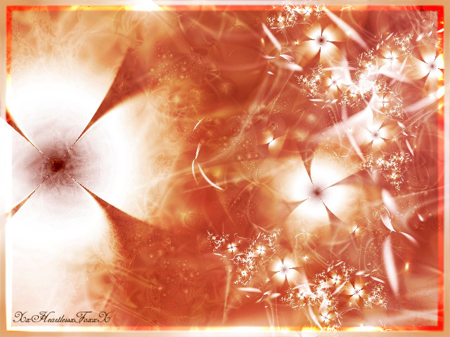
Okay so after some comments from my last piece, Angel of the Deep., I decided to tweak it a bit and play with it a little more in Photoshop.*rayvinazn had made a good point about needing more color, so I added more white and a lighter shade of blue to accent the blacks and blues already in the image. And this time I went for more of a widescreen feel by cropping it long ways. I also did the three different frames to sort of attract the eye to the three main parts of the "angel" ... both wings and the body.
I will wait to hear back from everyone about this one before I decide which one I want to keep or get rid of.
Related content


Comments: 16

I love fractal art with thought. And this my friend is it.
👍: 0 ⏩: 0


It's a little bright, but overall very nice  (Smile)")
👍: 0 ⏩: 0

Looks like angels pussy, lol. I love the colors and depth!
👍: 0 ⏩: 1
")


")

I would have to say that this image, looks a bit too powerful. By this I mean the brightness as stated by rayvinazn, perhaps just a little less brightness would produce an overall better effect as the blue colours will be more saturated with the white than overpowered. I do like your border usage. It reminds me of the 'rule of thirds' used in photography, when, a photographer would like to draw their audience to a specific point of viewing. The use of colours is well used, similar colours always work well together.
If you want to experiment, try turning your powerful white lighting to the opposite colour of blue (while still keeping the luminosity/hue of the picture). See how that works. (note: if you dont know what the opposite colour of blue is, its orange to put simply ")
👍: 0 ⏩: 1

Thanks!
I'll see how that works out.
👍: 0 ⏩: 0


i like it, it is bright.. but what angel is not?
the sections really cought my eye.
nice job!
👍: 0 ⏩: 0

Not to be a shithead or anything, but now it's a bit too bright. The white is almost overpowering, and while the contrast is a bit better overall, having so much white space in the picture detracts from the detail of the fractal itself, especially towards the bottom.
I love the cut-up look you gave it with the border though, that's definately an interesting idea.

👍: 0 ⏩: 1
No you aren't being a shithead, it is nice to actually get some honest critiques for once. I'll play with it some more tonight and see what I can come up with.
👍: 0 ⏩: 1
Yeah, but when you say you edited a picture for me, then I'm not happy with it again, it just seems a bit peevish of me.
That, and people might think we're sleeping together.
👍: 0 ⏩: 0