HOME | DD
 Quiless — CSS Tutorial: Transition
#animation #button #css #tutorial #webdesign
Published: 2015-06-13 09:18:13 +0000 UTC; Views: 6831; Favourites: 145; Downloads: 0
Redirect to original
Description
body div#devskin12174536 * { background:transparent; border:none; margin:0; padding:0; } body div#devskin12174536 .gr-top img { display:none; } body div#devskin12174536 .gr { padding:0 !important; } body div#devskin12174536 li.a.f { background:transparent; } body div#devskin12174536 .gr-top { background:#FE7776; text-align:center; padding:5em; } body div#devskin12174536 .gr-body { background:transparent; } body div#devskin12174536 .text { background:#FAF7F2; padding:5em 8em 5em 8em; margin-bottom:-1.5em; } body div#devskin12174536 .text a { color:#FE7776; } body div#devskin12174536 .gr-top h2 a { font-size:2.1em; color:white; text-transform:uppercase; font-family:'Arial Black' font-size: 3em; } body div#devskin12174536 .gr-top .timestamp { color:#fff; text-transform:uppercase; } body div#devskin12174536 .block { background:white; margin:0.5em; padding:0.5em; box-shadow:0 0 10px rgba(0,0,0,0.3); -moz-box-shadow:0 0 10px rgba(0,0,0,0.3); -webkit-box-shadow:0 0 10px rgba(0,0,0,0.3); } body div#devskin12174536 .tutbut1 { background:#234C68; color:white; display:inline-block; line-height:1em; padding:0.7em; margin:0.5em; cursor:pointer; font-size:13pt; } body div#devskin12174536 .tutbut2 { background:#234C68; color:white; display:inline-block; line-height:1em; padding:0.7em; margin:0.5em; cursor:pointer; font-size:13pt; } body div#devskin12174536 .tutbut2:hover { background:white; color:#234C68; } body div#devskin12174536 .tutbut3 { background:#234C68; color:white; display:inline-block; line-height:1em; padding:0.7em; margin:0.5em; cursor:pointer; font-size:13pt; transition:all 0.3s; -moz-transition:all 0.3s; -webkit-transition:all 0.3s; -ms-transition:all 0.3s; -o-transition:all 0.3s; } body div#devskin12174536 .tutbut3:hover { background:white; color:#234C68; } body div#devskin12174536 h1 { font-size:2.3em; color:#2F343A; font-family:'Arial Black'; text-transform:uppercase; } body div#devskin12174536 h2 { font-size:1.8em; color:#2F343A; font-family:'Arial Black'; text-transform:uppercase; } body div#devskin12174536 .commentslink { color:white; font-family:'Arial Black'; text-transform:uppercase; } body div#devskin12174536 .commentslink:hover { text-decoration:none; } body div#devskin12174536 .list { text-align:center; margin-top:2.5em; } body div#devskin12174536 .c.ppb.alink.bottom { line-height:3em; margin:0 auto; width:13em; transition:all 0.2s; -moz-transition:all 0.2s; -webkit-transition:all 0.2s; -ms-transition:all 0.2s; -o-transition:all 0.2s; color:white; font-family:'Arial Black'; text-transform:uppercase; transition:all 0.3s; -moz-transition:all 0.3s; -webkit-transition:all 0.3s; -ms-transition:all 0.3s; -o-transition:all 0.3s; background:#2F343A; } body div#devskin12174536 .c.ppb.alink.bottom:hover { background:#FE7776; } body div#devskin12174536 hr { height:2px; border:none; background:#2F343A; } body div#devskin12174536 .shadow-holder { margin:3px; } body div#devskin12174536 .shadow-holder img { transition:all 0.3s; -moz-transition:all 0.3s; -webkit-transition:all 0.3s; -ms-transition:all 0.3s; -o-transition:all 0.3s; border:2px solid #FE7776; } body div#devskin12174536 .shadow-holder img:hover { border:2px solid #2F343A; } body div#devskin12174536 img.lit.journal { border:none !important; background:transparent; } body div#devskin12174536 .lit.journal { padding:3px; background:#2F343A; color:white; } body div#devskin12174536 a.thumb.lit { transition:all 0.2s; -moz-transition:all 0.2s; -webkit-transition:all 0.2s; -ms-transition:all 0.2s; -o-transition:all 0.2s; background:#FE7776; color:white !important; } body div#devskin12174536 a.thumb.lit:hover { background:#2F343A; } body div#devskin12174536 a.thumb.lit q { margin:3px; } body div#devskin12174536 .button { display:inline-block; padding-left:1em; padding-right:1em; line-height:3em; margin:3px; transition:all 0.3s; -moz-transition:all 0.3s; -webkit-transition:all 0.3s; -ms-transition:all 0.3s; -o-transition:all 0.3s; background:#2F343A; } body div#devskin12174536 a.button { color:white; font-family:'Arial Black'; text-transform:uppercase; } body div#devskin12174536 .button:hover { background:#FE7776; } body div#devskin12174536 blockquote { background:#2F343A; border:none; color:white; padding:1em 8em 1em 8em; margin:0.3em -8em 0.3em -8em; } body div#devskin12174536 blockquote h2 { color:white; } body div#devskin12174536 blockquote h1 { color:white; } body div#devskin12174536 .copyright { color:#2F343A; text-align:right; font-size:xx-small; margin-right:-2em; } body div#devskin12174536 .copyright a { color:#FE7776; }
Hi! In this short tutorial I want to dive you into CSS Transitions! Before start: you need some CSS and HTML coding skills. Like an example we will use a simple button. You may open CSSdeck and hove some practice after reading the tutorial.
So, let's create a simple base like.
HTML:
And CSS:
.button {
background: #234C68 ; /* Background color of the button */
color: white; /* Button's text color */
font-size: 13pt; /* Font's of the button's text size */
display: inline-block; /* Button's display type in the web page's content */
line-height: 1em; /* Line height */
padding: 0.7em; /* Some spaces */
margin: 0.5em; /* a-and also some spaces */
cursor: pointer; /* Cursor style on hovering your mouse over the button */
}
And you will get something like that:
Button
Okay, let's create a hover effect. It is simply created with special :hover selector. Add to your CSS code:
.button:hover {
background: white; /* Let's change our background color, when mouse cursor is over */
color: #234C68 ; /* Yeah, and font color too */
}
Result:
Button
Now we need some simple transition. Let's change a bit our CSS code:
.button {
background: #234C68 ;
color: white;
font-size: 13pt;
display: inline-block;
line-height: 1em;
padding: 0.7em;
margin: 0.5em;
cursor: pointer;
transition: all 0.3s; /* Transition rule */
}
And the result is:
Button
So, this rule transition: all 0.3s animates all hover effects of the button in 3 seconds. The transition rule also has a lot of values. Try them by yourself:
- transition: all ease-in 0.5s;
- transition: all 5s ease-out 1s;
- transition: background 1s ease-out 0.5s; -webkit-transition: color 0.5s ease-in 1s;
Ask, if you have any questions. Have fun!
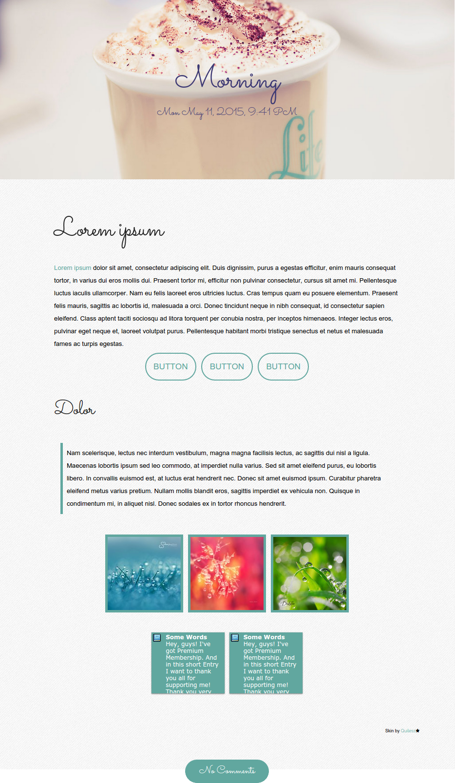
Skin by Quiless
Related content


Comments: 21

Hey I dunno if you still respond to this post but I have a few questions. I want to start coding and want to learn how to customise buttons.
How do you resize the button?
When you add the hover to the css, do you just paste it at the bottom? Or somewhere else in the original css?
I'm guessing I can substitute the original css for the transition code.
I also don't understand how you put the images in the codes.
Sorry for disturbing you ;v;
👍: 0 ⏩: 0

Hello! I have a question...
how do you add text to a button?
(let alone, have it even appear? Mine's not showing up)
👍: 0 ⏩: 0

OMG this really made my day. May I ask how to put the images on the buttons? I already have an image with the same dimensions as the button, but when I used background-image: URL (*my image address*); it doesn't work
")
👍: 0 ⏩: 0

I have a question. Would it be possible to make a button with one image that changes to another image when hovered over?
👍: 0 ⏩: 0

hi, this code did not work in DA's journal. did i do something wrong? please help.
👍: 0 ⏩: 1

I have another questiooon~
can we make these
MenuAbout meGallery
RequestsPatreon
Note meDonate
using these buttons??
👍: 0 ⏩: 1

Nice and simple tutorial, great!
I just wished there would be a way to pre-load images (for backgrounds) without Javascript... it kinda ruined a couple things on my profile. ;-;
Well, it needs a code revamp... specially now that I know that you can put transitions to the visibility propierty!
 (Wink)")
👍: 0 ⏩: 1


hello I have a question, how if I want the button to be my own image?? ;v;
btw this is a very helpful tutorial,
👍: 0 ⏩: 1

1. Create a button which size will be the same as your image's size. You can make it with height and width rules.
2. Add to your button's CSS next rule:
background-image: URL(*paste your image's URL here*)
3. Add to your button's :hover the same rule as in the paragraph 2, but with another URL.
background-image: URL(*paste your hover image's URL here*).
Is it clear or you need an example with full code?
👍: 0 ⏩: 3

what if you want to center the images?
👍: 0 ⏩: 0

Where in the code would you put the picture URL(s)?
👍: 0 ⏩: 0
well It's clear
I'll
try X'DDD
but thank you so much this really helps ;v;~~~~
👍: 0 ⏩: 1
You are welcome!~ ^^ Note me if you have any problems with CSS.
Good luck!
👍: 0 ⏩: 1
okay;;;
thank you again for the help~~~
👍: 0 ⏩: 0

Excellent mini tutorial. And interactive ;D Good to have the demonstration right there.
👍: 0 ⏩: 1
 (Smile)")