HOME | DD
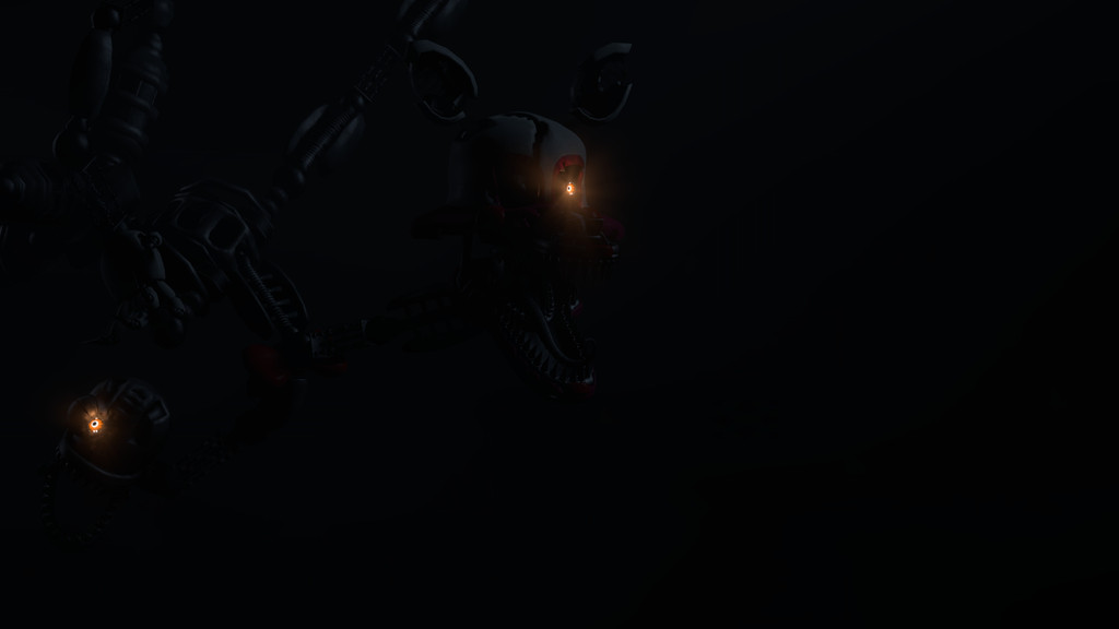
 Qurupeco16 — [SFM-FNAF] Unfixable

#sourcefilmmaker #sfmfnaf #dagamessongs #fnafsisterlocation #ennard
Published: 2017-03-25 10:39:20 +0000 UTC; Views: 768; Favourites: 15; Downloads: 2
Redirect to original
Description
Another poster for NSC... I hope you like it. n.nBtw, first time I use phongtint. º^º
Related content


Comments: 13

Hello, I am here with ProjectComment !
I think there's some interesting use of negative space here, and I'd like to see it pushed a little further. Perhaps by pushing the character's head further up and toward the edge, then turning it back to face the text a little more. As it is, it feels like the character "frames" the rest of the image, which I think is a really cool approach.
As for the text itself, the bright color and glow, as well as the way it's framed by the character make it feel like a focal point, but the small size kind of makes that effect falter. Maybe move it a little higher and make it larger in order to take advantage of the space you've framed with the character. I could easily picture something like that as say, a YouTube thumbnail, designed to draw the eye and attract people to it.
The reflected color is a really nice touch that paid off well imo, but it almost seems like it would make more sense coming from the other side, where the text is. This might help the text feel more like part of the composition, and lend it some atmosphere. The specular highlights are great, and lend visual weight to a character that might otherwise fade into the background.
As a whole, this is a simple idea communicated very effectively. You've made some really nice choices that I'd like to see pushed further in the future. You've got a good eye for presentation that will serve you well.
👍: 0 ⏩: 0

The poster made at Source Filmmaker by Qurupeco16 (TheIceEnder) is really good. This very well elaborated, she used a good model for Ennard, although if she could use a background if not very flashy, that at least not be the whole black background. The subject of the song of DAGames (Will Ryan) if it agrees enough, well it could add something more, it's simple, and although the phrase of less is but, could have used with the other funtime animatronics and Circus Baby's Pizza World. The light is quite unique, especially being the first time using Phongtint, although it could attenuate it more, it looks quite fine. It shows the great effort she put in the preparation of the poster, the theme is good, "original" is not the word with which I would describe the poster, but if it's spectacular, 'cause yes, it's quite good. I give it a rating of (8/10) Great job  (Wink)")
👍: 0 ⏩: 1

Background... I was too lazy for think one .w.
Also, thanks for the critique ^^
👍: 0 ⏩: 0

I love the shading of the material. That was a tricky point for me in animation classes, but this is beautiful. And I love the lights shining off him. One detail, though, is I don't remember Ennard wearing any buttons, but there is one under his chin. Maybe I'm blanking on the design, but this is also a nitpick. Great job overall!
👍: 0 ⏩: 1
I don't remember that Ennard used buttons on the teaser in where I was inspired, but I only put that because of the model xD
Also, thanks ^^
👍: 0 ⏩: 1


 (Smile)")
