HOME | DD
 r-drew — Hal 9000 Finder
Published: 2011-07-10 03:07:06 +0000 UTC; Views: 15267; Favourites: 117; Downloads: 4977
Redirect to original
Description
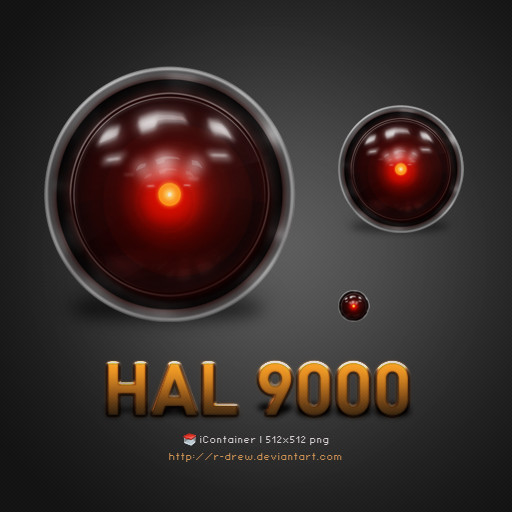
Hal 9000 replacement for Finder. It's my first official icon release. I hope you enjoy!Related content


Comments: 27

👍: 0 ⏩: 0


2nd that.! Would love this w/o pixellation.
👍: 0 ⏩: 0


I love this icon and want to use it so badly, but some reasons only .icns show up when replaced. .png's dont seem to be working
")
👍: 0 ⏩: 0


It's exactly what I'm looking for! Can I use it for my blog Header ?
👍: 0 ⏩: 0


Sweet! Hey, I made a HAL 9000 Adium dock icon ([link] ). Can I make an update using your image? I'll credit you for it.
👍: 0 ⏩: 1

Sure man, you can update it with using my icon. Thanks for asking.
👍: 0 ⏩: 0


Very pretty. Not very Finder-y but very good looking, and would fit well for a tech theme.
👍: 0 ⏩: 1
Agree to disagree? Just kidding... yeah, it isn't very "finderish" but I couldn't find any other icon I wanted to replace. Thanks for compliment!
👍: 0 ⏩: 0

Lovely work - will be using it for Pathfinder instead....!!
")
👍: 0 ⏩: 0

There's nothing like a classic ! Awesome work, thank you for sharing !
👍: 0 ⏩: 0

Amazing for a first one! Thanks for this fan art
You've been featured on iconpaper
 (Wink)")

👍: 0 ⏩: 1
Thank you for the feature, I'm honored!
👍: 0 ⏩: 0
I just checked out your site. Looks FANTASTIC! Perhaps I could submit the icon to your site?
👍: 0 ⏩: 1

sure... It sadly doesn't get updated that much anymore, but you're welcome to! I'll do it in fact.
👍: 0 ⏩: 1
Updated, you're the top icon.
probably ought to breathe some life into that place.
👍: 0 ⏩: 1
 (Smile)")

its stinking incredible! how did you make the highlights on the glass?
👍: 0 ⏩: 1
Thanks! It's a shape I made. Three layers for each. One is the basic shape at a lowered opacity. Second layer under it is the same shape with a gaussian blur. Third is a duplicate of the second but with a blur twice the size as the second layer and a very low opacity. All the smaller the highlights are is a duplication of the larger one but with a much lower opacity.
👍: 0 ⏩: 0